On , DEV Community member Rafi joined Christina and I on the pairing stream to work on improving some accessibility issues in the onboarding for a Forem instance, e.g. DEV onboarding.
Here is the issue that we were working on.
 Keyboard access and usability in Onboarding screens
#9585
Describe the bug
In the onboarding flow, there's a series of screens welcoming users and prompting them to accept the Code of Conduct, agree to T&Cs, follow tags, add some bio information, and follow users. A lot of these user interface controls are reachable for accessibility due to the use of buttons and real form controls, which is excellent! But they could still use some improvements.
The challenges I ran into were related to navigating with the keyboard alone. I couldn't complete some actions, and had to do unconventional navigating to complete the rest. Some improvements to markup and semantics will make them more usable in screen readers, as well.
For example:
-
I can't reach the Code of Conduct link or the Terms and Conditions links from the checkboxes–the links inside the labels are not reachable for some reason, and thus can't be opened before agreeing to the terms if you can't use a mouse.
-
From the second screen onward, the action buttons to go to the next screen are above the onboarding actions (such as toggling specific tag buttons), so keyboard users have to go backwards in the tab order to advance. It's pretty unintuitive from a keyboard access perspective, and would be very unusable to someone who can't see the screen.
-
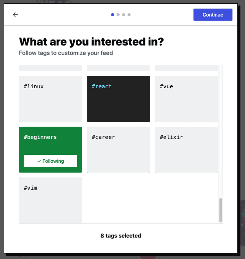
The same tag follow buttons don't have any semantic information marking them as selected, and they are nested in DIV elements so screen reader users won't know how many tag buttons there are, nor when they are or aren't selected.
-
When you do click "Continue" or "Skip for Now", the focus point is put at the end of the next screen as well–so to use a keyboard, you have to go backwards in the tab order again. Ideally, focus would be put at the start of the items for a more ergonomic keyboard experience.
To Reproduce
- Create a new account on Dev, for example by authenticating with GitHub
- Go through the onboarding flow with the keyboard alone (no cheating with the mouse!)
- Try to open the Code of Conduct link from the keyboard.
- Follow some tags with the keyboard using TAB and the Space or Enter keys
- Try to reach the Continue button. You'll find you have to use Shift + TAB to reach it, which is not ideal.
- Go to the next screen and try to fill in the profile fields. You'll find you're at the end of the tab order and again have to go backwards.
Expected behavior
All interactive items should be reachable and operable from the keyboard, in an intuitive order.
The Continue/Skip for now buttons should come after the UI controls they depend on in the source order AND the tab order. A design update to put those buttons at the bottom would be the best solution, as CSS positioning and tabIndex hacks are not recommended.
Toggle buttons should follow a pattern indicating their state for assistive technologies: https://inclusive-components.design/toggle-button/
Lists of items should also be nested in UL elements so the number of them is exposed in assistive technologies.
Showing a new onboarding screen should also put focus at the beginning of the content so a keyboard user is in a natural place to start interacting with it.
Screenshots
In this screenshot, I can reach the checkboxes but not the links:
In this screen, I can reach the tags but the button to continue requires going backwards in the tab order:
In this screen, my focus is put on the last form control and I have to go backwards in the tab order to fill them all in, and also to continue:
Desktop (please complete the following information):
- OS: Mac OS Mojave 10.14.6
- Browser: Google Chrome
- Version: 84.0.4147.105
Smartphone (please complete the following information):
- Device:
- OS:
- Browser:
- Version:
Additional context
On this stream, we covered:
- accessibility issues currently affecting the onboarding process in a Forem instance
- we figured out why hyperlinks in labels were not focusable. Turns out setting the CSS property display with the value
contentswas the culprit. This was in the explanation of the usage of thecontentsvalue for thedisplayCSS property in the Mozilla Developer Network (MDN) docs -- "Due to a bug in browsers this will currently remove the element from the accessibility tree — screen readers will not look at what's inside. See the Accessibility concerns section below for more details." - part of the fix was exploring part of codebase's SASS that was using @extend as well as we were trying to figure out where a
margin-topwas being set. - We had a bit of a setback with Rafi's web server dying for some reason, but we were still able to make do. That's the beauty of live coding. Unpredictable. 😎
Thanks again for coming on the stream Rafi!
You can also find the three of us all over the web here:
Rafi:
Nick:
Christina:
Looking forward to seeing you on future streams! If you're interested in pairing, fill out this form. We’d love to tackle an issue with you that the whole community could learn from!
Follow DEV on Twitch to be notified when future streams begin.


