 David Asaolu
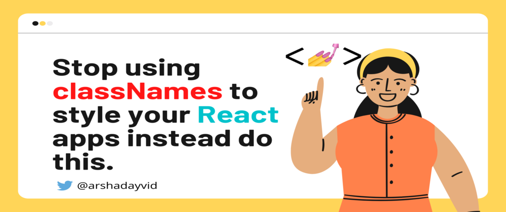
Yes, I have always been like you, I've been styling my html elements in my React apps using classNames, because, that was the only available way in React.😒
After completing a project, going back to maintain or edit the recently completed project is always stressful☹️.
I was also introduced to BEM syntax. BEM was quite helpful, but it wasn't still the best for me with React. Problem Unsolved! 😓

Not until few weeks ago, I was watching a tutorial video and I came across styled components. Sounds cool, but what is it all about?
Is it going to solve my problem? Is it less stressful?
Let's find out! 😊

So what exactly is styled-components?
According to the official website, styled components is the result of wondering how we could enhance CSS for styling React component systems. It uses the best bits of ES6 and CSS to style your apps without STRESS.🎉
So how can you use styled-components in your React apps.
Install it via NPM
npm install --save styled-components
Once, it is installed that's all.🎉
Let's build this simple design using styled-components

In order to use styled-components in your react app, you will have to import styled-components, like this
import styled from "styled-components"
Now, for the example above here is how the component looks like
import React from "react"
import styled from "styled-components" //The styled import


//In styled-components, every element is declared as a variable

//and you are free to use any variable name you like.

//styled.main: main represents the html tag <main></main> that's

//what Container is representing

const Container = styled.main`
  width: 90%;
  background-color: #fff;
  padding: 30px;
  border-radius: 15px
`

//Header represents the h2 tag
const Header = styled.h2`
color: #192041;
font-weight: 700;
margin-bottom: 15px;
font-family: "Merriweather", serif;
`

//Form represents the form tag
const Form = styled.form`
width: 100%;
margin: 15px 0px;
display: flex;
align-items: center
`

//InputContainer represents the input tag
const InputContainer = styled.input`
flex: 0.8;
margin-right: 10px;
height: 35px;
background-color: #e6e9fb;
border: 1px solid #ddd;
outline: none;
padding: 15px
`
//SubHeader represents the p-tag
const SubHeader = styled.p`
  color: #000;
  font-weight: 500;
  font-size: 14px
`
//What happened here is that ParagraphCommon inherits the style of

//SubHeader, just like giving them the same styles. You can also

//add specific styles within the quotes

const ParagraphCommon = styled(SubHeader)``

const SearchButton = styled.button`
height: 35px;
background-color: #192041;
flex: 0.2;
border: none;
color: #fff`

const ButtonGroup = styled.div`
width: 100%;
margin: 15px 0px;
display: flex;
align-items: center
`
const Button = styled.button`
  margin-right: 15px;
  width: 100px;
  padding: 7px;
  border: none;
  cursor: pointer;
  border-radius: 5px;
  color: ${props => props.textColor};
  background-color: ${props => props.bgColor}

//Here, styled-components receive props from the elements in the

//components, which are then accessed using this syntax, which

//gives you the opportunity to do conditional styling.
`

//The React component
function App() {
  return (
    <Container>
        <Header>
          Free and Pro website templates for your business
        </Header>
        <SubHeader>
          Choose from over 300 fully responsive portfolio, blog and ecommerce templates
        </SubHeader>
        <Form>
          <InputContainer placeholder="Search all templates"/>
          <SearchButton>Search</SearchButton>
        </Form>

        <ParagraphCommon>
            Common searches
        </ParagraphCommon>

        <ButtonGroup>
            <Button bgColor="#f1c0de" textColor="#F037A5">Blog</Button>
            <Button bgColor="#e0c3fa" textColor="#8C5EB8">Business</Button>
            <Button bgColor="#d0fccd" textColor="#77D970">Portfolio</Button>
            <Button bgColor="#F9E4C8" textColor="#F78812">Ecommerce</Button>
        </ButtonGroup>
    </Container>
  );
}

export default App;
More interesting view:
There are still a lot about styled-components, which you will love to check out. Click here for more
Feel free to follow and Connect with me on
🚀 Linkedin
🚀 Twitter
Thank you for reading!🎉


