Sometimes I use CSS variables to give names to specific font sizes and spacings. It might look like this:
:root {
    --font-small: 0.75em;
    --font-medium: 1em;
    --font-large: 1.5em;
}
I call this small-medium-large pattern t-shirt sizing, as it closely resembles clothing alpha-sizing convention. It's a pretty common pattern, usually making use of the sm, md, and lg abbreviations as well.
But maybe it's too common... is there a way science can provide an alternate way of thinking about design concepts like relative size? How about:
- Astronomy and planets to denote relative font sizes? 🪐
- Chemistry and atoms for proportioned margin and padding? ⚛️
- Meteorology and clouds for shadows and elevation? ☁️
And disclaimer: This is mostly a fun and creative take and is not the way I think CSS variables should in general be named. See: Is this actually useful?
Planetary Sizes
Our solar system has eight planets including Earth (or, it has tons of planets, but for this let's stick with eight!).
Planets of the solar system to scale. And Pluto. Source: NASA/Lunar and Planetary Institute
Each planet is a different diameter, so by listing the planets in order of their size, we can get a totally-not-t-shirt-size system for naming CSS variables!
- Mercury (smallest)
- Mars
- Venus
- Earth
- Neptune
- Uranus
- Saturn
- Jupiter (largest)
Just pick a baseline (I like Earth), then let the smaller planets represent smaller sizes, and the larger planets represent larger sizes.
:root {
    --font-size-venus: 0.9em;
    --font-size-earth: 1em;
    --font-size-neptune: 1.25em;
    --font-size-uranus: 1.5em;
}
With t-shirt sizes, you get five standard sizes (xs, sm, md, lg, xl) before you start needing more x's, plus assuming you choose md as the baseline, you only get two size tiers above it for all your different headings and whatnot. But with planets, you get eight sizes, four of which are bigger than Earth!
Need more? You could always introduce Pluto or the Sun 😉
Atomic Spacing
Sometimes, it's nice to know the ratio between different values. For example, on a button I might want the left-right padding to be three times larger than the top-bottom padding.
Literal numbers naturally accomplish this:
:root {
    --spacing-1: 0.125em;
    --spacing-2: 0.25em;
    --spacing-3: 0.375em;
}
Crucially, the numbers are not the same as the actual values used! They merely help define a ratio so that you know --spacing-3 is three times larger than the baseline. This happens to be Tailwind's philosophy.
This works, but it's boring! Instead, let's use atoms!
A Lithium atom, which has three red protons. Source: Indolences
The Periodic Table of Elements lists 118 different kinds of atoms, such as carbon, oxygen, and more. The thing to note is that the identity of an atom is directly tied to the number of protons it has.
- Hydrogen atoms always have 1 proton.
- Carbon atoms always have 6 protons.
- Oxygen atoms always have 8 protons.
This is known as an atom's atomic number, and conveniently, this gives us a numeric scale like we were using above! Instead of the number, we can use the corresponding atom's symbol:
:root {
    --spacing-h: 0.0625em; /* hydrogen (1) */
    --spacing-he: 0.125em; /* helium (2) */
    --spacing-c: 0.375em;  /* carbon (6) */
    --spacing-o: 0.5em;    /* oxygen (8) */
}
Sorry IBM, but this is how you really make a carbon design system.
Cloudy Elevation
Material UI has this concept of elevation that simulates how "high" off the screen something is by using a shadow. The bigger and more diffuse the shadow, the higher the element is.
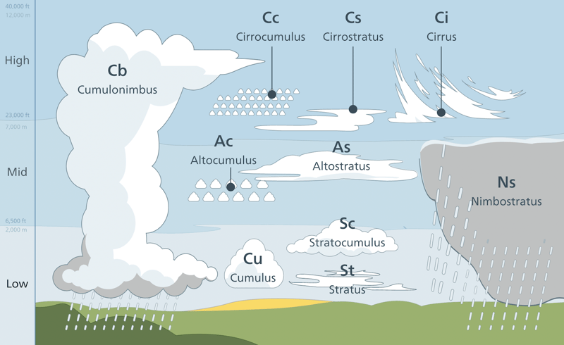
You know what else is elevated off the ground? Clouds! And importantly, different types of clouds generally live at different altitudes.
Different types of clouds are found at different altitudes. Source: Valentin de Bruyn / Coton
So, cirrus clouds are above altocumulus clouds, which are above stratus clouds. This helps establish a pattern for how much shadow an element may have:
:root {
    --shadow-ground: none;
    --shadow-stratus: 0 0.125em 0.125em hsla(0, 0%, 0%, 0.25);
    --shadow-altocumulus: 0 0.25em 0.25em hsla(0, 0%, 0%, 0.25);
    --shadow-cirrus: 0 0.375em 0.375em hsla(0, 0%, 0%, 0.25);
}

.dialog {
    box-shadow: var(--shadow-cirrus);
}
I know what we're all thinking though... what about that cumulonimbus cloud stretching through all the layers? 🙃
:root {
    --shadow-cumulonimbus:
      var(--shadow-stratus),
      var(--shadow-altocumulus),
      var(--shadow-cirrus);
}
Z-index is another elevation-like concept that comes to mind and is notorious for being mishandled.
Is this actually useful?
I've started using this scheme on small personal projects because I think it's more fun, but would I present this to a team? Definitely not.
Universality is very important in team and long-maintenance contexts. I might be a total chemistry nerd, but most people aren't; it would be wrong of me to force people to relive high school and college!
That said, the point is there isn't a one-true-paradigm when it comes to abstracting design concepts. You can use t-shirt sizes, but maybe your team is happy using animals instead, or maybe it's preferred not to use variables at all.
Find what works for you or your team, and if it happens to be a little creative, all the power to you!


