Developing Application Logic in JavaScript
Now let's start developing the application logic using JavaScript. Open the script.js file and place the following code below:
- app.js file:
/**
 * File: intro.js
 * Data: 05/04/2022
 * Description: Star Wars Movie Intro Logic.
 * Author: Glaucia Lemos <Twitter: @glaucia_lemos86>
 */

let width = window.innerWidth;
let height = window.innerHeight;

let intro = document.getElementsByClassName('intro')[0];

intro.style.fontSize = width / 30 + 'px';

window.addEventListener('resize', () => {
  width = canvas.width = window.innerWidth;
  height = canvas.height = window.innerHeight;
  intro.style.fontSize = width / 30 + 'px';
});
Let's figure out what we did here! The font size will be responsive. That's why we are going to use JavaScript. And for that to happen we need to get the width and length of the window!
Then we are selecting the intro class element so that we can store it in a variable with the same name.
And finally, we are setting the font size according to the width proportional size indicated. And with that, if you change the screen sizes on different monitors, the values will be updated.
Now that our opening sentence is ready, let's focus now on the abstract text, in yellow, that appears throughout the intro! 😀
The Story Must Be Told!
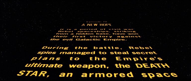
Now let's go to the next step. As I already mentioned above, now we have to develop the part of the summary that appears during the intro. If you don't remember how is, here's an image of what we're going to do now:
Let's hide the previous element by adding the opacity property to a value of 0.
In HTML, we'll add a new <section> tag. And in this tag it will receive a class called paragraphs.
Inside this class, there will be a division with a summary of the story, which is where we will include the story that will appear in yellow in our application.
Now, let's include the <div> tag and inside it we'll include the class called: text_story for the letter styles. Inside this element we will add in the <p> tags for each element.
- index.html file:
<!DOCTYPE html>
<html lang="en">

<head>
  <title>Star Wars Intro App</title>
  <meta charset="UTF-8">
  <meta http-equiv="X-UA-Compatible" content="IE=edge" />
  <meta content="width=device-width, initial-scale=1, maximum-scale=1" name="viewport" />

  <!-- Latest compiled and minified CSS -->
  <link rel="stylesheet" href="https://maxcdn.bootstrapcdn.com/bootstrap/3.3.7/css/bootstrap.min.css"
    integrity="sha384-BVYiiSIFeK1dGmJRAkycuHAHRg32OmUcww7on3RYdg4Va+PmSTsz/K68vbdEjh4u" crossorigin="anonymous">

  <!-- Optional theme -->
  <link rel="stylesheet" href="https://maxcdn.bootstrapcdn.com/bootstrap/3.3.7/css/bootstrap-theme.min.css"
    integrity="sha384-rHyoN1iRsVXV4nD0JutlnGaslCJuC7uwjduW9SVrLvRYooPp2bWYgmgJQIXwl/Sp" crossorigin="anonymous">

  <link href="css/style.css" rel="stylesheet">
</head>

<body>

  <header></header>

  <section class="intro text_intro">
    A Long Time Ago, in a galaxy far,<br> far away ...
  </section>

  <section class="paragraphs">
    <div class="story text_story">
      <p class="text-center">Star Wars Episode XI</p>
      <p class="text-center">Glaucia and the Lightsaber Quest</p>
      <br>
      <p class="text-center">
        These are very difficult times!
        That's why Glaucia Lemos needs to find the lightsaber so she can get programming powers
        like no other person in the galaxy.
        And with that, she begins her quest across the galaxy.
      </p>

      <p class="text-center">
        During your quest,
        Glaucia comes across a planet called Tatooine.
        And it is precisely there that she will start all her training
        to get her powers again.
      </p>
    </div>
  </section>

  <footer></footer>

  <script src="js/intro.js"></script>
</body>

</html>
The text can be created according to your creativity. The important thing is to use your imagination! Okay, now let's go back to CSS and apply some styles to this text.
Open the style.css file again and include the following classes:
- .story
- .story_text
.paragraphs
style.css file:
@import url(https://fonts.googleapis.com/css?family=News+Cycle:400,700);

body {
    margin: 0;
    background: #000;
    overflow: hidden;
}

.intro {
    position: absolute;
    top: 40%;
    left: 20%;
    z-index: 1;
}

.intro_text {
    font-family: "News Cycle", sans-serif;
    color: #00BFFF;
    font-weight: 400;
    letter-spacing: .1em;
}

.story {
    position: absolute;
    top: 80%;
}

.story_text {
    font-family: "News Cycle", sans-serif;
    font-weight: 700;
    color: #FFD700;
    text-align: justify;
    letter-spacing: .1em;
    line-height: 1.1em;
}

.paragraphs {
    position: absolute;
    left: 15%;
    width: 70%;
    z-index: 1;
}
Let's understand what was done here. In the .story class, we put a fixed position and its location will be vertically towards the top.
In the .paragraphs class, unlike the previous class, we will add the width and left property to center the element. And to override, we'll use the z-index property.
For the .story_text class we will use the Cycle News typography with yellow color and thickness 700. In addition, we will justify the paragraphs and give a spacing between the letters.
Try to avoid write to much in the summary. Don't include a long text. Remember that the text has to follow according to the intro song theme. (Yes! We will include audio in this intro!!) 😀
But in the movie intro, the letters kind of lie down, isn't? Well, there's a way to fix this. So let's apply the 3D effect inside the class: .paragraphs in the styles.css file 😀
- style.css file:
(...)

.paragraphs {
    position: absolute;
    left: 15%;
    width: 70%;
    z-index: 1;
    transform-origin: 50%;
    transform: perspective(300px) rotateX(20deg);
}
To make the letters effect, we use the properties: perspective and rotate. This will cause the text to be slightly slanted.
The first part in the transform property indicates the perspective that an item will be displayed in 3D and the second gives a certain axis rotation, a series of angles in degrees.
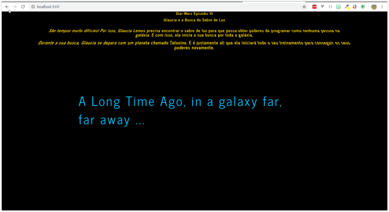
Before that, we will change the origin of the changes to the center of the element. Take a look at the result:
Now let's go back to the intro.js file and add logic to that text.
- intro.js file:
/**
 * File: intro.js
 * Date: 05/04/2022
 * Description: Star Wars Intro Logic
 * Author: Glaucia Lemos <Twitter: @glaucia_lemos86>
 */

let width = window.innerWidth;
let height = window.innerHeight;

let intro = document.getElementsByClassName('intro')[0];
let story = document.getElementsByClassName('story')[0];
let paragraphs = document.getElementsByClassName('paragraphs')[0];

intro.style.fontSize = width / 30 + 'px';
story.style.fontSize = width / 20 + 'px';
paragraphs.style.height = height + 'px';

window.addEventListener('resize', () => {
  width = canvas.width = window.innerWidth;
  height = canvas.height = window.innerHeight;
  intro.style.fontSize = width / 30 + 'px';
  story.style.fontSize = width / 20 + 'px';
  paragraphs.style.height = height + 'px';
});
Now, so that we can hide the paragraphs, let's change the position value from 0 to 80% in the .story class:
- style.css file:
(...)

.story {
    position: absolute;
    top: 80%;
}
Well, now let's add a button that will allow us to start our intro along with audio. Open the file: index.html and add the onclick attribute inside the tag with a function called: start()
- index.html file:
(...)

<body>
  <div class="button" onclick="start()">Start</div>
  <header></header>

  <section class="intro text_intro">
    A Long Time Ago, in a galaxy far,<br> far away ...
  </section>

(...)
Now let's apply some styles to this button created on the main page.
Create the class: .button in the style.css file:
- style.css file:
(...)

.button {
    color: white;
    display: inline-block;
    margin: 10px;
    padding: 5px;
    border: 3px solid;
    border-radius: 5px;
    cursor: pointer;
}
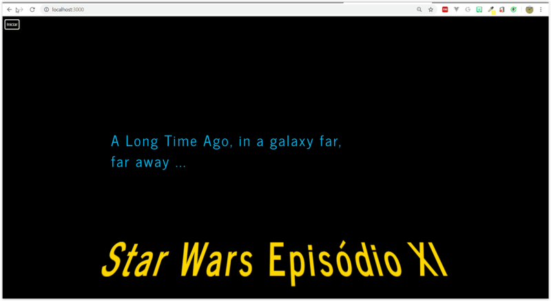
The result should be like this:
Awesome, isn't it?!! 😀
We're almost done! We just need to include more logic in this application and with that we will need to use more JavaScript!
A little more JavaScript to liven things up!!
In the script.js file we will create the start function. This function will be responsible for adding new classes to an intro element and to the story element class:
- intro.js file:
(...)

function start() {
  intro.className = 'intro text_intro animation_intro';
  story.className = 'story text_story animation_story';
}
Let's go back to CSS. Now let's create the classes that will be responsible for animating our intro:
- style.css file:
(...)

.animation_intro {
  animation: intro 2s ease-out 0s;
}

.animation_story {
  animation: paragraphs 80s linear 2s;
}
Let's go to the explanation: This property has 4 values. Let's go try to understand each one.
The first is the name of the animation. The second is duration. The third is about the function effects, and finally, the waiting time for the animation to start the app.
Now let's use CSS3 properties: keyframes.
For our first animation, we're going to do a fade in and out of sentences. So now, we will modify the property: opacity. And for the paragraphs we will have the animation effect too!!Let's add a fade animation and with the top property let's make the sentences disappear from bottom to top:
- style.css file:
@import url(https://fonts.googleapis.com/css?family=News+Cycle:400,700);

body {
    margin: 0;
    background: #000;
    overflow: hidden;
}

.intro {
    position: absolute;
    top: 40%;
    left: 20%;
    z-index: 1;
}

.text_intro {
    font-family: "News Cycle", sans-serif;
    color: #00BFFF;
    font-weight: 400;
    letter-spacing: .1em;
}

.story {
    position: absolute;
    top: 80%;
}

.text_story {
    font-family: "News Cycle", sans-serif;
    font-weight: 700;
    color: #FFD700;
    text-align: justify;
    letter-spacing: .1em;
    line-height: 1.1em;
}

.paragraphs {
    position: absolute;
    left: 15%;
    width: 70%;
    z-index: 1;
    transform-origin: 50%;
    transform: perspective(300px) rotateX(20deg);
}

.button {
    color: white;
    display: inline-block;
    margin: 10px;
    padding: 5px;
    border: 3px solid;
    border-radius: 5px;
    cursor: pointer;
}

.animation_intro {
   animation: intro 2s ease-out 0s;
}

.story_animation {
    animation: paragraphs 80s linear 2s;
}

@keyframes intro {
  0% {
    opacity: 0;
  }
  20% {
    opacity: 1;
  }
  90% {
    opacity: 1;
  }
  100% {
    opacity: 0;
  }
}

@keyframes paragraphs {
  0% {
    top: 75%;
    opacity: 1;
  }
  95% {
    opacity: 1;
  }
  100% {
    top: -200%;
    opacity: 0;
  }
}
Every Galaxy has Stars!
Yes. It is true! Every galaxy is made up of stars and planets! And in our app it will be no different!! Let's add stars in the background. Let's add the canvas property – so we can use the snow effect:
- style.css file:
@import url(https://fonts.googleapis.com/css?family=News+Cycle:400,700);

body {
    margin: 0;
    background: #000;
    overflow: hidden;
}

.intro {
    position: absolute;
    top: 40%;
    left: 20%;
    z-index: 1;
    opacity: 0;
}

.text_intro {
    font-family: "News Cycle", sans-serif;
    color: #00BFFF;
    font-weight: 400;
    letter-spacing: .1em;
}

.story {
    position: absolute;
    top: 80%;
}

.text_story {
    font-family: "News Cycle", sans-serif;
    font-weight: 700;
    color: #FFD700;
    text-align: justify;
    letter-spacing: .1em;
    line-height: 1.1em;
}

.paragraphs {
    position: absolute;
    left: 15%;
    width: 70%;
    z-index: 1;
    transform-origin: 50%;
    transform: perspective(300px) rotateX(20deg);
}

.button {
    color: white;
    display: inline-block;
    margin: 10px;
    padding: 5px;
    border: 3px solid;
    border-radius: 5px;
    cursor: pointer;
}

.animation_intro {
   animation: intro 2s ease-out 0s;
}

.animation_story {
    animation: paragraphs 80s linear 2s;
}

@keyframes intro {
  0% {
    opacity: 0;
  }
  20% {
    opacity: 1;
  }
  90% {
    opacity: 1;
  }
  100% {
    opacity: 0;
  }
}

@keyframes paragraphs {
  0% {
    top: 75%;
    opacity: 1;
  }
  95% {
    opacity: 1;
  }
  100% {
    top: -200%;
    opacity: 0;
  }
}

/*Background with Stars*/
canvas {
  position: absolute;
  top: 0;
  left: 0;
  z-index: -1;
}
And to include the sound – the Star Wars intro theme, let's create a variable in the intro.js file called: sound.
And include this variable inside the start function:
- intro.js file:
/**
 * File: intro.js
 * Date: 04/05/2022
 * Description: Star Wars Intro Logic
 * Author: Glaucia Lemos <Twitter: @glaucia_lemos86>
 */

let width = window.innerWidth;
let height = window.innerHeight;

let intro = document.getElementsByClassName('intro')[0];
let story = document.getElementsByClassName('story')[0];
let paragraphs = document.getElementsByClassName('paragraphs')[0];
let sound = document.getElementById('sound');

intro.style.fontSize = width / 30 + 'px';
story.style.fontSize = width / 20 + 'px';
paragraphs.style.height = height + 'px';

window.addEventListener('resize', () => {
  width = canvas.width = window.innerWidth;
  height = canvas.height = window.innerHeight;
  intro.style.fontSize = width / 30 + 'px';
  story.style.fontSize = width / 20 + 'px';
  paragraphs.style.height = height + 'px';
});

function start() {
  intro.className = 'intro text_intro animation_intro';
  story.className = 'story text_story animation_story';
  sound.play();
}
Let's get our attention back on creating a snow effect!
Now, notice that the changes related to the functions: start() and snow() are already included in the code scope!! 😀
- intro.js file:
/**
 * File: intro.js
 * Date: 04/05/2022
 * Descrição: Star Wars Intro Logic
 * Author: Glaucia Lemos <Twitter: @glaucia_lemos86>
 */

let width = window.innerWidth;
let height = window.innerHeight;

const intro = document.getElementsByClassName('intro')[0];
const story = document.getElementsByClassName('story')[0];
const paragraphs = document.getElementsByClassName('paragraphs')[0];
const sound = document.getElementById('sound');

intro.style.fontSize = width / 30 + 'px';
story.style.fontSize = width / 20 + 'px';
paragraphs.style.height = height + 'px';

window.addEventListener('resize', () => {
  width = canvas.width = window.innerWidth;
  height = canvas.height = window.innerHeight;
  intro.style.fontSize = width / 30 + 'px';
  story.style.fontSize = width / 20 + 'px';
  paragraphs.style.height = height + 'px';
});

function start() {
  intro.className = 'intro text_intro animation_intro';
  story.className = 'story story_text animation_story';
  sound.play();
}

/* Background with Stars */

let canvas = document.getElementById('snow');
const ctx = canvas.getContext('2d');

canvas.width = width;
canvas.height = height;

const num = 100;
const size = 2;
const elements = [];

function start() {
  for (let i = 0; i < num; i++) {
    elements[i] = {
      x: Math.ceil(Math.random() * width),
      y: Math.ceil(Math.random() * height),
      size: Math.random() * size,
    };
  }
}

function snow() {
  ctx.clearRect(0, 0, width, height);
  for (let i = 0; i < num; i++) {
    const e = elements[i];
    ctx.beginPath();
    ctx.fillStyle = '#FFFFFF';
    ctx.arc(e.x, e.y, e.size, 0, 2 * Math.PI);
    ctx.fill();
  }
}

start();
snow();
Now back to the main page… let's include all these changes:
- index.html file:
<!DOCTYPE html>
<html lang="en">

<head>
  <title>Intro - Star Wars</title>
  <meta charset="UTF-8">
  <meta http-equiv="X-UA-Compatible" content="IE=edge" />
  <meta content="width=device-width, initial-scale=1, maximum-scale=1" name="viewport" />

  <!-- Latest compiled and minified CSS -->
  <link rel="stylesheet" href="https://maxcdn.bootstrapcdn.com/bootstrap/3.3.7/css/bootstrap.min.css"
    integrity="sha384-BVYiiSIFeK1dGmJRAkycuHAHRg32OmUcww7on3RYdg4Va+PmSTsz/K68vbdEjh4u" crossorigin="anonymous">

  <!-- Optional theme -->
  <link rel="stylesheet" href="https://maxcdn.bootstrapcdn.com/bootstrap/3.3.7/css/bootstrap-theme.min.css"
    integrity="sha384-rHyoN1iRsVXV4nD0JutlnGaslCJuC7uwjduW9SVrLvRYooPp2bWYgmgJQIXwl/Sp" crossorigin="anonymous">

  <link href="css/style.css" rel="stylesheet">
</head>

<body>
  <div class="button" onclick="start()">Start</div>
  <canvas id="snow"></canvas>

  <section class="intro text_intro">
    A Long Time Ago, in a galaxy far,<br> far away ...
  </section>

  <section class="paragraphs">
    <div class="story text_story">
      <p class="text-center">Star Wars Episode XI</p>
      <p class="text-center">Glaucia and the Lightsaber Quest</p>
      <br>
      <p class="text-center">
        These are very difficult times!
        That's why Glaucia Lemos needs to find the lightsaber so she can get programming powers
        like no other person in the galaxy.
        And with that, she begins her quest across the galaxy.
      </p>

      <p class="text-center">
        During your quest,
        Glaucia comes across a planet called Tatooine.
        And it is precisely there that she will start all her training
        to get her powers again.
      </p>
    </div>
  </section>

  <audio src="https://raw.githubusercontent.com/glaucia86/sounds/master/starwars.mp3" id="sound"></audio>

  <script src="js/intro.js"></script>
</body>

</html>
Observe the HTML5 itself provides you with an <audio> tag that allows you to add audio to your page you are developing. This is one of the advantages that HTML5 provides us.


