CSS, the language for visually styling elements on the web, has evolved to include features that can change an element’s visual effects in a website’s source code – freeing you from the need for graphical and photo editing software. Enter CSS filters.
CSS filters allow developers to alter an HTML element (usually an image) appearance before it gets displayed in the browser. It provides various operations that can be performed on an element to change its visual properties—for example, increasing the brightness of an image, enhancing an element's color intensity, adding a blur effect, and much more.
There are 11 filters in CSS, which are:
This guide will walk you through each CSS filter, what they are, how they work, and how you can use them in your code.
How Do CSS Filters Work?
We can apply CSS filters to an element by declaring the CSS filter property within the element's style block, passing one or more of the 11 CSS filters as its value.
Syntax:
element {
filter: none | blur() | brightness() | contrast() | drop-shadow() | grayscale() | hue-rotate() | invert() | opacity() | saturate() | sepia() | url();
}
Notice that each filter has an opening and closing parenthesis after its name. That is because each filter is a CSS function that accepts either a length, percentage, or degree value, signifying how much of the filter should be applied to an element.
Now, let's look at how each CSS filter works in detail.
blur
.blurry {
    filter: blur( <length>);
}
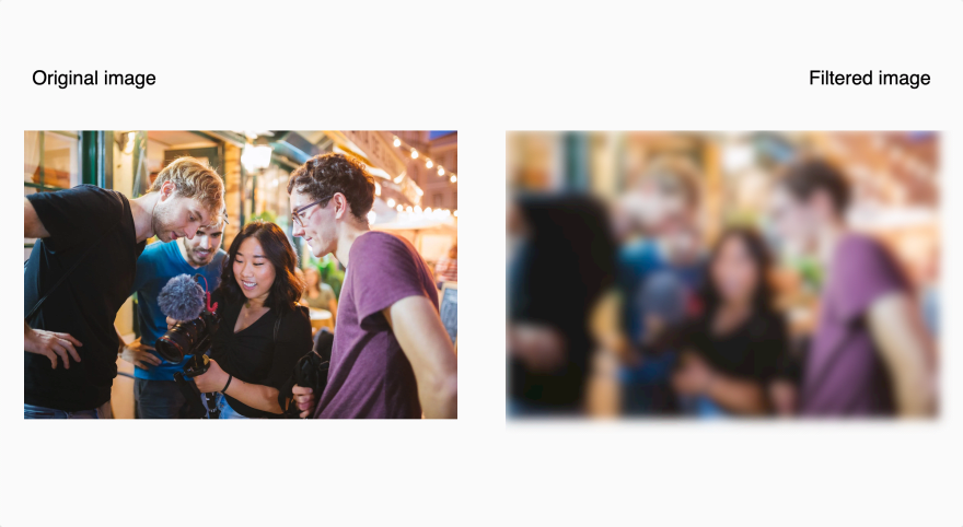
The CSS blur filter applies a Gaussian blur visual effect to an element. It accepts a CSS length unit (px, rem, em, etc.) to determine how many pixels on the screen need to blend into each other to generate a blurred result. The larger the value of the CSS length unit passed to the filter, the more blur is applied to the element. If we do not provide a value, a default value of 0 is used.
For the blur filter (and all CSS filters covered in this article) we'll use the image below to demonstrate each filter's effect on an element.

Photo by Fox from Pexels
The code below adds a blur effect of 3px to the image:
img {
    filter: blur(3px);
}
Here is the result:
brightness
.exposed {
    filter: brightness( <decimal> | <percentage>);
}
The brightness filter adjusts the brightness level of an image. The filter applies a linear multiplier to the input image, making it appear brighter or darker.
It accepts a decimal value between 0 and 1, or a percentage value. A value of 0 results in a completely black image. A value of 100% or 1 leaves the image as is with its original brightness level. Values greater or less than 100% or 1 determine how dark or bright the image will be.
Note that all filter functions that accept decimal values do not work with negative integers (-10, for example) but only accept positive numbers.
The brightness filter has a default percentage and numerical value of 100% and 1. Passing a percentage or numerical value lower than these numbers reduces the image brightness level, giving it the appearance of having a shadow cast over it. The lower the value the higher the intensity of the shadow cast over it is.
The code below applies the brightness filter with a percentage value of 35% to an image:
img {
    filter: brightness(35%);
}
The result:
The opposite effect occurs when you pass a percentage or numerical value greater than 100% and 1 to the filter function. It increases the image's brightness level to make it appear like a photo that has been over-exposed to too much light.
The code below applies the brightness filter with a value of 135% to an image.
img {
    filter: brightness(135%);
}
The result:
contrast
.sharpen {
    filter: contrast(<decimal> | <percentage>);
}
The contrast filter adjusts the brightness difference between the darkest and lightest parts of an image, giving the image a more or less enhanced look.
It accepts a percentage or decimal value to determine the contrast level of an image — a value of 0 results in a completely gray image. Values above 100% and 1 increase the contrast, and parameters below decrease the contrast of the image.
The code below adds a contrast level of 180% to an image:
img {
    filter: contrast(180%);
}
The result:
grayscale
.black-and-white {
    filter: grayscale( <decimal> | <percentage>)
}
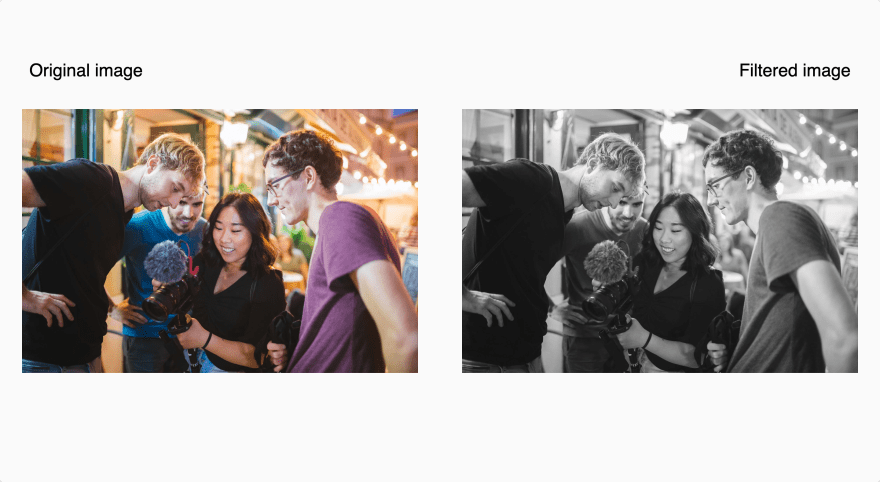
In digital photography, an image contains both color information and luminance (brightness) information. The grayscale filter removes all color information (a representation of the three light sources — red, green, and blue (RGB) used to produce colors on a computer screen) from an image. It leaves only the luminance information — a range of monochromic (gray) shades, with pure white as the lightest shade, pure black as the darkest shade, and every other shade in between being a shade of gray — known as the grayscale.

An illustration of the grayscale color range
The grayscale filter removes all color information from an image and sets its color to a tone in the grayscale.
It accepts a decimal value between 0 and 1, or a percentage value up to 100%. A value of 100% or 1 results in a completely gray image. The image would remain unchanged with a value of 0% or 0, and values between 0% and 100% give it a tone between its original color and complete gray, making the image have a desaturated look.
The code below uses the grayscale filter to make an image completely gray:
img {
    filter: grayscale(100%);
}
The result:
Typical applications where the grayscale filter could come into use would be applying it to images when dark mode is enabled to slightly reduce the overall vibrancy of colors, putting less eye strain on the user. You might also use it to make client logos gray when listing them on a website.
hue-rotate
.change-color {
    filter: hue-rotate(<angle> | <zero>);
}
Digital photography uses a concept known as the color wheel, an organization of colors around a circle, showing the relationships between the primary, secondary, and tertiary colors to produce colors on a computer screen.

An illustration of the color wheel
Each color in the color wheel has a property called hue, the position of the color (in angle degrees) on the wheel.
The hue-rotate filter accepts a CSS angle value (deg, grad, rad, or turn) and shifts the hue value of each color present on an element relative to the amount you specify, updating all colors relative to their hue's starting point.
For example, red is at 0 degrees on the color wheel, and blue is at 240 degrees. If a portion of an image contains red, passing a value of 240deg to the hue-rotate filter will shift the hues of all the colors on the image by 240 degrees, turning that part of the image from red to blue.
The code below adds a hue rotation of 180 degrees to an image:
img {
    filter: hue-rotate(180deg)
}
The result:
Note, the unit identifier for the hue-rotate filter is optional for zero angles. For example, both rotate(0deg) and rotate(0) are valid, but hue-rotate(45) is not.
invert
.turn-color-negative {
    filter: invert(<decimal> | <percentage>);
}
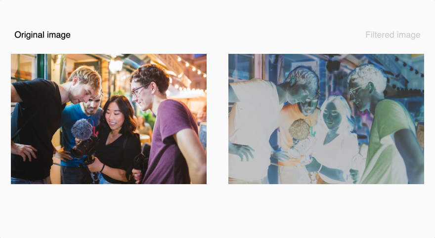
Remember the color wheel mentioned in the section above? When applied to an element or image, the CSS invert filter flips the hue of every color present by 180 degrees, converting each color to the color directly opposite it on the color wheel.

An illustration of the color wheel
Bright areas become dark, red becomes cyan, magenta turns green, blue becomes yellow, and vice-versa, giving the image a color-negative effect.
The invert filter accepts a decimal value between 0 and 1, or a percentage value up to 100% that controls the extent of the color-negative effect. A value of 0.5 or 50% turns an image completely gray.
The code below inverts the colors on an image by 80%:
img {
    filter: invert(80%);
}
The result:
opacity
.transparent {
    filter: opacity( <decimal> | <percentage>)
}
The opacity filter applies a transparency effect to an element's colors. It accepts a percentage or decimal value to decide how much transparency to apply to an image. An opacity of 0% or 0 will result in a completely transparent element. 100% opacity will show no transparency. Setting the opacity between 0% and 100% will give the element or image partial transparency.
The code below adds an opacity of 35% to an image:
img {
    filter: opacity(35%);
}
The result:
You might notice that the opacity filter works just like the CSS opacity property because both control how transparent an element should be. The difference and why you should prefer the opacity filter over the CSS opacity property is that CSS filters are hardware-accelerated.
When you use the opacity filter to add opacity to an element, the browser will offload the computing task onto the Graphics Processing Unit (GPU) — a specialized processor designed to accelerate graphics rendering within the system. This increases the browser's efficiency and frees up the CPU to perform other tasks.
saturate
.enhance {
    filter: saturate(<decimal> | <percentage>);
}
The CSS saturate filter enhances or decreases the intensity of a color, known as its saturation, making it appear more or less vivid.
It accepts a decimal value between 0 and 1, or a percentage value. A value of 100% or 1 keeps the color as is. A value above 100% or 1 amplifies the color's intensity, making it more vibrant (saturated), while values below that reduce the color's intensity, making the color grayed and dull (desaturated).
The code below applies a 172% saturation to an image:
img {
    filter: saturate(172%);
}
The result:
sepia
.nineties-effect {
    filter: sepia(<decimal> | <percentage>);
}
The sepia filter adds a soft brownish color tone to an image, giving it a warmer and vintage appearance that is calming to the eye. It is similar to using the grayscale filter but with a brownish color tone.
It accepts a decimal value between 0 and 1, or a percentage value up to 100%. A value of 0 leaves the image unchanged. A value of 100% or 1 changes the image entirely to sepia, and values between 0% and 100% give the image a tone between its original color and completely sepia.
The code below calls the sepia filter with a percentage value of 100%, converting the image to be completely sepia:
img {
    filter: sepia(100%);
}
The result:
drop-shadow
.shadow {
    filter: drop-shadow(<offset-x> <offset-y> <blur-radius> <color>);
}
The CSS drop-shadow filter applies an (often blurry) background shadow to an element, giving it a more three-dimensional look.
The drop-shadow filter accepts four parameters when applying a drop shadow to an element:
-
<offset-x>: A CSS length value that specifies the horizontal distance between the element and the drop shadow. Positive values place the shadow to the element's right, and negative values place the shadow to the left. -
<offset-y>: A CSS length value that specifies the vertical distance between the element and the drop shadow. Positive values place the shadow below the element, and negative values place the shadow above it. -
<blur-radius>: The blur radius of the shadow is specified as a CSS length unit. The larger the value, the more blurred the shadow becomes. If left unspecified, it defaults to 0, producing a sharp and unblurred shadow. No negative values are permitted. -
<color>: The color of the shadow, specified as a CSS color. If left unspecified, it defaults to the color black.
Here's an example of setting a drop shadow to an element:
img {
    filter: drop-shadow(30px 30px 50px #000);
}
The code above adds a black shadow with a 50px blur to the image, setting it 30px to the right of the image and 30px below it.
Here's the result:
The drop-shadow filter looks much like the CSS box-shadow property at first glance. However, there's a difference between the two, and it's worth comparing those differences to know when to prefer one over the other.
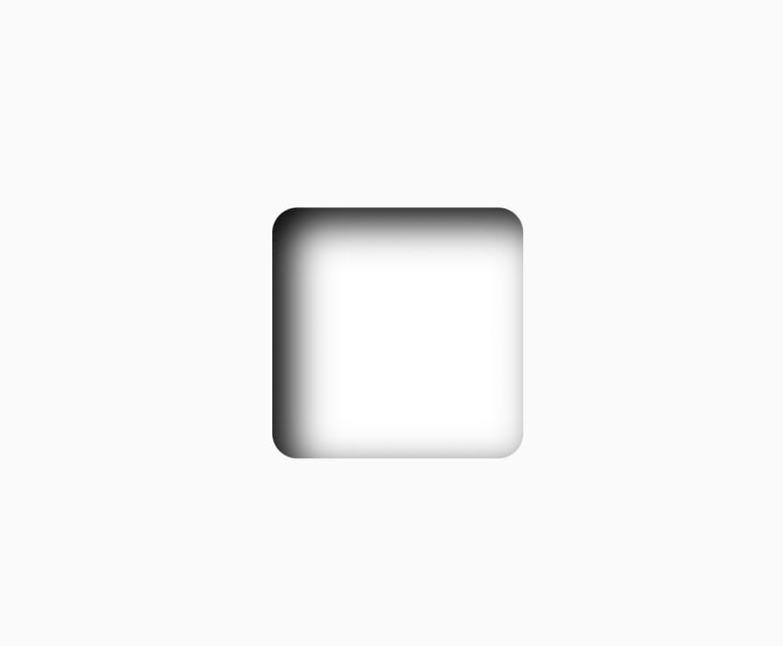
One difference between the drop-shadow filter and the box-shadow property is the drop-shadow filter does not accept the inset keyword, which, when set, rather than aligning the shadow behind the element, inserts the shadow within the element, giving it a framed appearance.
For example:
div {
    height: 200px;
    width: 200px;
    background: #fff;
    border-radius: 20px;
    margin: 20px;
    box-shadow: inset 15px 12px 30px #000;
}
The result:
The result of using the insert keyword that's only available to the box-shadow property to insert the shadow into the div.
Another difference between the drop-shadow filter and the box-shadow property is the drop-shadow filter does not accept the parameter — a CSS length value that specifies how wide the shadow will span. Positive values cause the shadow to enlarge, and negative values cause the shadow to shrink. If not specified, it will default to a value of 0 (the shadow will be the same size as the element).
Example:
img {
    box-shadow: 30px 40px 50px 70px gray;
}
The code above adds a gray shadow with a 50px blur to an image, passing an additional length value of 70px that signifies the shadow will span 50px more than the image in width.
The result:
Lastly, to explain the significant difference between the drop-shadow filter and the box-shadow property, we'll be using the CoderPad logo below.
If the box-shadow property is used to add a shadow to the CoderPad logo above:
.coderpad {
    box-shadow: 10px 10px 30px #000;
}
It results to the image below:
Notice that the shadow is applied to a rectangular box around the logo? This is because CSS uses a box model, where the edges of an element are bound in a rectangular box containing its padding, border, and margin properties. Even in cases where the element does not appear to have a rectangular shape, the box is still there, which is where the shadow will be applied.
CSS filters are not bound to the box model. That means that the drop-shadow filter will only consider the outline of the CoderPad logo, ignoring its box model so that only the contents of the logo receive the shadow.
For example:
.coderpad {
    filter: drop-shadow(15px 10px 28px #000);
}
The result:
Deciding which method to use between drop-shadow and box-shadow is totally up to you based on the effect you want to achieve.
url
.svg-filter {
filter: url('#selector-of-your-svg-filter-here');

/* you can also load filters from external SVGs this way: */
filter: url('filters.svg#name-of-your-other-filter-here');
}
The url filter takes a string value pointing to an SVG filter element and applies its effects to an HTML element.
The SVG filter element <filter></filter> is used to add special visual effects to SVG graphics.
Syntax:
<svg>
    <defs>
        <filter id="name-your-filter-here">
             ... <!-- insert filters here --> ...
        </filter> ...
    </defs>
</svg>
The <filter> tag takes a required id attribute to identify the filter. We can then use the url filter to apply the SVG filters to HTML elements using either the id selector of the filter or a link to it.
For example, the code below defines a blur filter using the
<feGaussianBlur> filter tag:
 <svg>
    <defs>
        <filter id="blur-filter" x="0" y="0">
          <feGaussianBlur in="SourceGraphic" stdDeviation="8" />
        </filter>
      </defs>
</svg>
Now, you can apply the SVG filter to an element by passing its id to the url filter:
img {
  filter: url("#blur-filter");
}
Here's the result.
Other Usage Notes
Here are a few more points to note when using CSS filters.
Using Multiple CSS Filters
Throughout this article, we have only looked at using a single CSS filter per section. However, you may combine two or more CSS filters to manipulate the rendering of an element.
Syntax:
.multiple-effects {
    filter: blur() | brightness() | contrast() | drop-shadow() | grayscale() |          hue-rotate() | invert() | opacity() | saturate() | sepia() | url();
}
We can pass two or more of the 11 CSS filters to the filter property, and CSS applies them to the element according to the order they appear.
For example:
img {
    filter: opacity(50%) drop-shadow(20px 10px 0px black);
}
The opacity filter comes first in the filter property in the code above before the drop-shadow. When rendering the image in the browser, CSS will apply an opacity of 50% to the image, making it partially transparent, before adding a drop-shadow.
Here's the result:
Reversing the order of the filter properties changes the result:
img {
    filter: drop-shadow(20px 10px 0px black) opacity(50%);
}
The result:
Usage with the initial and inherit keywords
In addition to the 11 CSS filters, the filter property accepts two extra values.
-
initial: The default value of the filter property — resolves to "none". -
inherit: The computed value of the filter property from an element's direct parent.
Try using CSS filters yourself!
Hopefully, you now have a thorough understanding of all 11 CSS filters, how they work, and how you can use them to apply different visual effects to the elements on your websites.
CSS filters give you more independence from photo editing software when creating production assets and visual effects for your websites—helping save on both time and money. They enable you to apply these visual effects directly in the browser.
If you'd like to read more informative articles from CoderPad's blog, check out the related posts below:


