 Programming with Shahan
Hey👨💻, welcome back.
In this article we gonna build a beautiful animation project using only HTML & CSS. This project is part of my "The Complete CSS3 Animations Course", and I assume that you are an intermediate-level CSS developer to build this project.

⛳ CSS3 Animation Properties That I used In this Project:
- CSS Transformations
- 3D Transformations
- CSS Transitions
- Animation
- Custom Timing Function(keyframes)
So, are you excited to build this project? I'm too. Let's Begin 🏒
Note: In case you want to code along with me, I added full tutorial video at the bottom of this article. This helicopter shape was inspired by @frontendjoe
🏗 Defining Helicopter Structure Using HTML
Let's define a container in the main element called “helicopter” and inside this container write 4 div elements with class in order:
- cockpit
- tail
- main
- rotor
Inside this “rotor” class you have to add a div with class “rotator” along with two empty div inside this “rotator” class.
<html>
 <head>
 </head>
 <body>
  <main class="helicopter">
     <div class="cockpit"></div>
     <div class="tail"></div>
     <div class="main"></div>
     <div class="rotor">
       <div class="rotator">
         <div></div>
         <div></div>
       </div>
     </div>
     <main>
 </body>
</html>
🚁Helicopter Design
In this section, we will design our HTML structure to turn into a helicopter shape.
Body
body {
  /* put elements into center */
    width: 100%;
    height: 100vh;
    display: flex;
    align-items: center;
    justify-content: center;
}
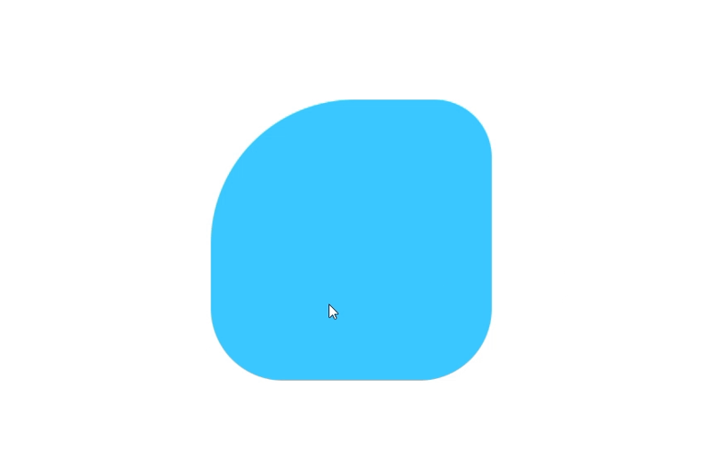
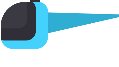
.cockpit class
.cockpit {
    position: absolute;
    overflow: hidden;
    z-index: 1;
    width: 195px;
    height: 195px;
    border-radius: 100px 40px 50px 50px;
    background-color: #44d2fd;
}
Output:
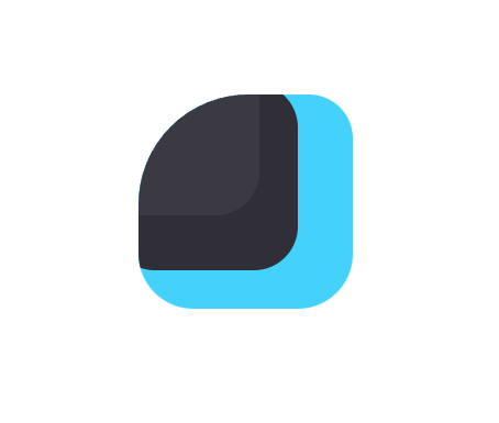
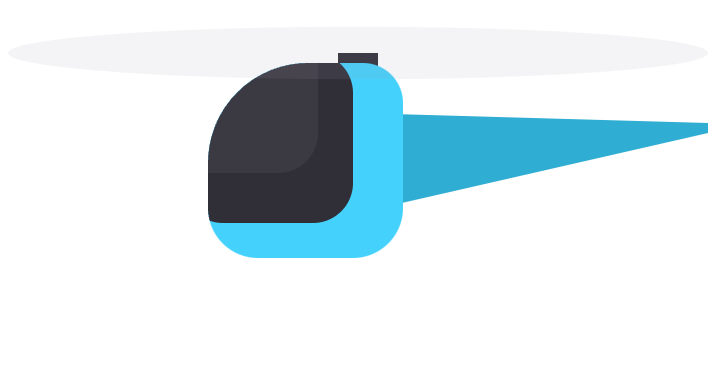
Then we have to add glass to this cockpit class. So let's define glass shapes on .cockpit :before and :after:
.cockpit::before {
    content: "";
    position: absolute;
    z-index: 1;
    top: -10px;
    left: -25px;
    width: 170px;
    height: 170px;
    border-radius: 40px;
    background-color: #302e37;
}
.cockpit::after {
    content: "";
    position: absolute;
    z-index: 1;
    top: -60px;
    left: -60px;
    width: 170px;
    height: 170px;
    border-radius: 40px;
    background-color: rgba(255, 255, 255, 0.05);
}
Output:
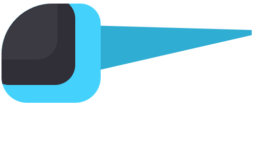
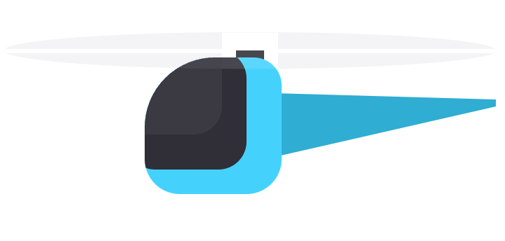
.tail class
Now, we have to apply styles to .tail class:
.tail {
    position: absolute;
    top: 50px;
    left: 150px;
    transform-origin: left center;
    border-top: 10px solid transparent;
    border-bottom: 80px solid transparent;
    border-left: 350px solid #2fadd2;
    border-bottom-right-radius: 10px;
    height: 10px;
}
Output:
.main class
This class will be the helicopter rotator body:
.main {
    position: absolute;
    left: 130px;
    top: -10px;
    width: 40px;
    height: 20px;
    background: #302e37;
}
Output:
.rotor class
.rotor {
    width: 700px;
    height: 700px;
    border-radius: 350px;
    position: absolute;
    top: -360px;
    left: -200px;
    z-index: 2;
    overflow: hidden;
    background-color: #a299ab;
    opacity: 0.12;
    transform: scaleY(0.075);
}
Output:
After styling the main rotor, we have to target the two empty div inside this rotor to make this rotor realistic. You will see beautiful animation when we will apply rotate animation in the next lesson.
.rotator div {
    position: absolute;
    top: 50%;
    left: 50%;
    margin-left: -350px;
    margin-top: -30px;
    width: 700px;
    height: 80px;
    background-color: #fff;
}

.rotator div:nth-child(1){
    transform: rotate(0deg);
}

.rotor div:nth-child(2) {
    transform: rotate(90deg);
}
Output:
🛫Flying Capability
Up until now, we created our helicopter shape and design. But without animations and keyframes, there will be no animation. So, Let's give it flying power using CSS animation property.
⏱Defining @Keyframes
Before using the animation property, we need to create keyframes. For this project, we will create two @keyframs called:
- bounce
- rotate
bounce
@keyframes bounce {
    0%,100%{
        transform: translate(0px, -50px) rotate(-15deg);
    }
    50% {
        transform: translate(0px, 50px) rotate(-10deg);
    }
}
rotate
@keyframes rotate {
    0% {
        transform: rotate(0deg);
    }
    100%{
        transform: rotate(360deg);
    }
}
📁Using Animation Property
So far, we defined two @keyframes for our helicopter project. Now, add them in our .helicopter & .rotator class.
.helicopter class
.helicopter {
    animation: bounce 5s infinite; /* adding bounce keyframes with duration 5s and infinite loop */
}
.rotator class
.rotator {
    position: absolute;
    width: 700px;
    height: 700px;
    border-radius: 350px;
    animation: rotate 0.6s linear infinite; /* added rotate @keyframs */
}
Output:
🎬Full Tutorial
You can code along to build this project from scratch by following this video.
👏Conclusion
So, we learned how to create complex shapes and animation using only CSS. You even don't have to touch JavaScript. Hope you enjoy this project. You can subscribe to my YT channel if you are interested in Front-end dev.
Let me know what do you think after completing this project. Feel free to leave a comment below✍
☕_Buy me a coffee:
https://www.buymeacoffee.com/codewithshahan
🎿You can connect with me on:
Twitter
Linkedin
Github
Happy Coding!


