When we think of teamwork in the world of user experience (UX), we often imagine design and engineering working together. However, the idea of design and marketing working together is not as common. While marketing aims to persuade users to take action, UX is all about meeting their needs and expectations. It can be challenging to balance sell and serve simultaneously.
However, as Contenda experienced rapid growth with multiple ongoing releases, there came a point when I had to tackle both go-to-market and UX efforts as the sole designer. This is my advice to all the solo designers out there trying to juggle a startup’s many priorities.
Embracing a holistic approach
To overcome these hurdles, I decided to set aside the distinction between marketing and UX, and instead focus on the bigger picture. I asked myself questions like:
“What do I want people to remember about Contenda?”
“How can I make our platform engaging, informative, and valuable?”
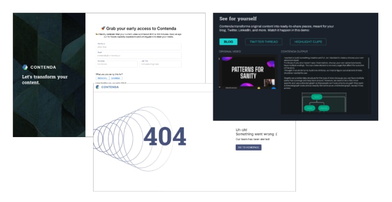
While seeking answers to these questions, I found that one of Contenda’s biggest problems was the lack of consistency. Take a look below - some pages looked like they were still under development, while others exuded a polished, professional vibe. The colors, typography, and layout were completely different too. This inconsistency was exacerbated by the numerous customer channels ranging from emails to social media to partnership pages. It was crucial to convey Contenda’s value consistently across these touch-points.
By aiming for consistency across the platform, I found that I was naturally able to address both marketing and UX concerns. For instance, while creating graphics for our Contenda Kitchen newsletter, I also considered how those visuals could be incorporated into a fun 404 page. Designing new sign-up forms provided an opportunity to re-examine how I was communicating Contenda’s value proposition and how I can incorporate assets from marketing graphics into banners in our app.
Helpful design practices along the way
Throughout this journey to harmonize marketing and UX, I also discovered several super helpful and handy design practices:
Create reusable components - I transformed most visual assets into reusable components across the entire Contenda ecosystem. For instance, when updating our social media avatars, I noticed that adding a drop shadow to the logo instantly made it more visually appealing and helped it stand out against the dark background. This inspired me to apply the same shadow in other areas with dark backgrounds, like our hero section and soon-to-come new sign-up page! Drop shadows across our landing page and soon to come new sign-up page
Build templates for everything - With a multitude of changes and rapid releases, it’s essential to keep designs flexible yet scalable. Templates, like the branding-related ones I made in Figma, proved to be incredibly useful. Whenever we established a new partnership, someone else could simply drop the logo and export the file to be used in the relevant social media posts. Skeletal layouts for signup/submission forms were also beneficial for experimenting with new designs.
Establish a central hub for visual documentation - This was particularly critical for both the marketing and front-end sides to maintain visual consistency. I found tools like zeroheight extremely helpful for easily pushing changes and allowing the entire team and the public to view our brand guidelines.
The Outcome
I’ve discovered that marketing and UX can indeed work together harmoniously. By focusing on the overall experience and message, I ended up enhancing both go-to-market and user experience aspects simultaneously. I was thrilled to see marketing impressions soar dramatically, while the entire platform began to look more cohesive. But hey, all good things come at a cost - you should see the state of my desktop now!


