"Is there a tool that checks if my website is accessible?" is a question I get asked sometimes. (Answer is no, by the way.) This usually leads to discussions about accessibility testing as part of the development flow.
I've also had conversations with people who state that code is bad if it can't be tested with automated tests. I disagree. When it comes to testing a website's usability and accessibility, it can't be fully automated. There are too many factors that can't be programmatically checked yet.
This blog post will discuss a bit what I mean by automated accessibility testing and give some examples. I will also discuss why it's not enough and provide some tips and further reading on testing your website manually.
I also want to point out that it would be best to hire actual people with disabilities for testing. For example, a sighted tester, who does not use screen readers daily, can catch only so many problems on the site. However, I recognize that it's not always possible, so as developers, we need to know how to test (at least) basic things manually.
Automated Accessibility Testing
There are multiple ways to conduct (semi) automated accessibility testing. It's possible to add plugins to linters and have a plugin that checks accessibility in the test environments. There are also automated tools in browsers, such as Lighthouse.
So when I'm referring to automated testing, I'm talking about everything that takes the code, parses it, and programmatically determines if the site is accessible or not.
I'll introduce some of the tools that could be used for this. It's not an extensive list, but something I've used. And note: I'm doing mostly React-code, so these tools are from that world.
Linter
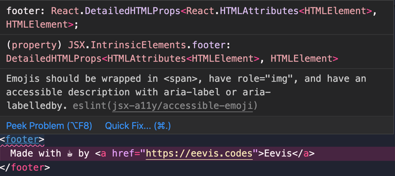
eslint-plugin-jsx-a11y is a plugin for eslint. It catches accessibility issues when developing. I use VSCode and eslint-extension, so if I write code that violates the rules, I get warnings in the code editor:
This plugin helps to catch low hanging fruits, such as missing alt-attributes or missing attributes for a declared role.
Tests
Tests are another place where plugins can bring more accessibility insights. I've used two, depending on the test setup: jest-axe and
cypress-axe. They both add axe-core, Deque's testing solution to the testing environment.
It's also possible to add Google's Lighthouse as an npm-module and include its tests to your CI/CD-pipeline. I bet other tools have these as well, but I haven't tried them.
Tools in Browsers
There are multiple extensions for testing your site for accessibility. First, Google's Lighthouse is a way to run a test on your website. It's built-in to Chrome and can be added to Firefox as a plugin. It's not only for checking accessibility; as the introduction in their website says:
Lighthouse is an open-source, automated tool for improving the quality of web pages. You can run it against any web page, public or requiring authentication. It has audits for performance, accessibility, progressive web apps, SEO and more.
In Chrome, you can find it from the developer tools:
There are other tools as well: Deque's aXe and WebAIM's Wave are useful tools for checking the accessibility of a web page programmatically. They work a bit differently from each other. Axe runs the same checks as the testing library extensions mentioned above. The plugin and testing library extension both use axe-core.
Wave, however, visualizes the elements where problems are. In my opinion, Wave's way of showing things can get pretty messy and hard to understand. Poking it for a while helped me learn how to navigate it, but it might be hard at first. You have been warned.
Axe and Lighthouse recognize that their results are not exhaustive, and they also list things to check manually.
Manual Testing
What I mean by manual testing is testing that is done, well, manually. This means using, for example, screen readers or keyboards - those tools that people with disabilities utilize to use the internet.
I want to emphasize that if you aren't a screen reader (or other assistive technology) user, you can't actually know how users of those technologies use the web. So listen to the actual users if they say something. However, it's good to learn the basics of testing with these technologies.
Why Test Manually?
In 2019, the Act on the Provision of Digital Services came into effect in Finland. It means that all the public sector websites need to abide by the European Union's accessibility directive requirements. The transition period ended last fall, and there were some articles about if public sector websites are accessible or not.
What was pretty typical for the articles was that accessibility was often evaluated only with the Lighthouse's accessibility audit's score. Also, the questions for the representatives of cities and municipalities with lower scores were about improving that score.
I took a look and did a bit of digging on those sites having a score of 100. A quick test with a keyboard showed some problems immediately. For example, in one site, links were distinguished only by color. Looking into alt-texts also revealed some texts like "This is the logo for the site."
These already fail some of the Success Criteria from WCAG 2.1, which is the requirement to pass. (To be exact: SC 1.4.1 and SC 1.1.1, respectively)
Anyways, having a perfect accessibility score from Lighthouse is a start. By implementing those requirements, there are usually many benefits, and most of the low-hanging-fruits are caught. On the other hand, it's good to note that it's possible to build a website with a perfect Lighthouse Score, which is also entirely inaccessible.
Depending on the study, automated testing catches only about 15-40% of failures. Good examples of things that automated tests miss are the quality of alt-texts. I mean, they can detect the presence of an alt-attributes, but they cannot detect if that text is actually descriptive or if the image is purely decorative and alt-text should be an empty string.
Tips on Testing Your Site Manually
Testing with Keyboard
The first and maybe the easiest way to test a website is to navigate it using only a keyboard — tab through the interface. See if you can tell where you are as you go. If the focus disappears, take note of those situations, and fix them.
Also, remember that the expected keyboard navigation has some rules, other than just using tab and enter for navigation. For learning more about those, WAI-ARIA Authoring Practices provides a comprehensive list of these patterns.
Screen Reader Testing
Another assistive technology to test with is a screen reader. I won't go into detail on how it's done because there are other helpful resources, and I am not an expert on the topic. For example, WebAIM answers a lot of questions about screen reader testing.
Other Tools
Some other tools can help with manual testing. The first thing to list here is the browser's developer tools' accessibility features. They provide different ways to debug and test accessibility. Read more from different browsers' dev tools:
A note, though: for some reason, you have to explicitly turn them on in Firefox and Safari.
There are other helpful tools for manual testing as well. For example, Web Developer-extension is a useful tool for checking and visualizing aspects of a website. For example, you can show alt-texts on a website to check that they're meaningful:
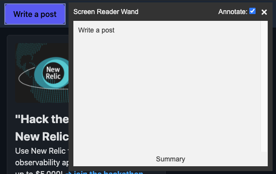
Another tool I have used is tota11y from Khan Academy. It's a bookmarklet that provides a tool for visualizing problems in things like headings, labels, color contrasts, and alt-attributes. One thing that I really like is the screen reader wand. With it, I can hover an item and see what the screen reader would read. It's an experimental feature and can't replace actual screen reader testing, but it's useful for quick checks.
Wrapping Up
Automated accessibility tests and tools are a good start to catch accessibility failures from the code. These are usually so-called "low hanging fruits" and are relatively easy to fix. However, fixing just those problems doesn't guarantee accessibility.
Manual testing with assistive technology, such as keyboard and screen readers, gives more insight into the website's accessibility. For example, navigating the site using only a keyboard can be illuminating - you might find out that the site is not accessible for those users who don't use a mouse.
Resources
Tools
- eslint-plugin-jsx-a11y
- jest-axe
- cypress-axe
- axe-core
- axe-extension
- developer tools in Chrome
- developer tools in Firefox
- developer tools in Safari
- Lighthouse
- Web Developer-extension
- tota11y-bookmarklet


