This is Part 1 in the series called "UI/UX for Frontend Developers". A new article will be published every few weeks.
In each part, I will talk about a general topic, some UI/UX tips about an element, and a practical UI/UX pattern.
In this part, I will share with you tips about color, buttons and the auto-save pattern. Let's get started.
General Topic: Color
Color itself is a broad topic that deserves several detailed articles. It will be broken down into many aspects to be more digestible.
The color system
Every application should have its own defined color system. The most common structure of a color system nowadays is usually as follows:
- The primary color: The color that speaks your brand
- The secondary/accent color: The complementary color to the primary color
- Other colors for states: Red-ish (Error), Green-ish (Success), Yellow-ish (Warning)
- The primary text color: Often black-ish
- The secondary text color: Often lighter than the primary text color
Notes: In practice, there might be more elements to the structure of a color system, depending on the needs of the application.
There are also extremely useful tools to help you build the color system (e.g. they let you know which colors are complementary to which):
- Adobe Color: https://color.adobe.com (this one also lets you build the whole color system from a colored logo you already have)
- Color Scheme Designer: http://colorschemedesigner.com/csd-3.5
- Coolors: https://coolors.co/generate
Color branding
Suppose you are going to build an application of some sort, you might be wondering what color you should pick for it. Basically, you are free to choose what color you like. However, having a guideline might be better than none, so I'll give you one:
Red
- Characteristics: Power, Excitement, Hunger, Passion
- Commonly seen types of applications: Food, Entertainment
- Brand examples: Coca-cola, KFC, Youtube, Netflix, Pinterest, Nintendo, MSI
Green
- Characteristics: Health, Relief, Growth, Freshness, Eco-friendliness
- Commonly seen types of applications: Health, Environment, Stress relief, Education
- Brand examples: Starbucks, Spotify, Heineken, Tropicana, Grab, Duolingo
Blue
- Characteristics: Reliabity, Trust, Loyalty, Calm, Peace, Security
- Commonly seen types of applications: Social networks, Banking, Money-related, Business, Education
- Brand examples: Facebook, LinkedIn, Quizlet, Paypal, Skype, HP, Intel
Yellow
- Characteristics: Optimism, Positivity, Energy, Warmth, Youthfulness, Creativity
- Commonly seen types of applications: Food, Shipping/Delivery
- Brand examples: McDonalds, Cheetos, Lay's, DHL, Snapchat, IMDb
Orange
- Characteristics: Motivation, Cheerfulness, Creativity, Dynamic
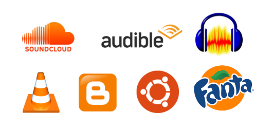
- Commonly seen types of applications: Sound, Music, Audio-related
- Brand examples: Soundcloud, Audible, Audacity, VLC, Blogger, Ubuntu, Fanta
Purple
- Characteristics: Feminine, Beauty, Luxury, Romance, Loyalty
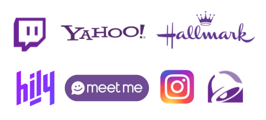
- Commonly seen types of applications: Beauty, Women/Girls, Dating, Romance
- Brand examples: Twitch, Yahoo, Instagram, Hily, Meetme, Hallmark, Taco Bell
Brown
- Characteristics: Protection, Durability, Seriousness, Down to earth
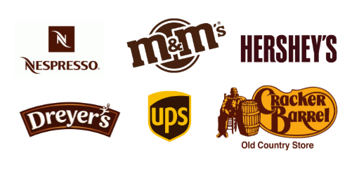
- Commonly seen types of applications: Natural products (esp. coffee & chocolate), Leather products
- Brand examples: Nespresso, M&M's, Hershey's, Dreyer's, Ups, Cracker Barrel
Pink
- Characteristics: Love, Feminine, Beauty, Sweetness
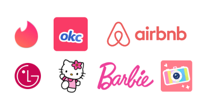
- Commonly seen types of applications: Beauty, Women/Girls, Dating, Romance
- Brand examples: Tinder, OkCupid, Airbnb, LG, BeautyPlus, Hello Kitty, Barbie
Black
- Characteristics: Power, Luxury, Seriousness, Elegance
- Commonly seen types of applications: News, Luxury products
- Brand examples: Apple, Gucci, Adidas, Chanel, Nike, The New York Times, Daily.dev, DEV.to, Medium
Element: Button
Types of buttons
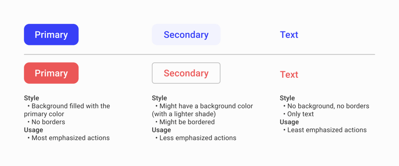
There are 3 main types of buttons: Primary buttons, Secondary buttons, and Text buttons.
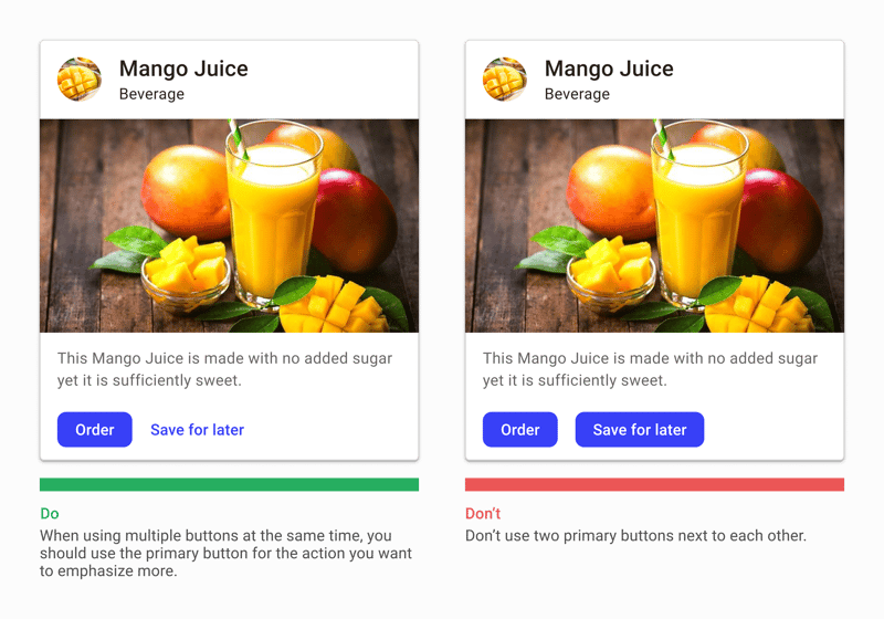
Based on the level of emphasis of each action, you should use the appropriate type of button.
Button states
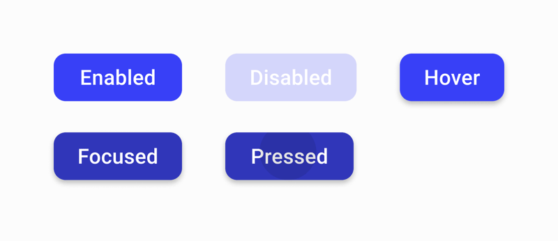
Each button should have these states:
- Enabled: The normal state of the button
- Disabled: The disabled state of the button
- Hover: The state when the button is hovered by a cursor
- Focused: The state when the button is focused
- Pressed (optional): The state when the button is pressed
UI/UX Pattern: Auto-save
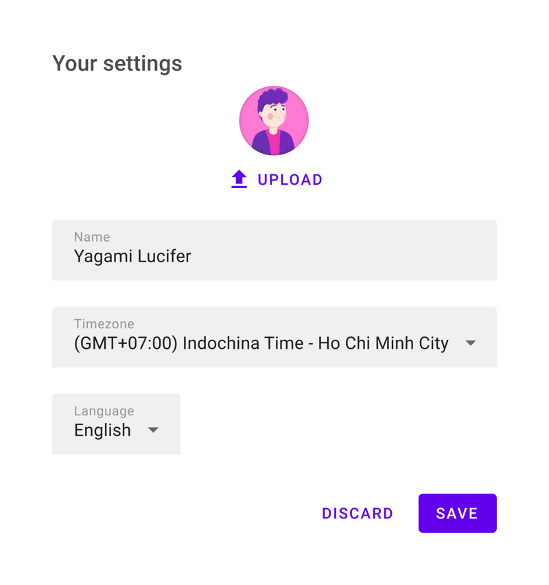
Let's say you are building a page to configure settings for a user. You will probably have the tendency to design a form and then place the "Cancel" and "Save" buttons at the end of it.
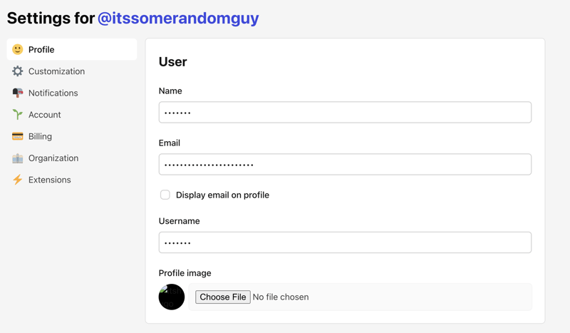
Now when the user changes anything, he/she will have to remember to press the "Save" button before leaving. There shouldn't be any problems until you have a lot of fields and the "Save" button is way at the bottom and out of the current viewport. Then, the user will likely not notice the presence of the "Save" button and forget to press it. DEV.to itself encounters such a problem:
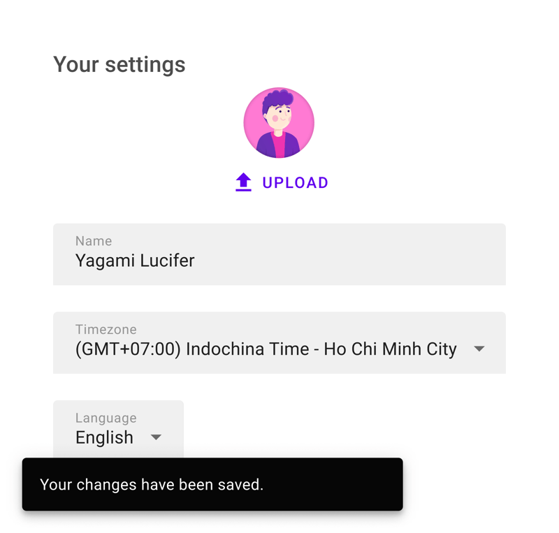
In such cases where the changes are unimportant and non-breaking, you can ditch the "Save" button and whenever a change is made, it is saved immediately (with a notification).
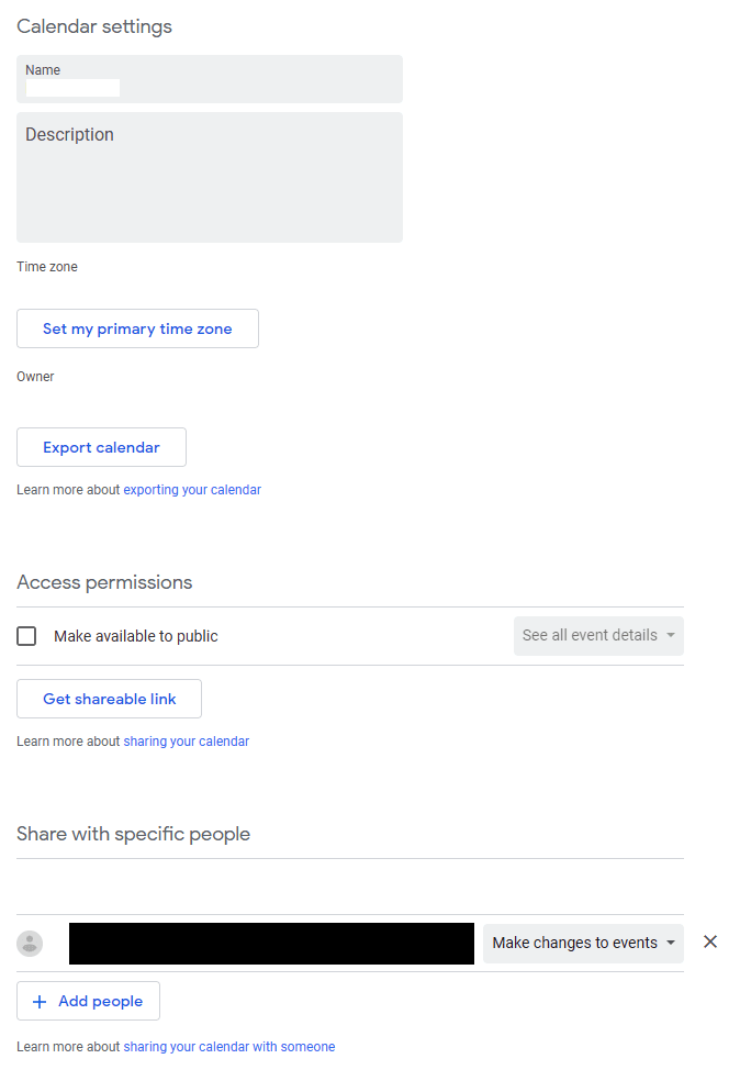
A lot of applications nowadays are applying this "auto-save" pattern for a better user experience. For example, Google Calendar:
Conclusion
This is the end for UI/UX Tips for Frontend Developers (Part 1). Do not hesitate to leave a comment if you have some feedback. I will try to publish Part 2 next week, and I'll be more motivated to do so if you guys react to this article to show that it's useful.
Thank you so much ❤️.

