Accessibility 360 — Web 🕸 and mobile📱

https://medium.com/media/a5f95d8a6bcb6f5dd9cb78b699d9c3e8/href
As a developer, I’ve noticed ever since starting out that a lot of us are intimidated by building accessible apps. The fact of the matter is, it doesn’t have to (and shouldn’t) be that way. Accessibility is just like building 🏗 any other feature — and there needs to be greater awareness around this. 🤯
If you’ve incorporated accessibility into apps before or want to integrate accessibility for the first time, then this post is for you ⬅. I’m going to use both web 🕸 and mobile📱as an example.
Here are a few things ✨ to consider when incorporating accessibility. Let’s get started!
👏🏼 Semantics 👏🏼
Follow the semantics 🧠. When any assistive device scans a web page, it will read the HTML structure of the page. That means when using an image on the page, don’t use a div and give it a background-image but instead use a tag for it because semantically img is the correct HTML element to use. Another example is a
Similarly, for 📱mobile, use the Image API from React Native which is the correct semantic element. If you don’t, you will have to patch it up with different accessibility tags 🔖. This way, you’ll get accessibility right out of the gate instead of having to fix 🔨 things later.
Accessibility is great for SEO 💹
In HTML, we have six levels of header tags from H1 to H6. If a user primarily uses a keyboard ⌨️ to navigate using tabs, the headings act as markers that the screen reader uses to navigate. By using the correct header a screen reader can help the user to find the section they want to read. This also helps screen readers 📖 to skip the block of contents and only focus on headings. When a user looks 🔍 for a term using a search engine, and you’ve used the correct semantics, it will rank higher on the page which can lead to an increase in traffic🚦.
That means when you’re thinking of accessibility, you’re also thinking of SEO. 💯
Bonus: you will make the marketing team happy when you get that SEO right.😉
Build accessible components ⛩
With the power 💪🏼 of components, we get a lot of re-usability. When we onboard new developers, it is easier for them to find a component that already exists and use that instead of creating a new one. 🤷🏻♀️ This is where a design system 💅 comes in handy because we can make these components accessible.
It’s important to add accessibility properties to these common components such as accessibilityLabel for React Native or ariaLabel for the web (take a look at the wrapper example below) and use linters to suggest that developers add these to your components while using them. Therefore adding a wrapper to these components with accessibility properties baked in is really useful 💯. That way anyone using the component will get the default accessibility properties baked in automatically.
interface IButtonProps {
  onPress: () => void;
  accessibilityLabel: string;
  accessibilityHint?: string;
  accessibilityRole: string;
  text: string;
  buttonStyle?: any;
  isDisabled: boolean;
  buttonTheme?: any;
}
Build a 👏🏼 design 👏🏼 system 👏🏼 of 👏🏼 accessible 👏🏼components 👏🏼
There’s a lot to be said on how design systems 💅 can improve accessibility, it’s not easy to sum up the many, many benefits in a few sentences. For example, as you build accessible components, your accessibility becomes baked in wherever those components are used therefore improving accessibility across your app — keeping in mind that doesn’t mean your entire app is accessible. The list goes on.
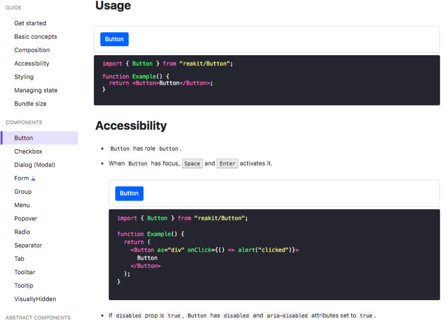
An excellent example of a component library is Reakit. They have a separate section on accessibility with some fantastic explanations of the different considerations you should be thinking about. For your team, you can start using “Reakit” as it will provide you with a lot of common accessible components so you don’t have to build 👷♀️ from scratch. Alternatively, you can also build a Design System 💅 yourself and use ReaKit as a reference. For example,

Personally, I like using Storybook ❤️ as it serves as documentation for your components and everyone on the team has visibility 👀 of all the components, it’s properties etc. You can also use it to keep track 🛤 of which components are accessible and which are not and run automated accessibility tests on them.
Rules to follow 📐

Every web 🕸 or mobile📱 app will have elements such as Text, Buttons, Keyboard navigation, responsiveness and more, some of which are depicted above. Try adding a wrapper around components with the required and optional properties related to accessibility just like you would otherwise. You can determine these properties through the docs. This not only helps onboard new developers quickly but also help keep accessibility top of mind. 🧠
The reality 😐 is, we humans are creatures of habit 🤷🏻♀️ and this will help create good habits. 💯
Example of an accessible component 💯
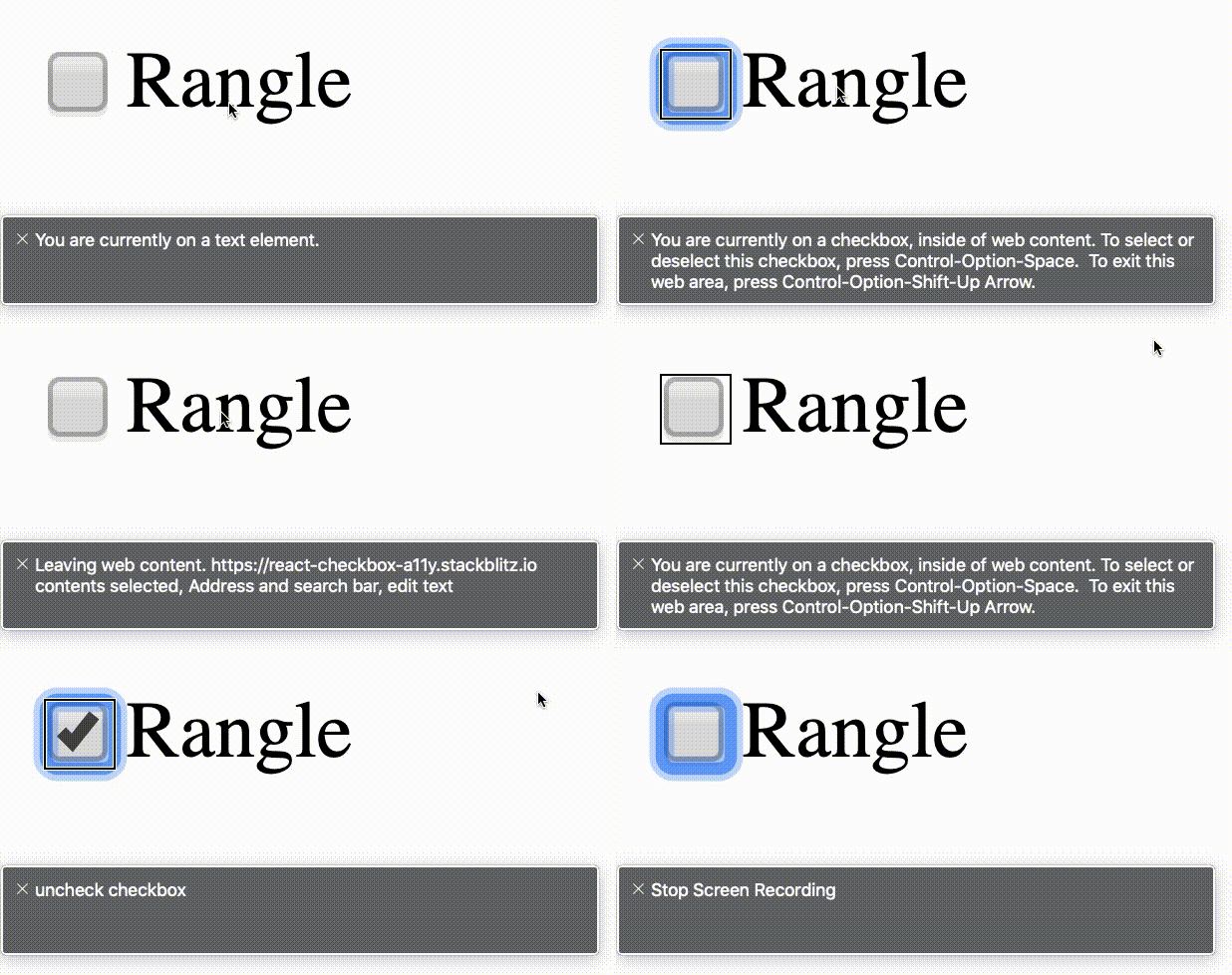
This is just a basic checkbox ✅ component but will give you an idea on how we can start adding accessibility.
https://medium.com/media/a51ee039bfa1972d0fa552e81b3264a0/href
Screen Reader 🖥 for web 🕸 and mobile 📱
On the web 🌎, if you are a Mac 🍎 user, you can turn on voiceover by using cmd+f5. You should turn on the screen reader very early in the development process to see how it will inevitably read the contents of your website. This will help create a better user experience and help ensure you use the right accessibility properties. Here is an example of how the above checkbox component will be read by the screen reader when voice over is turned on.

Accessibility checklist ✅
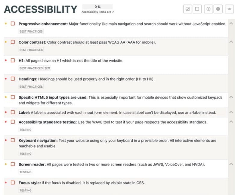
Below is a handy checklist ✔ on what should be considered when thinking of accessibility. This is a great start and serves as a solid reference point. It’s important to also keep in mind that there is more to accessibility than what is listed here. Here is the 🔗link to this checklist.
Make Open-source 👐🏼 libraries more flexible or accessible
If you are an open-source developer, you can help promote 💪 accessibility by adding accessibility yourself, making your library manageable so that others can add accessibility properties themselves — or both 🙌🏼. This is very important as developers tend to use a lot of packages 📦 on our projects. This way, before we decide to code something ourselves, we can look for existing packages that will do the job for us.
If those packages aren’t flexible enough to inject properties, you can fork🍴 their repository and add accessibility properties yourself. However, this is a much more difficult option 😢 and takes a lot more time ⏰. Therefore it is our responsibility as open-source developers to make our packages more flexible.
I hope that after reading how you can get started with accessibility, you realize how important it is to consider it from the start — not as an afterthought. If you’re interested in learning more, check out one of my recent talks at React Europe, here: https://youtu.be/X_3tnSwXLls
Please give it some 👏 if you liked it 🙏 and share your experience in the comments below.


