Continuing with my series of "easy" but functional TypeScript articles, here's a guide of a type of dashboard that I haven't found anything online.
If you search on Google "dashboard multi-direction", you'll only find this same example's online version.
With this example we will learn how to dynamically create 4 charts and place them within a dashboard. Also, the values will be randomly created to complete each of the charts.
This dashboard is particularly useful when you need to present different charts and analyze them at once.
Setting up our project template
Please, download the template that is provided in this article. The project is in a .RAR file that you can download here.
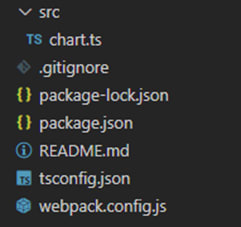
You will see a file tree like this one:
Now, please, open a new terminal in Visual Studio Code.
As usual in a Node JS project, we will have to run our NPM Install command.
This would be everything for our initial setup. Let’s code.
CHART.ts
Inside this file, we will have all the logic needed to create our chart, configure animations, and format the data.
- Declare the constant lcjs that will refer to our @arction/lcjs library.
- Extract required classes from lcjs.
- Extract required classes from xydata.
// Import LightningChartJS
const lcjs = require('@arction/lcjs')

// Extract required parts from LightningChartJS.
const {
    lightningChart,
    SolidFill,
    ColorRGBA,
    AxisScrollStrategies,
    DataPatterns,
    Themes
} = lcjs

// Import data-generators from 'xydata'-library.
const {
    createProgressiveTraceGenerator,
    createTraceGenerator
} = require('@arction/xydata')
- Now, let's create the dashboard:
const grid = lightningChart().Dashboard({
    theme: Themes.darkRed,
    numberOfRows: 3,
    numberOfColumns: 3
})
- numberOfRows/Columns: indicates the number of rows and columns within the dashboard. We can specify by row/column index, where a chart will be displayed.
For instance, here's a 3x3 Dashboard:
- Theme: A collection of default implementations can be accessed by using the property Themes.
The Color theme of the charts must be specified when they are created and can't be changed afterward. Otherwise, it would destroy the chart and it would have to be recreated.
Learn more about the Themes property here.
- Cells: This array will contain the location of the 5 XY plots. Within the 3x3 dashboard, we can create up to 9 charts, so feel free to experiment and add or remove indexes.
const cells = [
    { row: 1, col: 0 },
    { row: 2, col: 1 },
    { row: 1, col: 2 },
    { row: 0, col: 1 },
    { row: 1, col: 1 }
]
- chooseRandom: This constant will help us to specify what type of XY chart will be created. The random value always will be 0 or 1.
const chooseRandom = (options) => options[Math.round(Math.random() * (options.length - 1))]
- createCell:
const createCell = (cell) => {
    const chart = grid.createChartXY({
        columnIndex: cell.col,
        rowIndex: cell.row,
        columnSpan: 1,
        rowSpan: 1
    })
    // Add a random omni-directional series.
    const type = chooseRandom(['PointSeries', 'LineSeries'])
    // Setup data-generation for series.
    if (cell.row == cell.col) {
        const series = chart['add' + type]()
        if (type === 'LineSeries') {
            series.setCursorSolveBasis('nearest')
        }
        // Random trace
        createTraceGenerator()
            .setNumberOfPoints(100000)
            .generate()
            .setStreamInterval(50)
            .setStreamBatchSize(10)
            .setStreamRepeat(true)
            .toStream()
            .forEach(point => series.add(point))
This function will create a random chart for each index in the cells array (map).
createChartXY: New XY chart object added to the dashboard (grid) object. The location will be specified by the column-row index properties. The values were specified in the cells array object.
const type: Gets the type chart for this new object, using the random function explained above.
0 = ‘PointSeries’
1 = ‘LineSeries’setCursorSolveBasis: Sets the basis for resolving the closest data point to a given location in this series. Learn more about setCursorSolveBasis in the documentation.
createTraceGenerator: This creates a basic progressive random generator and uses the Stream API to output the data to console.
setNumberOfPoints: Define that 100000 points should be generated.
generate: Generates those 100000 points.
setStreamInterval: The progress interval will be 50 milliseconds.
setStreamBatchSize: The stream will generate 10 points at a time.
setStreamRepeat: The stream will repeat infinitely.
toStream: Create a new stream with the above settings.
forEach: This function will be executed for each point in data.
Adding behaviors to the charts:
const flipPlane = cell.col == 1
        const mul = { x: cell.col == 0 ? -1 : 1, y: cell.row == 0 ? 1 : -1 }
        // Configure axes.
        let axisX = chart.getDefaultAxisX(), axisY = chart.getDefaultAxisY()
getDefaultAxisX / getDefaultAxisY: With these functions we will be able to add properties to the Axis X and Axis Y of the current mapped chart.
if (mul.x < 0) {
            axisX
                .setInterval(-100, 0)
                .setScrollStrategy(flipPlane ? AxisScrollStrategies.fitting : AxisScrollStrategies.regressive)
        } else
            axisX
                .setInterval(0, 100)
                .setScrollStrategy(flipPlane ? AxisScrollStrategies.fitting : AxisScrollStrategies.progressive)

        if (mul.y < 0) {
            axisY
                .setInterval(-100, 0)
                .setScrollStrategy(flipPlane ? AxisScrollStrategies.regressive : AxisScrollStrategies.fitting)
        } else
            axisY
                .setInterval(0, 100)
                .setScrollStrategy(flipPlane ? AxisScrollStrategies.progressive : AxisScrollStrategies.fitting)
Adding AxisScrollStrategies depending on the Axis column value:
AxisScrollStrategies can be used to customize the behavior of Axis scrolling.
expansion: Axis will scroll to fit Series that are out of view, but it won't shrink even if there is empty space (like "fitting" does).
fitting: Axis will constantly scroll to fit attached Series.
progressive: Axis will scroll to show new, progressive data, but will keep its interval constant - leaving older data out of view.
regressive: Axis will scroll to show new, regressive data, but will keep its interval constant leaving older data out of view.
npm start
To visualize the application, open a terminal and run the npm start command. You'll be able to see the dashboard in a local host server.
This Multi-Direction Dashboard let's you stream data in multiple directions and provides you a high-level of flexibility to customize the themes and other properties.
To see more high-performance and fully interactive JS charts, visit LightningChart JS.
I hope that this article was helpful and see you in the next one!
Written by:
Omar Urbano | Find me on LinkedIn


