 Caio Marcellus Cabral
You can access this article in portuguese here
Você pode acessar este artigo em português aqui
I love being part of technology communities. Besides learning a lot from people with more experience than me, it allows me to share some of what I've learned with other developers. In addition to that, while trying to answer some of the questions that come up, I am compelled to do a lot of research, which leads me to deeply understand some techniques that I knew to work but didn't know why.
Recently, in Alura’s Discord community, I came across a question from a user who wanted to solve a layout problem on smaller screens. Her font sizes were too big, and layout would break. One of the Discord users advised her to change the font size measurements to REM.
And this isn't the first time I've seen this misconception.
I've worked on a project where an experienced developer used a library that converted all measurements originally in pixels to REM, believing that this contributed to the site's responsiveness.
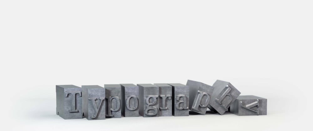
Knowing that typography is a topic that gets so little attention from developers (yeah, I am talking to you, who only declares font-size and font-family and completely ignores font-weight and line-height), I decided to write this article to talk about best practices when working with text in web development.
1) Organize your typography information in one place
The first thing I see very often is the repetition of font size declarations. On the header, the developer declares:
.cabecalho{
  font-size: 18px
}
Moments later, they need to declare:
.titulo{
  font-size: 18px
}
This works, of course. But what if there's a change in the font sizes used in the project? You'll need to go on a scavenger hunt to find all occurrences.
And change them.
One.
By.
One.
Not very practical, right?
There's a programming principle we can use to solve this problem: DRY (Don't Repeat Yourself). It states that if we're copying a piece of code or information, it could be isolated in a function or variable that can be called or referenced elsewhere in the code.
So, we could declare our font sizes as CSS Custom Properties, aka "CSS variables":
:root{
  --fs-1: 12px;
  --fs-2: 16px;
  --fs-3: 20px;
}

.cabecalho{
  font-size: var(--fs-2)
}

.hero-banner{
  font-size: var(--fs-3)
}

main .titulo{
  font-size: var(--fs-3)
}

.rodape{
  font-size: var(--fs-2)
}
This way we reduce the chance of errors, as well as keep this information in one place, greatly improving the maintainability of our code.
2) Never use PX again
In programming, it's rare being able to say something so straightforward: never do X, always do Y. Usually, there are multiple ways to achieve a goal, different techniques with pros and cons, and we need to analyze each case to determine the best approach. And that’s the beauty of this field. I like to think that in programming there is no right way of doing anything, just not-wrong ways.
But in this case, I say it without hesitation: you shouldn't use PX for your font sizes.
Let me tell you a story: Alberto can't read very small letters. They seem to shuffle in front of him, making it difficult for Alberto to do web research for school. This changed when Alberto discovered he could change the default font size in his browser! The default font size in browsers is 16px, but Alberto can change it to 24px, which makes his life much better.
The problem is that the developer who created one of the sites Alberto wants to access used pixels (PX) for all fonts. And 18px will always be 18px because it's an absolute measurement that doesn't adapt to user preferences. Using PX for font size made Alberto's experience less satisfactory, perhaps even preventing him from accessing that content.
That's what happens when we use PX for font sizes: we ignore user preferences and impose the exact size we've chosen.

Fortunately, we can overcome this problem by using the REM unit.
REM is based on the browser's default font size, which is typically 16px. So, usually, 1rem is equal to 16px.
"But, Caio, I need to use 18px in my project, not 16px." .
Easy-peasy: in the default measurement, 18px is equal to 1.125rem. We just need to divide the value we want by 16.
Here's a list of some frequently used values:
.25rem = 4px;
.5rem = 8px;
.75rem = 12px;
1.5rem = 24px;
Notice that I said these are generally the REM values in pixels because this conversion was done using browsers’ default values. In Alberto's case, it would be different: 1rem would be equal to 24px, and 1.125rem would be equal to 27px.
So, everyone wins: those who use the default font size will have the same experience, but those who choose to change it will have their choice respected.
Let's see how our declaration from item 1 would look like:
:root{
  --fs-1: 12px;
  --fs-2: 16px;
  --fs-3: 20px;
}
This would become:
:root{
  --fs-1: .75rem;
  --fs-2: 1rem;
  --fs-3: 1.25rem;
}
Easy, right?
One more thing: many people, finding it difficult to divide by 16, do the following:
html{
  font-size: 62,5%
}
This sets the default font size to 10px, making it much easier to define values in REM.
Sounds great, doesn't it?
But, please, don’t do it.
Doing this can confuse other developers, it is difficult to undo, and can conflict with libraries possibly used in the project.
So, don't change the base font size of the browser. It might provide some comfort and convenience for you now, but it could have negative consequences for your users and project collaborators.
3) REM doesn't solve responsiveness
Now that you know what REM is and how to use it, your website will be fully responsive and beautiful, right?
If you've been paying close attention, you've already read the introduction to this article, and you know that's not the case. Let's understand why that is.
When we talk about responsiveness, we're generally referring to a website that adapts to various screen sizes: the site should work well on smartphones, tablets, laptop screens, and ultrawide monitors.
However, REM has nothing to do with screen size. 1rem will be, by default, 16px on a smartphone screen or a television.
Since it doesn't care about the screen size, let's say you create a rectangle for screens of 1600px width, and you define the width of this rectangle like this: width: 100rem.
You'll get a 1600px rectangle for users who use the default font size. But if a user changes the default font size to 20px, your rectangle will now be 2000px wide, causing overflow on the screen you had in mind.
I created an example of this on CodePen. Since each reader will be viewing this on different screens, I replicated the scenario of using REM to adjust content to the screen size by setting the width to 100%, then subtracting 16px and adding 1rem.
In this way, with the default size, everything works fine, but when the user's default size is different, our layout breaks. That's because in this context, we shouldn't use REM or PX. It's ideal to work with percentages. But delving into responsiveness is a topic for another article!
Or access here.
Note: I am deining the font size on HTML to 16px to allow us to test changing the default font size more easily. That code snippet is for didactic purposes only.
On the next example, you can see that the text inside the box will sometimes fit and sometimes overflow as we play with resizing the screen and changing the default font size via the input.
The behavior is erratic.
The width and height of the box are set in a way that, when the content varies, the layout breaks. The conclusion is that defining our H1 font size with REM didn't help with responsiveness at all.
Or access here.
Note: I set the height of this div using height for didactic purposes. Setting height on elements with content is a bad practice for responsiveness.
"Caio, my world fell apart! How do I make the fonts in my project responsive?"
The most common way to make your fonts responsive is by using them: media queries.
This allows you to define that from a certain screen size—let's say, 1200px—your fonts that were 12px, 16px, and 20px will have sizes of 18px, 24px, and 32px—yes, in this blog, we preach the gospel of mobile-first.
It would look something like this:
:root{
  --fs-1: .75rem;
  --fs-2: 1rem;
  --fs-3: 1.25rem;
}

@media (min-width: 75em){
  :root{
    --fs-1: 1.125rem;
    --fs-2: 1.5rem;
    --fs-3: 2rem;
  }

}
Don't be scared of the EM unit in the media query. It's a good practice to declare media queries with this unit. I can talk more about that another time.
As seen in the previous section, REM helps make our site accessible. Note that I said "help make accessible." Accessibility is a complex and multifaceted issue, and we need to take many steps to ensure accessibility on our site for as many people as possible. We need to pay attention to colors, keyboard navigation, screen readers, and much more. In the case of REM, we're only dealing with one aspect of it: font size.
To illustrate the distinction between responsiveness and accessibility, I created this example. It includes four text cases:
1) Not responsive and not accessible (doesn't change with screen size, uses PX)
2) Not responsive and accessible (doesn't change with screen size, but uses REM)
3) Responsive and not accessible (changes with screen size, but uses PX)
4) Responsive and accessible (changes with screen size and uses REM)
Change the screen width and the font size to see how the font sizes behave.
Or access here
With these examples, we can see that it's past time for you to replace all your PX fonts with REM, but don't fool yourself: this alone won't make your site responsive.
4) Define your line heights
When you were working on school or college assignments that needed a certain number of pages, you may have been tempted to increase the line height to make the content take up more space.
"Set double-spacing. Do it, no one will notice.", said the voice in your head.

The truth is, line height makes all the difference in text legibility (the correct term here would be "readability." I encourage you to look up the difference).
It's very common to find projects where the font family, weight, and size are defined, but the line height is not declared.
When we do this, we delegate the setting of line height to the browser, and each browser has a different default. Sounds bad, right?
So, we should always explicitly declare our line height. But how do we do that? With the line-height property!
We should follow the same principles as with font size: no PX!
Imagine you have a font of 1rem (remember, no PX for font size), and you set the line height to 20px. What will happen if the user's default font size is 24px? That's right: the font size will become 24px, but the line height will remain locked at 20px, and the text will become cluttered.
Or access here
One solution would be to define the line height in REM, this was it could vary along with the font size. However, by doing that, every time we change the font size within a media query we would have to change the line height too, to maintain the scale.
There's an easier way: this property accepts percentages. So, we can declare the line height as we used to in Microsoft Word: 1, 1.2, 1.5, 2.
In our example, if I have a font of 1rem and a line height of 1.25, the values will generally be 16px and 20px. But if the user's default font size is 24px, the values will be 24px and 30px. This way, we always maintain the same proportion between font and line height. What's even better is that if the size of our font changes with media queries, we don't need to redeclare the line height!
See this example: here we are using REM units, changing them with media queries, and defining the line height relatively to the font size.
Or access here
Conclusion
In this article, we learned some typography best practices, saw how to have more control over our fonts, how to avoid code repetition, and how to make our texts more accessible and responsive.
With everything we've seen here, you already know everything you need about typography to create flawless web projects. But we can always go further, right?
Did you notice that I mentioned, "The most common way to make your fonts responsive is with them: media queries."?
What if I told you that you can make your font sizes vary WITHOUT USING MEDIA QUERIES???
So, stay tuned, because soon there will be an article about how to implement the technique of fluid typography.


