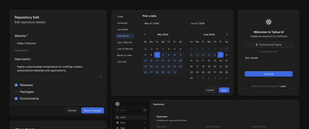
Tailus UI React is a modern React UI Kit for building custom, accessible web UIs on top of Radix UI and Tailwind Css.
Top-level customization
When it comes to customization, Tailus UI React stands out as a highly flexible option within the realm of React UI Kits. Here’s a deeper dive into its customization strengths:
Component Part Variants
Tailus UI React offers more than just pre-built components. It provides the ability to customize individual parts within each component using variants.
For example, consider the Annonce component. You can modify the variant and size of the <Annonce.Root /> part, change the variant, intent and size of <Annonce.Concern />, and even add a <Annonce.Message /> with its own unique variants. Each part can be customized independently, giving you the flexibility to create highly tailored user interfaces.
Theme Customization
Tailus UI React allows you to tailor the overall theme by using data attributes. This method simplifies the process of adjusting various properties such as palette colors, border radius values, background and border shades, and shadows.
For instance, imagine you’ve set the border radius for your entire app theme to xl. With Tailus UI React, you have the flexibility to override this setting and adjust the border radius to 2xl for a specific component, simply by using data attributes.
This approach is superior to using the “className” property for components that need to calculate their border radius based on the border radius of their parent component. With data attributes, you can directly and independently adjust the theme of each component, providing a more intuitive and flexible customization process.
Css Variables
While theming is based on data attributes, you can also use CSS Variables to customize your theme.
Why is Tailus UI React better than Shadcn UI
Both Tailus UI React and Shadcn leverage Radix UI and Tailwind CSS, but Tailus UI React takes customization a step further:
Built in Palette colors
Tailus UI React comes with built-in palettes that leverage familiar Tailwind CSS defaults, making it easier to quickly start building your UI.
Multi theming support
Tailus UI React empowers you to create multi-themed applications with ease.
Component part variants
Tailus UI React components offer granular customization through part variants.
Data attributes
Tailus UI React empowers you to customize your theme with ease using data attributes. This approach simplifies adjusting various properties for both the entire application and individual components.
Shadcn offers a solid foundation with Radix and Tailwind, but Tailus UI React empowers you to achieve a truly unique and tailored user interface through its superior customization features.
With component part variants, data attributes, thoughtful design choices, and CSS variables, you can achieve a high level of design control without sacrificing development speed.


