Introduction
Up until a few years ago if you wanted background shapes or sections of a website that were anything besides rectangles you most likely needed a designer to provide you with a static PNG or JPEG image that would be added as required, but CSS has come a long way since then, my friends.
When I was working on a website update that broke up the contents on the page into different colored background sections, alternating between pure white and soft gray colors, the design mock up I had included one section whose bottom edge tilted up and to the right instead of going across the page at a perfect 90 degree angle, as a typical block element does.
Now I could have asked the designer to make a background image to do this for me, but instead I wanted to see if I could do it on my own with the power of CSS. And lo and behold I could, with CSS clip-path.
Interesting shapes and visuals in the DOM are no longer purely the domain of designers, with tools like CSS clip-path, devs have the power to reshape elements and I'll show you how.
CSS clip-path
If you're less familiar with the CSS clip-path property, like me, it creates a clipping region that sets which parts of an element should be shown. Parts that are inside the region are shown, while those outside are hidden.
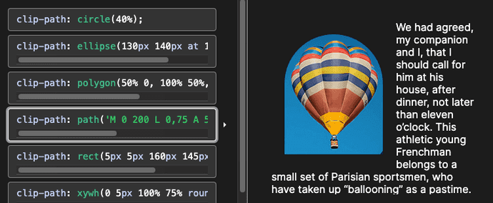
A demo from the MDN clip-path docs. Different clip-path options provide different views of the hot air balloon and text.
The clip-path property can accept a large variety of values:
-
<clip-source>, which accepts values likeurlfor an SVG element with clipping path defined. -
<geometry-box>, which accepts values likemargin-boxandborder-box. -
<basic-shape>, which accepts values likecircle()andrect(). -
global-values, which accepts values likeinheritandrevert.
The <geometry-box> and <basic-shape> values can even be combined together in one clip-path.
/* this CSS combines two different clip path properties */
clip-path: padding-box circle(50px at 0 100px);
This post doesn't go into great detail about all of the properties
clip-pathcan accept and how they can be combined to create quite complex shapes. If you want more information and examples ofclip=pathin action, I recommend starting with the Mozilla documentation.
One of the <basic-shape> properties clip-path accepts is polygon(), and this ended up being the solution I needed for my tilted background section.
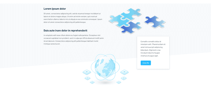
The polygon I needed to recreate with CSS
The gray polygon background I needed to create with CSS.
The image above is a screenshot of the gray background section I needed to recreate with CSS clip-path's polygon() property. And the first thing I needed to do was create some HTML elements to apply the CSS to.
polygon() clip-path vs rect() clip-path
You might be wondering why I chose to use the
polygon()property instead of therect()property withclip-path. While the two are similar,polygon()can create more complex polygonal shapes and offers greater versatility for advanced designs by accepting pairs of coordinates to define each vertex of the polygon, whereasrect()can only handle rectangular shapes.
Set up the HTML and CSS
The site I was working on relied on the static site generator Hugo, a Go-based framework. Hugo uses templates to render the site's HTML, so the example code below should look relatively familiar to you if you know HTML.
A note on templates:
If you've ever used JSX components, Node.js with Pug or Handlebars, or Jekyll - Hugo's templates are similar: HTML elements with Go variables and functions sprinkled in with
{{ }}to render the correct information wherever the templates are injected.
Here's the code for what I'd nicknamed the "puzzle section" of the page due to the puzzle piece in the foreground of this section. For the purposes and clarity of this article, I've replaced the Go variables injected into the template with the generated HTML.
single.html
  <div class="about-body">
    <!-- more HTML elements up here -->

    <section class="puzzle-section section">
      <div class="container">
        <div class="row">
          <div class="col-12 col-md-6 col-lg-6">
              <h4 class="mb-3">
                Lorem ipsum dolor
              </h4>
              <p class="mb-5">
                Sit amet, consectetur adipiscing elit, sed do eiusmod tempor incididunt ut labore et dolore magna aliqua. Ut enim ad minim veniam, quis nostrud exercitation ullamco laboris nisi ut aliquip ex ea commodo consequat. Ipsum dolor sit amet consectetur adipiscing elit pellentesque.
              </p>
              <h4 class="mb-3">
                Duis aute irure dolor in reprehenderit
              </h4>
              <p class="mb-5">
                in voluptate velit esse cillum dolore eu fugiat nulla pariatur. Excepteur sint occaecat cupidatat non proident, sunt in culpa qui officia deserunt mollit anim id est laborum. Consectetur adipiscing elit pellentesque habitant morbi tristique senectus et.
              </p>
          </div>
          <div
            class="col-sm-8 offset-sm-2 col-md-6 offset-md-0 col-lg-6 offset-lg-0"
          >
            <img
              class="img-fluid"
              src="/images/about/puzzle-pieces.png"
              alt="Puzzle pieces"
            />
          </div>
        </div>
      </div>
    </section>

     <!-- more HTML elements below -->
  </div>
This section of code is relatively compact, but it deserves discussion. In addition to the HTML elements, there are quite a few CSS classes which come from the Bootstrap library, one of the original open source CSS frameworks for responsive web designs.
Among the custom classes like about-body, which I used for adding custom styling, there are classes like container, row, col-12 or col-md-6, mb-5, and mb-3.
All of the latter classes are Bootstrap classes, which serve to make the text and image elements onscreen share the width of the page when the viewport is over a certain width (col-md-6), or apply a margin-bottom of a certain amount to the <p> tags (mb-3 or mb-5).
The Bootstrap classes are beside the point for this post though, the class to focus on is the puzzle-section which wraps all the text and puzzle piece image.
This puzzle-section class is where we're going to add the clip-path property to display the light grey background behind the text and image with the slightly tilted, up-and-to-the-right design.
Add the CSS clip-path to shape puzzle-section
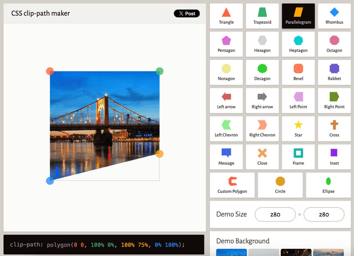
As I wasn't quite sure how to style a normal, rectangular <div> into an uneven shape, I started looking for a solution online and found this helpful, interactive clip-path-focused site, CSS clip-path maker.
This CSS clip-path maker website is fantastic because it has a whole slew of preset shapes, adjustable image sizes and backgrounds, and the currently displayed image's vertices can be dragged into any arrangement you want. The line at the bottom of the screen shows the exact clip-path CSS values that you can copy/paste into your own project's CSS.
I chose the parallelogram preset shape as my starting point, and then dragged the corners to match the angle of the background section I was trying to recreate from scratch. Once I was satisfied it looked accurate, I copied the CSS line at the bottom of the page to my clipboard.
In my project's SCSS file, I added the copied clip-path CSS in addition to the light grey background-color property and some padding to give the text and puzzle piece images some breathing room on the page.
NOTE: Even though this file shown in the example code is SCSS instead of pure CSS, for this post it shouldn't make a difference here. It should be a direct 1:1 comparison.
about.scss
.about-body {
  // this white sets the white background color for the whole webpage
  background-color: white;

  .puzzle-section {
    // clip-path code copied from the clip-path maker website
    clip-path: polygon(0 0, 100% 0%, 100% 75%, 0% 100%);
    background-color: light-grey;
    padding: 2rem 0 10rem 0;
  }
}
That little bit of CSS for clip-path was all that was needed to take my perfectly rectangular DOM element and turn it into an imperfect polygon instead. Not too shabby!
Conclusion
CSS is pushing the boundaries of what web developers can do without resorting to images, videos, and custom designed elements all the time. And the satisfaction of figuring out how to do a cool little bit of design on all on your own feels pretty empowering.
A recent example of this was using the CSS clip-path property to create a background box for some text and images that had an uneven bottom edge. With the help of an interactive website dedicated decoding to clip-paths of all shapes and sizes, I was able to make quick work of this slightly skewed polygon.
And let me take a moment to shout out how much I appreciate the folks putting out those little sites or code snippets that solve a very specific problem for another developer - you folks continue to make the Internet a better place.
Check back in a few weeks — I’ll be writing more about JavaScript, React, IoT, or something else related to web development.
If you’d like to make sure you never miss an article I write, sign up for my newsletter here: https://paigeniedringhaus.substack.com
Thanks for reading. I hope learning to reshape how elements look in the DOM with just the power of CSS helps you as much as it's helped me.
Further References & Resources
- MDN docs, CSS clip-path
- CSS clip-path generator website


