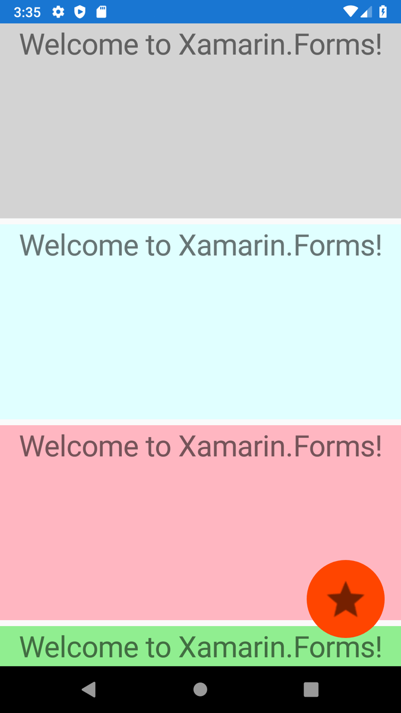
What is floating action button?
Well..., it's a button, it's floating and when you press it, it does some action. Simple!
It looks like this (red circle button at the bottom right):
We won't need any other special NuGet package reference for this example, however it would be fine to have some icon or image that we can use for that button. So let's start with this.
Get an Image for Button
There are multiple ways how to find images for your buttons.
Here is one way how you can do that.
- Google for
Android Asset Studioand chooseGeneric icon generator. (Here is the link) - Download, unzip file and copy all
drawable-*directories to yourAndroid\Resourcesproject directory (e.g.FloatingActionButton\FloatingActionButton.Android\Resources). There are multiple directoriers ending with-hdpi,-mdpi, '-xhdpi', etc. because those are for different resolutions of mobile devices. Note, that if you have only one image, put it todrawablefolder (without any suffix). - Open
Solution Explorerand toggleShow All Files, so that you can see those newly added directories under yourAndroid\Resourcesdirectory. - Select all of them and right-click to press
Include In Project.
Now, when we have referenced an image, let's use it in our new floating action button.
Create FloatingActionButton
Open your XAML content page and change it like this:
<?xml version="1.0" encoding="utf-8" ?>
<ContentPage
    x:Class="FloatingActionButton.MainPage"
    xmlns="http://xamarin.com/schemas/2014/forms"
    xmlns:x="http://schemas.microsoft.com/winfx/2009/xaml"
    xmlns:d="http://xamarin.com/schemas/2014/forms/design"
    xmlns:mc="http://schemas.openxmlformats.org/markup-compatibility/2006"
    mc:Ignorable="d">
    <AbsoluteLayout>
        <ScrollView
            AbsoluteLayout.LayoutBounds="0,0,1,1"
            AbsoluteLayout.LayoutFlags="SizeProportional">
            <StackLayout>
                <Label
                    BackgroundColor="LightGray"
                    FontSize="30"
                    HeightRequest="200"
                    HorizontalOptions="Fill"
                    HorizontalTextAlignment="Center"
                    Text="Welcome to Xamarin.Forms!"
                    VerticalOptions="Start" />
                <Label
                    BackgroundColor="LightCyan"
                    FontSize="30"
                    HeightRequest="200"
                    HorizontalOptions="Fill"
                    HorizontalTextAlignment="Center"
                    Text="Welcome to Xamarin.Forms!"
                    VerticalOptions="Start" />
                <Label
                    BackgroundColor="LightPink"
                    FontSize="30"
                    HeightRequest="200"
                    HorizontalOptions="Fill"
                    HorizontalTextAlignment="Center"
                    Text="Welcome to Xamarin.Forms!"
                    VerticalOptions="Start" />
                <Label
                    BackgroundColor="LightGreen"
                    FontSize="30"
                    HeightRequest="200"
                    HorizontalOptions="Fill"
                    HorizontalTextAlignment="Center"
                    Text="Welcome to Xamarin.Forms!"
                    VerticalOptions="Start" />
            </StackLayout>
        </ScrollView>
        <ImageButton
            AbsoluteLayout.LayoutBounds="0.95,0.95,80,80"
            AbsoluteLayout.LayoutFlags="PositionProportional"
            BackgroundColor="OrangeRed"
            CornerRadius="40"
            HeightRequest="80"
            Source="ic_star.png"
            WidthRequest="80" />
    </AbsoluteLayout>
</ContentPage>
Let's explain what is what.
- Reason for usage of
AbsoluteLayoutis that we want our button to float above aScrollView. -
ScrollViewis used there so that we can scroll multiple controls (Labels in this example). If you don't need to scroll content, this is optional. - Multiple big
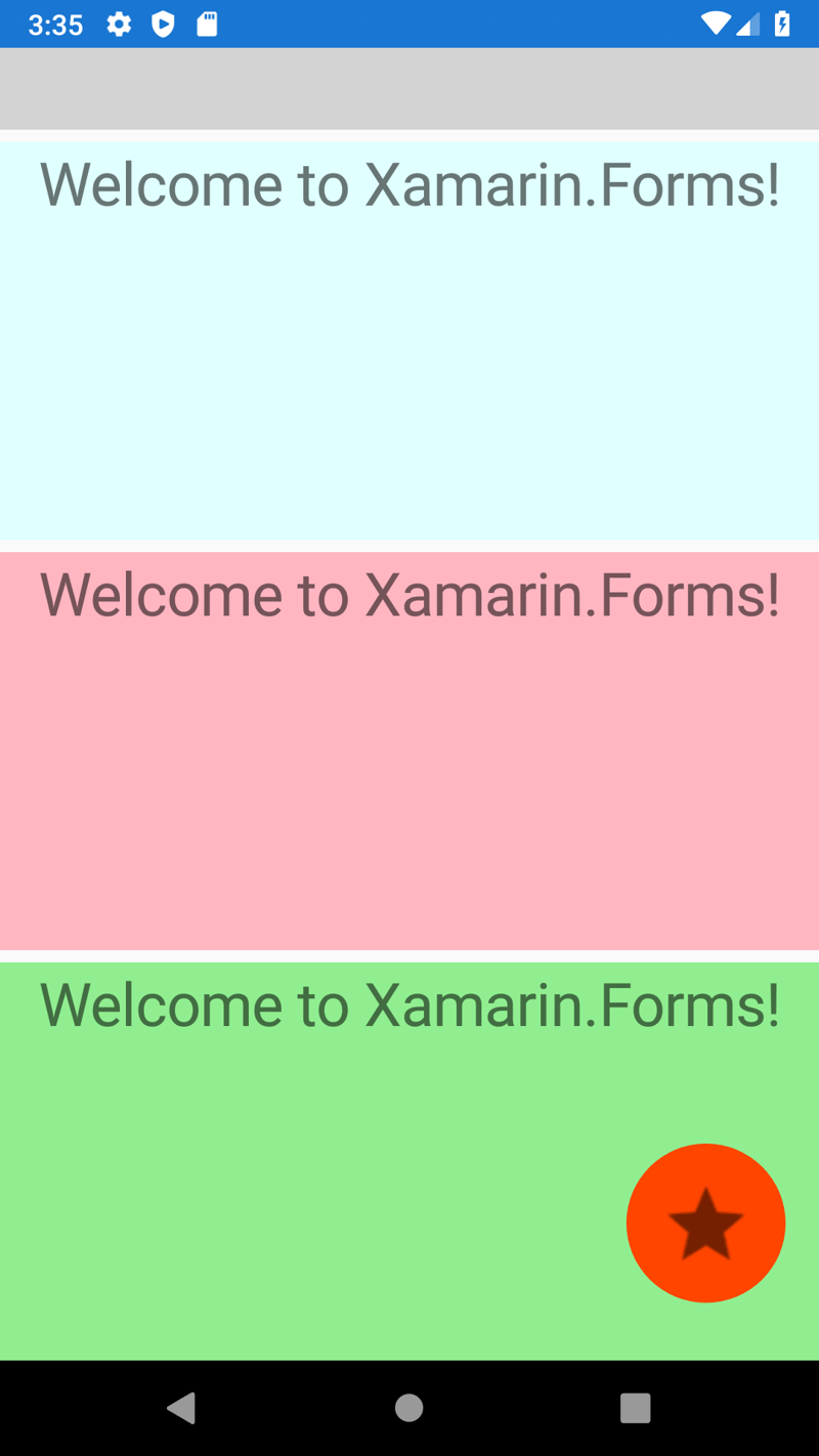
Labels are there just to fill space so that we can scroll it, background is changed so that you can see how it looks when it's scrolled:
In order to add action to this button, add Command property and bind it to command from ViewModel. Here you can find an example how to do that.


