
If anyone follows me on LinkedIn (and if you don't you should 😉) they will know I have been vocal about the new Power Automate UI, and I've seen by the comments others are too
- LinkedIn - Copy Paste Not Working on Containers
- LinkedIn - Copy and Paste Still Not Great
- LinkedIn - New UI Missing Features
So I thought I would take a deep dive into my thoughts, with 'The Hits', 'The Misses' and the 'If Onlys'
The Hits
The Look
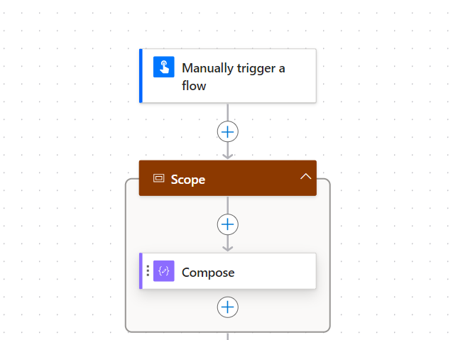
We can all agree the Classic UI looks dated, its still has a Windows XP vibe, and the New UI looks clean and modern.
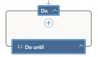
And call out to the new Do Until, I love it, it looks like it would in code and so can easily be identified 😎 It's my new favourite action (before you say anything we all know we have one 😂).
Pan and Zoom
One of the hardest things in the Classic UI was to get a full view of your flow. I often had to zoom out on the browser, which was not user-friendly or pretty. Additionally in dealing with horizontal branching/containers is just painful using scroll bars. The New UI smashes it.
Guessing even Microsoft's top web developers have trouble with CSS, the zoom buttons are always half hidden
The ability to zoom in, out, pan around, fit to screen and search for actions from list is great and a big improvement on the Classic UI.
Filter Actions
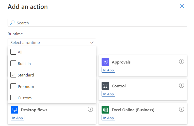
Filters are simply better then seperate tabs, this is so much easier to use then the Classic UI.
Static Result (Mock Outputs)
Not many talk about this but I think its cool, the ability to stop an action running outside of the flow, but allowing the flow to continue. A good example is a Email trigger flow that after completing deletes the original email. If you rerun the flow it always fails because it can't delete the email again, but with this you can get it to skip deleting but act like it did.
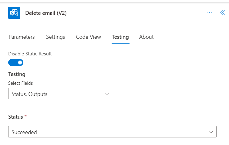
The other big use is exception handling, as you can get an action to fail and then see how the exception is caught, no more imaginative ways to force an action to fail needed.
Shortcut Keys (Kind of)
I love shortcut keys, and the New UI allows you to use / to add in variables/expressions.
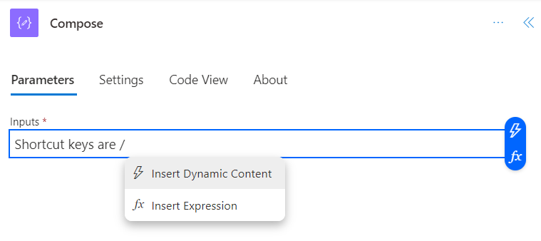
It's far to basic for the moment but its a welcome step in right direction, excited to see more shortcut keys.
Side Panel
Now this is an interesting one as it depends. From a negative side the action inputs are now not in the action, so you have to move your cursor further. It's marginal, but for pro developers everything adds up and can impact your productivity. Add in memory muscle changes and it can be more than you realise.
New UI mouse path
Classic UI mouse path
So why's it a hit, well you just need to zoom out. If you try and use the Classic UI to action an edit, it all falls apart when you zoom out, as the action is too small. And you may argue is the trade off worth it, and I say yes. Microsoft are 100% right, we should be developing from a big picture view, it's simply more productive and efficient that way (other RPA tools do, look at Blue Prism and UI Path). So for me this UI change will improve the way we work in the long run, I just wish it would default to be a little more zoomed out.
The Misses
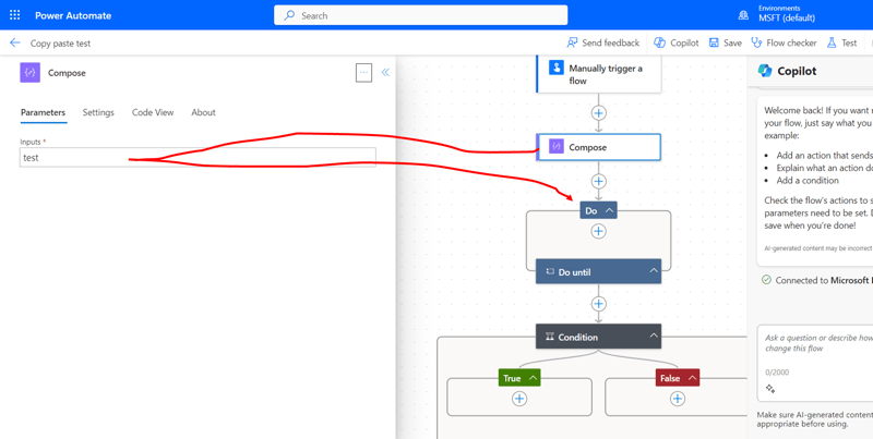
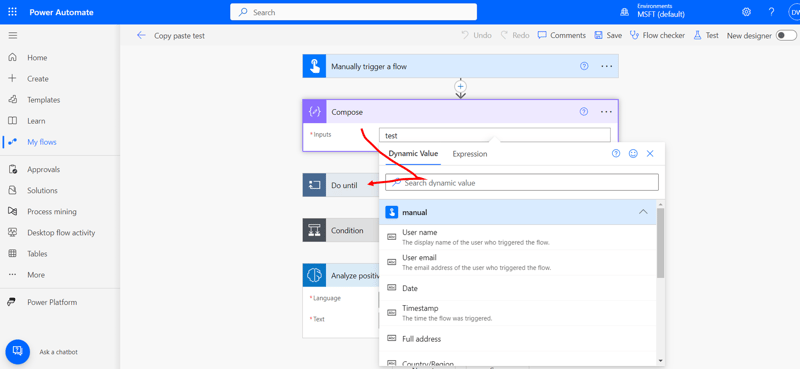
Copy and Paste
How the New UI went into general release without copy and paste is madness (that's a move from the Apple playbook not the Microsoft I know). They have added it since but it's a shadow of the classic.
It can't copy containers:
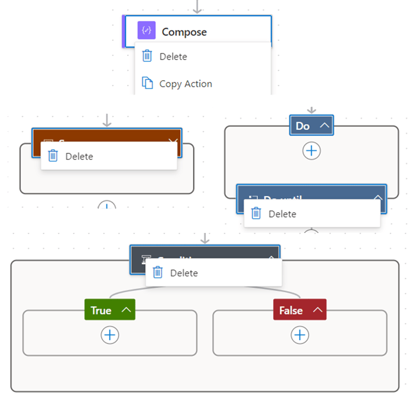
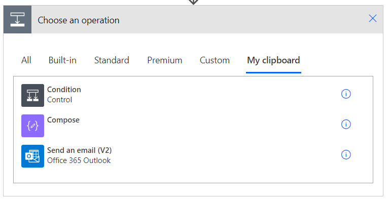
It only remembers the last action copied compared to a clipboard list in Classic.
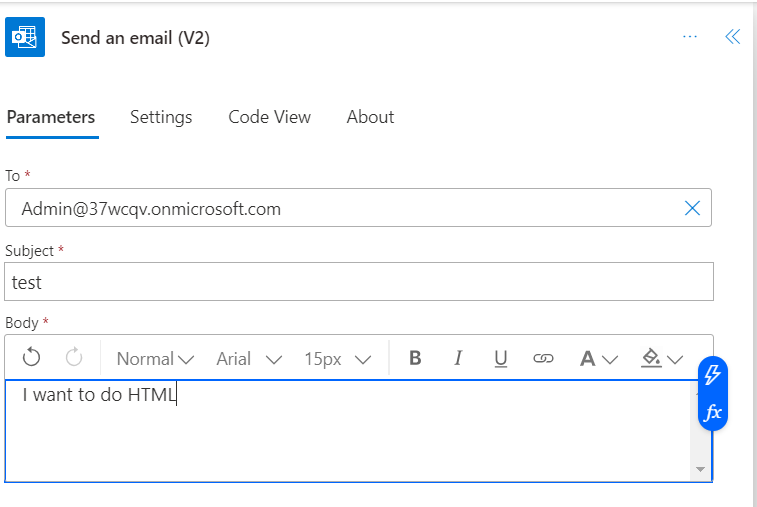
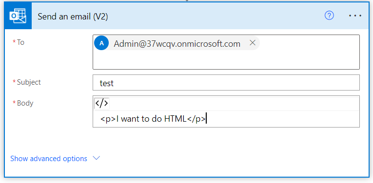
HTML
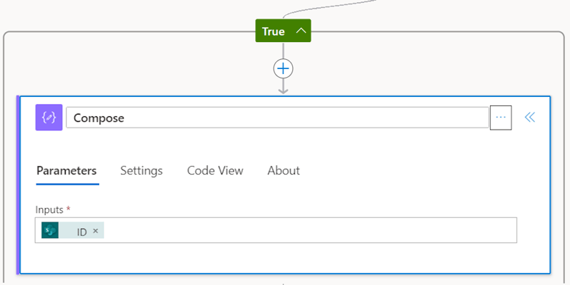
So if you want HTML in your emails you need an additional Compose action, what! Nearly every Send Email action I have in a flow usee HTML, it's a fundamental requirement, how this was missed is another crazy move.
New UI No HTML button (</>)
Classic UI with HTML button
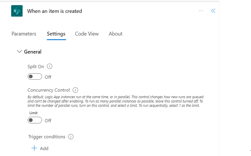
Trigger Default
We have been brought up with default trigger to split and for good reason. In all my years of development I have never had a use case that doesn't require it. So why does the New UI default to not split, crazy.
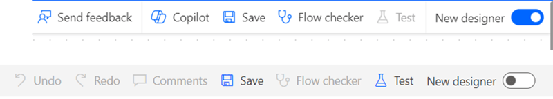
Undo/Redo
On the list of the very very basic features you would expect from any software, an undo button must be one of the first. Yet this is missing from the new UI 🤦♂️
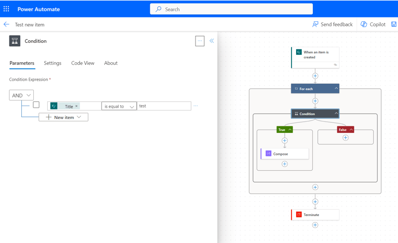
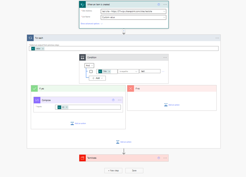
Open Multiple Actions
When code reviewing or debugging its definitely a lot harder in the New UI as you can only see one action at a time. This is another of the Zoom out trade offs, but it is a definite negative as there are now no benefits for the code review process.
New UI above, Classic UI below
The If Onlys
For me there was lots of opportunities to make the developer experience better and/or to make the transition easier.
Panel and Action
For me this is obvious, why not have the best of both worlds, when zoomed in show the inputs within the action (Classic UI Style) and when zoomed out the side panel (New UI style). With zoom Microsoft didn't need to make the actions smaller.
My Design for Zoomed in Actions in the New UI
Improved Filters
As I said the filter is definitely better then the Classic UI tabs, but they missed an opportunity to add functionality. I would love a filter that only shows available to me (so hides DLP blocked actions and if I don't have premium hides premium actions).
Secondly I would love a favourites filter, so I could star actions I use a lot and and then filter to just them.
Improved Copy and Paste
Imagine instead of removing Copy and Paste functionality they added to it, in the Office suite there are different types of copy (formula,theme,value), so I would love a copy inputs. How would that work, well lets say you have SharePoint Get Items, you copy inputs, then when you add a new SharePoint action any matching inputs would be auto populated (like site or list).
Improved Debugging
The 'Static Result' is a great start, but I would love to see more developer tools like what Chrome Dev tools have.
- Start from action, (I have memory of this in preview but cant find it in Planned Features) this would allow you to test a flow with a previous failed run and continue from the failed point.
- Break Point, instead of adding a terminate to stop during development you could add stop on an action. You can then click continue or end.
- Conditional Break point, so if a condition is met it will stop
- Trace variables, showing how variables change during the run, it would also show inputs/outputs (why can't I see the inputs of the condition in the run logs!!!!)
Find and Replace
The action search is a start, but I want to be able to search for values within actions not just action names. On top of that I want to be able to replace. If you think about it this is basic functionality found in nearly all programs.
In Conclusion
My starting place was very much that I didn't like the New UI (borderline hate it), but after completing this blog I realised that I like what Microsoft is trying to do, they made the right design choices, but messed up the rollout. The New UI is simply not ready for General release (barely preview), I suspect it was rushed out because they wanted to release Copilot.
Pro developers have a tight efficient work stream and muscle memory to the existing UI. If they are going to invest in changing there are 2 key requirements for a product refresh to work:
- Feature Parity
- Killer New Feature
All the Misses are missing features from the Classic UI, and with things like 'Static Result' there are potential for a Killer New Feature. So Microsoft could easily make the New UI work, they just need to:
Get proper feature Parity, that's not half fixes like 'Copy and Paste' it needs to be at least as good as Classic.
Add features for Pro Developers, Copilot is not useful for us and is definitely not a reason to change.
Microsoft really messed up the launch of the New UI, and a lot of developers like me only see the negatives and miss the positives. Let's hope they get their focus right, get feature parity and think of Pro Developers not just the Copilot generation.


