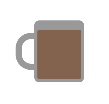
Hi folks! After I made an illustration with CSS, I wanted to try more with some animation and function.
So here I made a cup with pure CSS and added few buttons to fill the cup with the desired beverage, also added simple animation to fill the cup.
Cup with HTML and CSS
So, first of all, I started with an illustration of the cup I made one parent div containing two children's divs which would represent the cup holder and cup body.
 <div class="cupContainer">
   <div class="cupHolder"></div>
   <div class="cupBody"></div>
 </div>
and styled it like this
.cupContainer {
  height: 200px;
  width: 200px;
  background-color: white;
  display: flex;
  justify-content: center;
  align-items: center;
  position: relative;
}
.cupHolder {
  height: 20px;
  width: 40px;
  transform: rotate(-90deg);
  border-radius: 25px 25px 0 0;
  border: 10px solid #999999;
  position: absolute;
  margin-right: 100px;
}
.cupBody {
  height: 100px;
  width: 80px;
  background-color: #999999;
  border-radius: 8px;
}
After that, I added another div to represent the beverage inside the cup, so now the code would look like this
<div class="cupContainer">
  <div class="cupHolder"></div>
  <div class="cupBody"></div>
  <div id="beverage" class="coffee"></div>
</div>
.coffee {
  width: 70px;
  background-color: #8A624A;
  height: 70px;
  position: absolute;
  bottom: 55px;
  border-radius: 3px;
}
Now we get a cup with coffee in the browser

Get beverage on button click
Next, I wanted to change the beverage type in a cup with a button click just like a coffee machine but not with a javascript state or variable. I wanted to change it with the CSS variable.
I started with creating a beverage named CSS variable in the root.
:root {
   --beverage: #999999;
}
After that, I made three buttons beside a cup like this
<div class="btnsContainer">
  <button
    class="btnDiv"
    type="button"
    id="coffee"
    onclick="get_beverage(this.id)"
  >
    Coffee
  </button>
  <button
    class="btnDiv"
    type="button"
    id="tea"
    onclick="get_beverage(this.id)"
  >
    Tea
  </button>
  <button
    class="btnDiv"
    type="button"
    id="chocolate"
    onclick="get_beverage(this.id)"
  >
    Hot Chocolate
  </button>
</div>
and styled these like this
.btnsContainer {
  display: flex;
  flex-direction: column;
  justify-content: center;
  align-items: flex-start;
}
.btnDiv {
  height: 30px;
  width: 100px;
  background-color: #999999;
  color: white;
  border-width: 0;
  margin-bottom: 10px;
  border-radius: 10px;
}
As you can see I added get_beverage function to each onclick of three buttons and passed ids of each button as a parameter.
Now get_beverage the function will get our CSS variable through document.querySelector method and then I simply added an if-else command to check the value of passed id and changed the beverage variable with desired hex code.
function get_beverage(value) {
  var r = document.querySelector(":root");
  if (value === "coffee") {
    r.style.setProperty("--beverage", "#8A624A");
  } else if (value === "tea") {
    r.style.setProperty("--beverage", "#c1734b");
  } else {
    r.style.setProperty("--beverage", "#683b39");
  }
}
Also before that don't forget to change the class .coffee background-color to beverage variable
.coffee {
  ...
  background-color: var(--beverage);
  ...
}
Now you would see that cup is filling with the desired beverage but it's changing color absurdly. For that, I added simple linear animation to it.
Adding animation
I made another class for animation and named it as coffeeAnimation and defined my animation properties like this
.coffeeAnimation {
  -webkit-animation: fill-it-up 3s linear forwards;
  animation: fill-it-up 3s linear forwards;
}
defined keyframes
@-webkit-keyframes fill-it-up {
  0% {
    height: 5%;
  }
  100% {
    height: 40%;
  }
}

@keyframes fill-it-up {
  0% {
    height: 5%;
  }
  100% {
    height: 40%;
  }
}
and passed this class to my beverage div alongside with coffee class.
<div id="beverage" class="coffee coffeeAnimation"></div>
After adding this, you would see that the animation is running for only the first time but I wanted to restart the animation after every click.
For that, I just removed the coffeeAnimation from the div and added it again. I wrote these lines in my get_beverage function.
  ...
  var el = document.getElementById("beverage");
  el.style.animation = "none";
  el.offsetHeight;
  el.style.animation = null;
  ...
and here I got some nice animation of filling a cup. ☕
You can see the full code and results below.


