I first created my portfolio website while I was still a student at the Flatiron School. At that time I created it utilizing Ruby, Sinatra and a PostgreSQL database. I used Twitter Bootstrap to style it and deployed it to Heroku with a custom domain name. After that I pretty much left it alone except for adding new projects and blog posts to the database.
Shortly after graduating from Flatiron I decided to separate out the backend and the frontend of the website. I reshaped the Ruby and Sinatra application into an API service that served up the results of a couple database queries as JSON and transitioned over the frontend into a React with Redux client that made fetch requests to the backend API. Initially, I left the frontend design exactly as before, but the reason why I made this transition was with the idea that it would be simpler to update the frontend once it was separated out from the backend.
Over the past couple weeks I found the time to refresh the look of my portfolio site. I am still working on a couple responsive quirks with smaller devices, however, overall I am really happy with how it looks. I decided to not use Bootstrap this time around but rather design it purely with Flexbox and custom CSS. This, of course, proved more challenging and I was excited about that challenge. I did use a few Node packages, such as react-fullpage, node-emoji and nuka-carousel.
The react-fullpage package is a version of the fullPage.js package specifically designed to better work with the React framework. fullPage.js makes designing beautiful single page applications easy and intuitive. One of my goals for this redesign was to shape my new site to be on a single page. I liked the user experience of rarely needing to go to a different page (even if it was being rendered instantly with react-router, etc.) and I wanted to implement that for my portfolio site as well.
When the visitor first comes to my site they are welcomed with a big "Hi!" and a couple friendly emojis to greet them:
The user can either click on the very simple navigation on the right-hand side, scroll with their mouse or press the down arrow on their keyboard to navigate through the sections of the site. The content itself is clearly divided between an introduction, portfolio projects, blog posts and contact information. Visitors can scroll through the portfolio projects and blog posts using the navigation provided by the developer friendly nuka-carousel Node package.
I recently added a separate page to display all my blog posts. I made this exception to my rule of a single page application because there were just too many blog posts to keep within the carousel and still maintain it as a user friendly scrolling experience. Now I only list the two most recent blog posts in the carousel and users are invited to visit the blog page to see the rest. I am thinking of doing something similar for the portfolio projects as well.
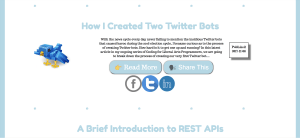
The blog page was created with Flexbox once again and some custom CSS and Javascript. The page makes a fetch request to my backend API and then iterates through the array of posts creating a "blog card" for each blog post consisting of a picture, title and a snippet of the post. There are two buttons for each post, one that lets users view the entire blog post in its original published location, and one that lets users share the post on a few different social media platforms. The "Share This" button controls a bit of Javascript that either displays or hides the div containing the social media share icons and links. The social media sharing div is hidden by default.
In contrast to my first portfolio website my new site looks more modern, brighter and presents a more user friendly browsing experience. I have some more plans for it including a bit more responsiveness, but I am quite happy with this new version. What I am most glad about was the opportunity to not only design a newer and better version of my portfolio site, but the chance to further refine my frontend skillset using Flexbox and learning some great new (for me) Node packages.
You can view my portfolio site at bengreenberg.org.


