 Creative Tim
Hello Tailwind fans 👋
I prepared a list of open-source checkbox components coded with Tailwind CSS and Material Tailwind.
Each Tailwind CSS checkbox example showcased below is easy to integrate and customize. The links to the source code are placed below each example.
Simply copy and paste the code directly into your application.
Happy coding!
Checkbox Component Examples
1. Colored Checkbox
This set of checkboxes shows a variety of color options, allowing you to apply distinct hues to the checkbox component. You can use them to represent different categories or statuses within the interface.
For example, in task management apps you can define different priority levels with colored checkboxes. Low priority tasks with blue checkbox, high priority ones with red, and completed tasks with green checkboxes.

Get the source code of this checkbox on different colors examples.
2. Checkbox with label
Use this example to provide context or instructions related to the checkbox's function, improving UX by clarifying the purpose of the selection.

Get the source code of this checkbox with label.
3. Checkbox with Ripple Effect
In this example, the ripple effect offers immediate visual feedback, making the interface more responsive and engaging.

Get the source code of this checkbox with ripple effect example.
4. Checkbox with Custom Icon
Use this example to align the checkbox with specific branding guidelines or thematic elements of the app.

Get the source code of this checkbox with custom icon example.
5. Disabled Checkbox
In this example, the checkbox is grayed out, indicating to users that the option is currently unavailable/inactive.

Get the source code of this disabled checkbox example.
6. Checkbox with Link
Use this example to allow users to agree with terms and conditions or other linked content directly from the checkbox component.

Get the source code of this checkbox with link example.
7. Checkbox with Description
This checkbox includes a supplementary description beneath the main label providing additional context or information about the checkbox's function.
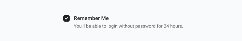
Get the source code of this checkbox with description example.
8. Checkbox with Vertical List Group
Try this checkbox component example that allows users to select multiple items from a vertically stacked list.

Get the source code of this checkbox example.
9. Checkbox with Horizontal List Group
Use this example for compact UI designs where space efficiency is crucial.
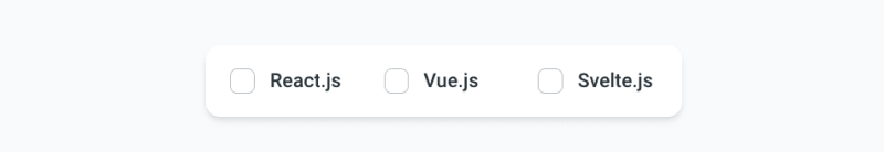
Get the source code of this checkbox example.
10. Checkbox with Custom Style
This checkbox showcases custom styling.

Get the source code of this checkbox with custom style example.
🚀 Looking for even more examples?
Check out our open-source Tailwind CSS components library - Material Tailwind - and browse through 500+ components and website sections.