Recently, I’ve been trying to build an open source video conferencing application specifically for online meetups. Just like every other developer on the planet, it seems. Video conferencing apps are the new chatbots. Maybe.
This was also a good reason for me to get to know OpenTok better, as I had previously not had a use-case to build for. I’ll probably write up the whole process into a lengthy multi-part tutorial style post thingy when I actually get it into a reasonable MVP shape.
But this mini-post is about Flexbox and absolute positioning, and a minor bug (at least I think it is so I filed one) in the Firefox DevTools.
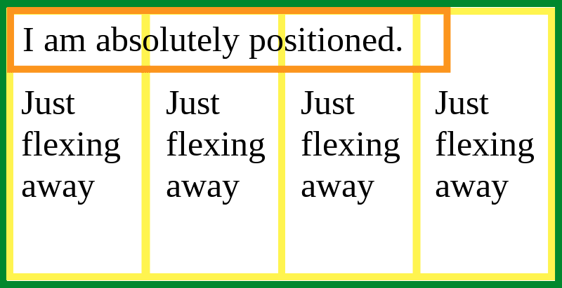
What happens when you position: absolute a flex item?
I can’t have been the only person to have tried this, right? Although for me, this was the first time I actually used such a combination even though I had read about it when I was combing through the Flexbox specification.
Which is why I knew there was a section detailing it, 4.1. Absolutely-Positioned Flex Children. I did not memorise the specification, I just knew such a section existed, okay?
Let me lift out the key points that I find most pertinent:
…an absolutely-positioned child of a flex container does not participate in flex layout.
however:
The static position of an absolutely-positioned child of a flex container is determined such that the child is positioned as if it were the sole flex item in the flex container, assuming both the child and the flex container were fixed-size boxes of their used size.
which means that:
…if you set, for example,
align-self: center;on an absolutely-positioned child of a flex container, auto offsets on the child will center it in the flex container’s cross axis.
Let’s break that down. The first part is fairly straight-forward. If you position a flex item absolutely, it no longer participates in the flex layout. This means any flex properties on the item become moot. You can remove them if you like.
The next part explains that the absolutely positioned item behaves like it is the sole flex item in the flex container. So distil your mental model down to:
The box alignment properties still apply to the flex item even if it is absolutely positioned, which means using align-self will have an effect. Details of how normal behaviour works in this case can be found in the relevant section of CSS Box Alignment Module Level 3.
Additional information I won’t go into: 8. Sizing and positioning details which details how absolutely positioned elements are sized. (Maybe this might be a blog post in future)
The maybe bug in DevTools
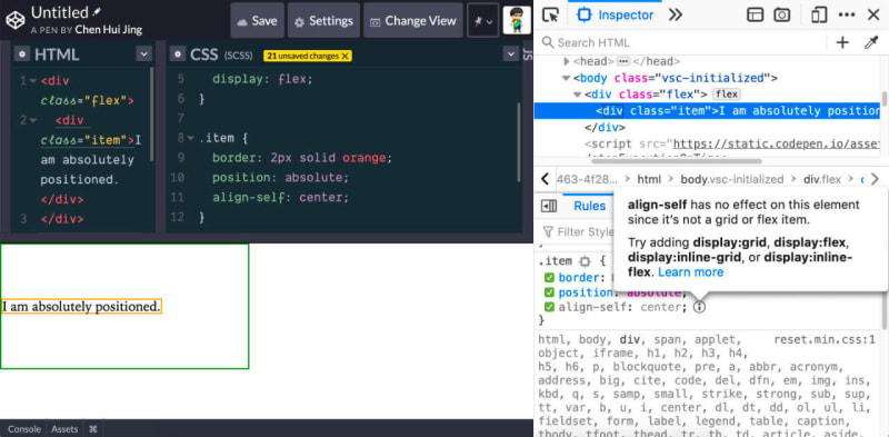
Firefox DevTools has a feature that informs you why certain CSS is inactive. It’s pretty cool and I lean on it for layout related properties when I build stuff. However, it says that the align-self property is not active because the absolutely-positioned item is not a flex item.
But it does have an effect. And the browser itself is behaving as expected. So I guess this is a DevTools bug? I’m not sure, so I filed a bug and am hoping someone will triage it.
My naive thinking says this was perhaps an edge-y case that the inactive CSS feature missed in terms of the wording for the pop-over, but what do I know?
TLDR on why I absoluted a flex item
For now, the way my application works, all video streams go into a single parent container. I want to have the ability to focus on a single stream and make that the large size display (common UI pattern in most video conferencing clients).
That happens when a .focused CSS class is added to the selected stream element container, but because all the streams are on the same level, this is a sort of hacky way to get that effect. We shall see if I can modify the mark-up but as of now, I don’t know how.
Anyway, the project I'm working on is on GitHub, if anyone is remotely interested.
It's slow going and very WIP, and if you think it looks decent, that's because I run away from my harder problems and work on layout instead. ¯\_(ツ)_/¯
Cover image from @yola.balu


