I started my first full-time web developer job back in September of 2013 (not counting the period where I built random sites for random people). So it’s kind of like my 9 year anniversary of being able to earn a stable living by building on the web. Thanks, Sir Tim Berners-Lee. 🙏
Throughout these 9 years, I have encountered quite a good number of designs that involve overlapping elements.
Keep in mind that everything on the web is boxes, quadrilateral boxes (i.e. having 4 straight sides), to be precise. Boxes stacked atop boxes next to boxes nested within boxes.
You get the picture.
Even if your content doesn’t take up the entire box, the browser still recognises and lays out your bits of content as boxes.
Before 2017, if you wanted your content to overlap, you had multiple options but all of them were tricky to implement. Especially if you wanted the design to look good at every possible viewport size.
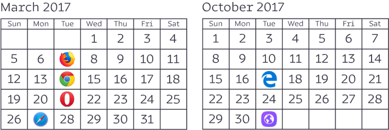
What happened in 2017, you might be asking? Well, Grid was rolled out in one of the most coordinated feature releases the web had ever seen.
To me, Grid is a wonderful addition to your web layout toolbox when it comes to building designs with overlapping elements. Especially if you want more granular control of the height of the layout or a consistent amount of overlap across viewport widths.
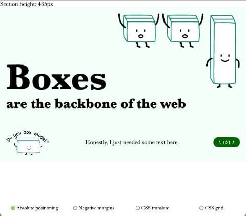
Here are 2 demos you can play around with that show use of the 4 options covered below:
Option #1: Negative margins
Negative margins are good for small individual elements that are always overlapping at that same position. Ideally, an element that isn’t a major player in the overall “support structure” of the layout.
This is because, when we set a negative margin on an element, the elements that come after it are impacted by the shift as well. In a sense, it compounds the calculations quite a bit if your shifted element is instrumental to the overall layout.
<section>
  <h2>Écrire comme un chat</h2>
  <p>Quand le Chat n'est pas là, les Souris Dansent</p>
  <img src="img/hei.jpg" alt="A beautiful black cat basking in the sun">
</section>
If you set a margin-top: -3em on the p element in the above markup, then the img will also move up. And if you need to shift the image, that 3em shift needs to be taken into account.
There is always the option to rearrange the markup, BUT, semantics must take precedence for accessibility reasons, so there might be instances where you have to do extra on the styling front.
To a certain extent, left-right shifts with negative margins are probably less consequential than those which impact height, IMO.
Option #2: Translate using transform
Using transforms to translate content is quite similar to the negative margins approach, at least, that’s my experience. Great for small elements that are inconsequential to the main layout. You can tell me otherwise.
The reason being, when you transform something, be it translation, rotation or whatever, the browser recognises the original un-transformed element’s position and size in the grand scheme of the whole layout. Paint and composition are steps during the rendering process that occur after the browser determines layout.
So, if you had plans for the space left behind by the transformed element, you’re going to have to account for that on the other elements adjacent to the transformed one.
On the first demo, I display the height of the section for each technique in the top-left corner, and the transforms option is taller than everyone else because the section retains the original height from BEFORE the transformation happened.
But the difference from the negative margins approach is that the adjustments you need to make for each element do not impact other elements in the layout. So maybe that makes the code easier to reason with? ¯\_(ツ)_/¯
Option #3: Absolute positioning
Absolute positioning is not a terrible option, especially if your markup is rather flat and easy to reason about. However, if you’re dealing with numerous nested elements each with their own margin and padding contributing to the height of the overall container, things could get confusing.
The main issue with absolute positioning is that because the absolutely positioned element is taken out of normal flow, you might have to account for the height “loss” with the other remaining elements in flow.
.position {
  .corner-img {
    position: absolute;
    top: 0;
    right: 0;
  }

  h2 {
    padding-top: 5em; // gotta pad all that space back
    margin-bottom: 2em;
  }
}
However, I do find that if the layout is “propped up” by the elements themselves, i.e. the layout doesn’t have swathes of vertical white space which need to be dealt with either with margins or paddings, absolute positioning is rather straight-forward to reason with.
And similar to the other 2 options discussed earlier, they all have the issue of unpredictable overlap at certain viewport widths. Elements might overlap more than you want them to simply because there’s no good way to control that.
With absolute positioning, you can also play around with variable widths more easily because there is no “compounding effect” for adjustments like there is for negative margins or even transforms. For demo 2, only the absolute positioning option and the grid option use a variable font-size.
Because my brain was unable to handle the math for negative margins and transforms. But you can still optimise the layout for different viewport widths easily. That’s what media queries are for. ¯\_(ツ)_/¯
*New* Option #4: Grid
We got a new tool to play with! And it’s really useful too. Grid really shines when your layout has extensive use of white space, especially along the height axis. Because when you use CSS grid, the browser recognises the grid as a “scaffold” for the entire layout, and can figure out the height of things a little bit better.
Grid, like Flexbox, involves a parent-child relationship where properties applied on the container will have an impact on the immediate child items within it. For grid, once the grid structure is determined, you are free to assign areas to each of your grid items.
.grid {
  display: grid;
  grid-template-rows: 1fr 420px 1fr;
}

.item1 {
  grid-row: 1 / 3;
}

.item2 {
  grid-row: 2 / 4;
}
You can control the amount of overlap based on the amount of space you want to allocate to the row or column where the overlap happens. So in the above example, the overlap will always be 420px, which is a value I fixed.
I find it slightly easier to reason with layout when using Grid, especially if I want more granular control over the positioning of my items, because the scope is reduced.
In other words, each of my items won’t “disturb” others on the grid, and I can use the box-alignment properties to adjust them within their allocated spaces.
.corner-img {
  grid-column: 2 / 4;
  grid-row: 1 / span 2;
  justify-self: end; // i really love box-alignment
}
Wrapping up
I’m really pleased with having more tools in my CSS toolbox that are well-suited to handle specific use-cases. Our previous approach of having to use floats for everything is no longer necessary, and floats can go back to doing what it does best. Float content.
Anyway, my point is, we can have more nuanced solutions for implementing layouts based on what type of design we are trying to build, as well as what type of markup we need to deal with. Grid is great, really. But neither is it the end-all-be-all of layout solutions.
The only techniques that are deprecated are the techniques that were hacks, but techniques that utilise CSS properties the way they were intended are still very much useful and worth considering.


