Reaching a 100% score in Lighthouses performance audit is just the beginning. We can go much further and even optimize for aspects that most automated audits don't check.
Here are 7 Things I did to massively improve my loading and navigation times.
#1: Components and Bundling
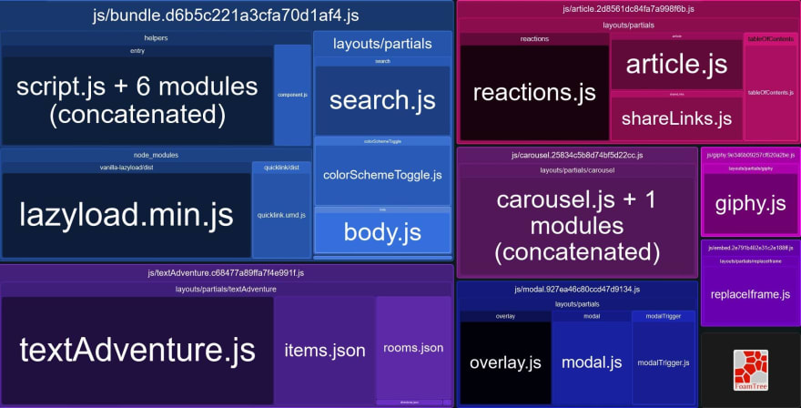
I've split up my website into component bundles. That way I can load only the parts that are needed (here's how that works) and omitting non-critical javascript altogether. Right now, my website generates the following bundles:
The blob dimensions are equivalent to the respective bundles' file size.
| Bundle | Size |
|---|---|
| bundle.js | 8.41 kB |
| textAdventure.js | 5.61 kB |
| article.js | 2.59 kB |
| carousel.js | 2.37 kB |
| modal.js | 1.52 kB |
| giphy.js | 1.07 kB |
| embed.js | 1.03 kB |
The top entry contains javascript that needs to be executed on every page. It powers things like the color switch, image lazy loading, and the component loader itself. All the other bundles only load when needed. That cuts my JS bundle size from 22.7kB to only 8.41kB for the index page.
To keep those individual bundles as small as possible, I stay clear of runtime node modules as far as I can. Most of them are too feature-rich for me. The lightbox modal I use on my site is a very simple one. I could use a fully-featured one from npmjs.org, but I would end up shipping more than 10 times the code without ever needing it.
Verlok's vanilla-lazyload and Quicklink are the only exceptions here, as I actually utilize most of their features. (Also, lazyloading images can get weird in detail. I'm not up for that.)
I keep coming back to three very useful tools for code maintenance:
- Bundlephobia is excellent at keeping track of excessive node packages
- Identifying unused code is really simple with Chrome's coverage tool.
- webpack-bundle-analyzer makes those awesome bundle visualizations.
#2: Image optimization
Images take up a huge portion of this site. It's important to serve them as efficiently as possible. That means choosing the right format, the right sizes, and the right time to load them.
#2.1: Formats
Choosing the right image format is simply a matter of putting your image into the right category. Vector-based graphics like logos, diagrams, and line art work best with SVG, photo-like graphics go with JPEG and animated things are GIFs. PNGs work well for semi-transparent images, but I don't really have those, so I'll just ignore that.
Then there's WebP, the new kid on the block. It's is way more efficient for encoding pixel-based images than the traditional formats and also checks all the boxes for features like alpha channels and animation. WebP has gotten some really nice browser support over the last year, but it still doesn't run everywhere (looking at you, Safari). Thankfully, there's a way we can fall back to jpeg and co. in case WebP isn't supported.
#2.2: Source Sets
Enter source sets. They allow me not only to automatically provide WebP if it's supported but serve adequately sized image files, based on their context.
<picture>
    <source
        type="image/webp"
        srcset="image_380x380.webp 380w,
                image_590x590.webp 590w,
                image_786x786.webp 786w,
                image_full.webp 1920w"
    >
    <source
        srcset="image_380x380.jpg 380w,
                image_590x590.jpg 590w,
                image_786x786.jpg 786w,
                image_full.jpg 1920w"
    >
    <img src="image_full.jpg" alt="A black cat playing the piano">
</picture>
This will load one of four differently sized files depending on the dimensions of the image on the screen. If the image is displayed on a 380px wide container (like in a mobile layout), it will only load a 380px wide file, while large desktop layouts get the Full HD variant. Browsers that don't support source sets fall back to the linked variant in the <img> tag.
If you wanted, you could also support higher resolution images for high-DPI displays.
Source sets allow me to cut down on one of the largest portions of transferred files. This has a huge impact on loading times and is reflected accordingly in Lighthouse's performance score.
#2.3: Lazy Loading
Lazy Loading images is the practice of loading images not right after the document loads, but just as they become visible in the viewport. That saves a lot of data (e.g. on metered connections) and speeds up page load times.
It has become really easy to use since browsers started implementing it natively. Just slap loading=lazy inside your <img> and you're good to go. At least if you ignore Internet Explorer (as you should) and Safari (as you shouldn't) (full stats here). There are some implementation differences between Chrome and Firefox, such as scroll distance and data saver recognition, but I think both browsers handle the problem quite well.
I use vanilla-lazyload. It comes with native lazy loading support and acts as a fallback for browsers that don't support it. More importantly though - I already use it as a javascript scroll trigger on any element that needs it.
#3: Fonts and icons
Font files are huge and essential to display content. They can play a big role in delivering your site to the user. I have already dedicated a whole article to that subject, so I'll just link that here.
#4: CDN Caching
The way a CDN speeds up client-server connections is by having multiple data centers around the globe. My website is hosted in Germany, so if I connect directly to my host I'll have a much lower latency in Europe than someone in the US. A CDN automatically sends the request to the nearest data center relative to the client, reducing the physical distance between the sender and recipient and thus latency.
I let Cloudflare cache my website and deliver it straight from the CDN to the client without even hitting my host. That turns out to be really fast, reducing my TTFB from ~0.8s to ~0.1s.
While Cloudflare is fast, it's known to have some downtime every now and then. Those are hard to miss because apparently lots of popular services are managed by Cloudflare and an outage seems to take down half the internet. Keep that in mind before depending your own site on third parties.
#5: Pushing Assets
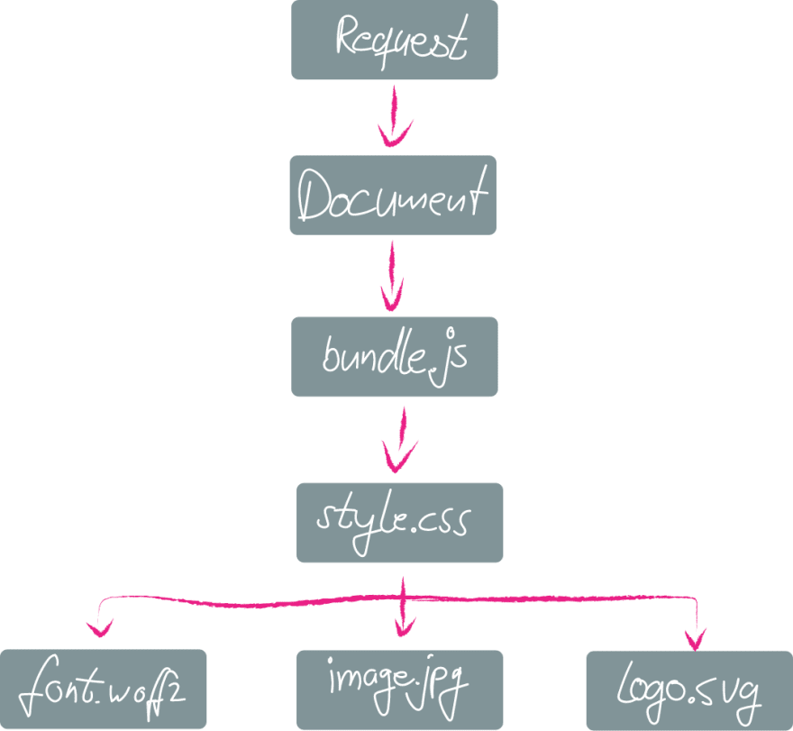
Normally, the browser loads assets as it sees them. But they can depend on each other and create very long chains:
With preloading, you can tell the browser right in the document what assets will be needed. With this tool you can optimize the shape of the waterfall diagram and speed things up a lot:
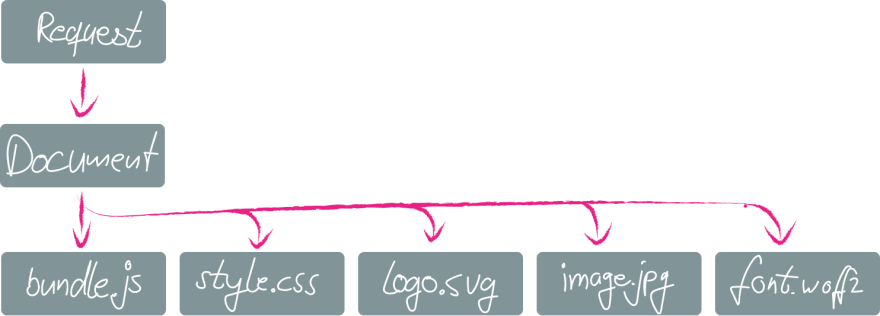
The final form of this technique is pushing your assets. You can still tell the browser what assets will be needed, but you do so even before the document is parsed. The asset push comes right with the first request. This is how it looks with the request chain reduced to zero:
Pushing can be quite tricky to implement. A server push will always be initiated server-side (duh!). It doesn't care if the file is already cached in the browser or not. I'm working around that by setting a cookie with the push, that prevents any further pushes on reloads and the next pages. Since I use a static site generator and only serve HTML files, I put that logic inside my .htaccess:
# only do that with HTML files
<filesMatch "\.([hH][tT][mM][lL]?)">
    # don't push if cookie is set
    SetEnvIf Cookie "h2push=1" h2push
    # do the push!
    Header set Link "</fonts/share-v10-latin-700.woff2>;rel=preload;as=font;crossorigin,</css/styles.css>;rel=preload;as=style,</js/bundle.js>;rel=preload;as=script"
    # set cookie to prevent next pushes
    Header add Set-Cookie "h2push=1; Path=/; Secure; HttpOnly" env=!h2push
</filesMatch>
#6: URL Preloading
Now that I load the current page as fast as I can, it's time to look into speeding up the future navigation. When everything is loaded for the current document, why leave it at that? Let's preload the pages the user may want to visit next. There are some libraries doing that already, namely quicklink, Instant.page and Flying Pages. Quicklink fits my needs just fine, so that's my way to go.
The principle that makes all of them work is simple but clever: Find what links are available within the viewport and load them. They provide options like ignore lists, or a check for slow connections and data saver mode, to prevent loading URLs that the user most likely doesn't need or want.
Once the next URL is preloaded, the document can be painted almost instantly after the navigation element, because everything it needs is already cached. I try to keep my document sizes small, so that strategy results in a surprisingly snappy experience even on a slow 3G connection.
#7: Have a performance budget
A performance budget is a self-imposed set of rules that prevent you from slowing down your website below a certain threshold. That threshold is individual to every website and even to individual pages within a project (e.g. a highly optimized landing page). That threshold can be determined by evaluating metrics that are important to you. Examples could be time based, like the Time to First Byte (TTFB), First Contentful Paint (FCP), Time to Interactive (TTI), or audited Scores, such as Page Speed Insights, Lighthouse or YSlow.
I value Progressive Enhancement a lot and try to keep my features working even without javascript. That means that TTI is not important to me, but I keep a keen eye on TTFB, FCP, and my Lighthouse Score.
I monitor those values with GTmetrix. In case any of those values rise over an arbitrary value, it's time for me to find the problem and fix it. Those values are my performance budget, which ensures that I don't accidentally slow down my website in future deployments.
Wrapping up
In the end, I have a website that loads consistently in well under a second on a high-speed connection. It still feels not too bad even when throttled to 3G speeds. Navigation between pages is almost as snappy as a Singe Page Application, without the burden of large frontend frameworks, Server Side Rendering, Hydration, etc. And because I only load javascript components when they're needed, I can add as many features as I want without affecting loading times.
(Cover Image Sloth by LillyCantabile)


