New Relic dashboards let you analyze telemetry data across your entire stack, regardless of the source. Dashboards are a flexible way for engineering teams to visualize data however they want by combining pre-made templates, native platform visualizations, custom queries, and more—all in one place.
Now you can enhance your dashboards with even more customization choices, including the ability to:
Tailor your chart colors to highlight key information, identify errors faster, or match your preferred color palette.
Remove or transform null values.
Increase chart detail and clarity with customizable units.
Analyze different time ranges on the same dashboard.
Use Markdown to add custom content to your dashboards.
In this blog, you’ll see examples and tips to help you make the most of your custom dashboards with the latest dashboard options. You’ll also get a sample dashboard JSON file so you can try it out yourself.
Getting started
Prerequisites
Follow along by starting with these steps:
Log into your New Relic account. If you don’t have one, you can sign up for free.
Connect an application or service in New Relic. This ensures that the dashboard will be populated with transaction data. If you haven’t done this before, go to Add data in New Relic and select guided install, or choose an application monitoring data source and follow the installation instructions.
Get the dashboard template
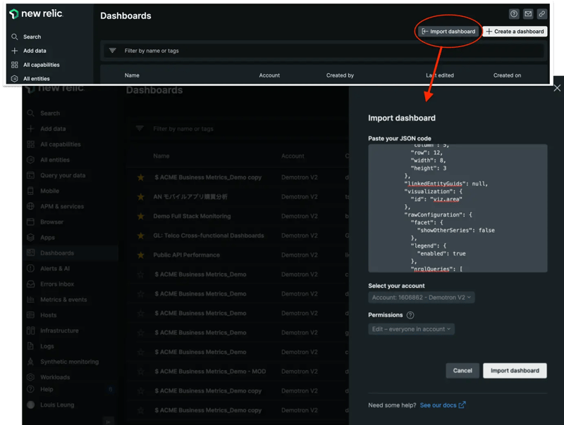
Once you have logged into your New Relic account and connected your application or service successfully, you can get a copy of the dashboard template. To do this, simply go to dashboards in New Relic, then select Import dashboard.
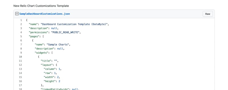
Next, paste the JSON code from this GitHub gist.
Note: Before moving on to the next step, update the account number in the JSON code.
There should be a total of nine instances of the following line: "accountId":
Replace the placeholder with your account number. Here's an example: "accountId": 1231234
If you don’t know your account ID, follow this documentation.
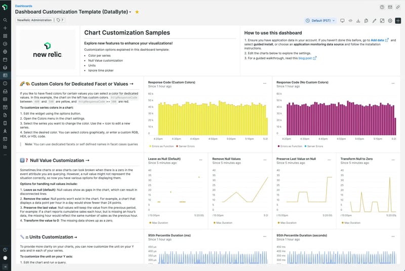
Then, select Import dashboard. You should see something like this.
Color customization
Adding colors to your data visualizations doesn't just improve their aesthetics. Colors can also help convey meaning and draw your eye to critical information. Now you can change the color of your time series charts, on a per-series basis, for area, bar, line, pie, and stacked bar charts.
For example, you might want to select a classic red and yellow scheme for severe or moderate error warnings. Charts that are faceted by country code could also use readily identifiable colors to help readers parse information without needing to look at the chart legend. Or you could simply choose your branding colors for a polished look.
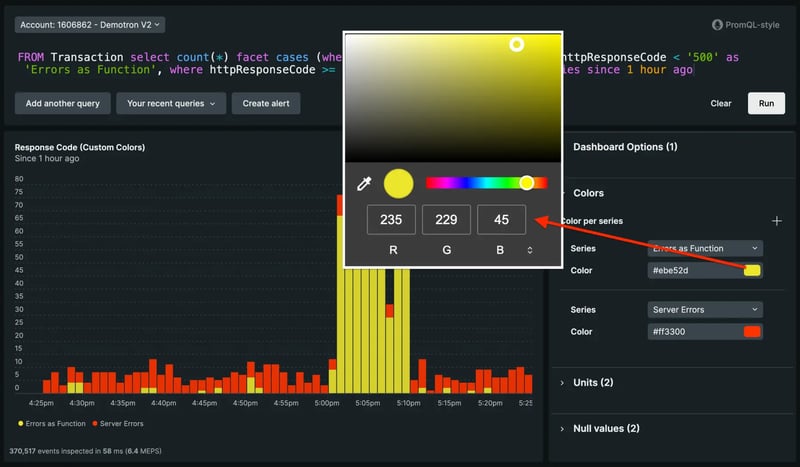
To customize series colors:
- Run your query.
- Open the Colors menu in the chart settings.
- Select the + icon.
- Select the series you want to recolor.
- Select the desired color. You can select colors graphically or enter a custom RGB, HEX, or HSL code.
Null value settings
Sometimes time series charts can look broken when there is a zero in the event attribute you are querying. However, a null value may not represent the situation correctly. Now you have various options for displaying null values, making your time series charts easier to understand.
The new options for handling null values include:
Leave as null (default): Null values show as gaps in the chart, which can result in disconnected lines. You may want to use this option if it's important to find gaps in reporting, or when it doesn’t make sense to connect a continuous line.
Remove the value: Null points won’t exist in the chart. For example, a chart that displays a data point per hour in a day would show fewer than 24 points.
Preserve the last value: Null values will keep the value from the previous period. For example, if a chart reports cumulative sales each hour, but is missing an hour’s data, the missing hour would reflect the same number of sales as the previous hour.
Transform the value to zero: The missing data shows up as a zero. This option could be useful when no data means there is no meaningful transaction, count, or usage.
To customize how your null values appear:
- Select Edit chart or run a query.
- Open the Null values menu in the customizations UI.
- Select the Null values option that you want to apply.
- Optionally, if you’d like to use different options per series, you can select the + button beside Null values per series to configure them.
Unit customization
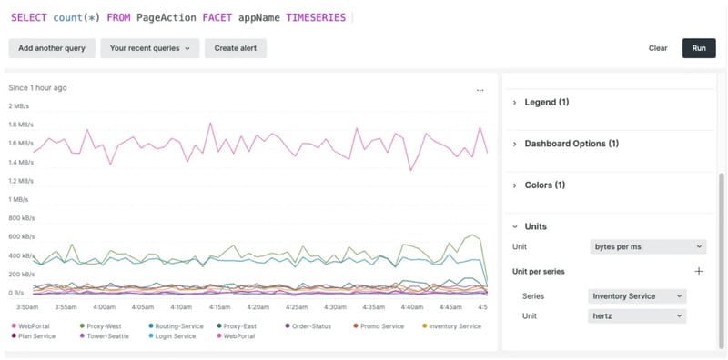
To provide more clarity on your charts, you can now customize the unit on your Y-axis and in each of your series. It’s available in line, area, and stacked bar charts.
To customize the unit on your Y-axis:
- Run a query.
- Open the units menu in the customizations UI.
- Select the unit that you’d like to use. This will be shown on the Y-axis.
- Optionally, use the + icon to add a per series customization. Select the series that needs another unit. These will be shown when you hover over the values.
Ignore the time picker for persistent values
The time picker defines the time range of your analysis. Adjusting the time range at the top of your dashboard sets the same range for all of your charts. This is handy while troubleshooting incidents when you need to narrow down your data to observe what happened in a specific time period. In addition, dashboards make it easy to correlate information across your charts, as you can click and drag within a time series chart to adjust the time picker for the dashboard.
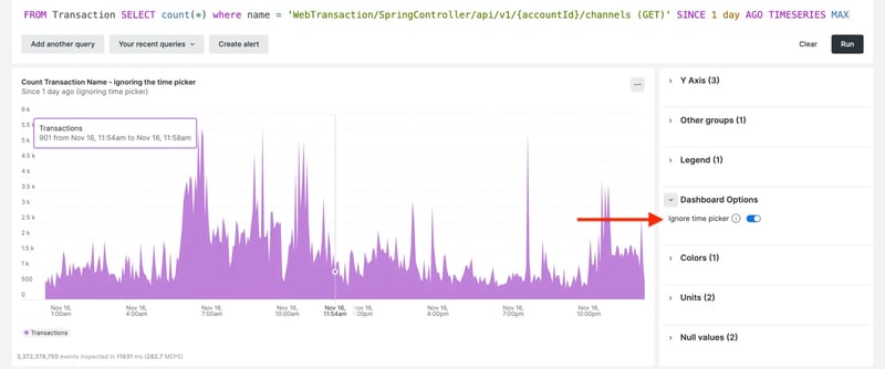
However, there are instances when you might not want a dynamic chart. For example, you might want values to be persistent to show a cumulative count for a specific time period. Or maybe you always want to show the values from the last 24 hours, regardless of the time range the rest of the dashboard shows.
To make a chart and ignore the time picker:
- Select Edit chart or run a query.
- Open the Dashboard Options menu in the customizations UI.
- Turn the toggle on for Ignore time picker.
Markdown widget
Add context and flair to your dashboard with custom content using our Markdown editor. With this feature, you can add formatted text, checklists, images, code snippets, and more. This makes it easy to explain shared dashboards, add useful hyperlinks, create task lists, and create any other Markdown content you need!
To add a Markdown widget:
- Select the + symbol in the top right corner of your dashboard.
- Select Add text, images, or links.
- Enter your inputs into the Markdown pane on the left.
- See your content in the Preview pane.
- Select Save to add it to your dashboard.
- If needed, edit existing content by selecting the ellipses (...) icon on any Markdown widget and selecting Edit.
For more information about Markdown syntax options, see the GitHub Markdown guide.
Check out the video below to learn more about the widget.
To read the full New Relic blog, click here.

