Real-Time Data Visualization: The Future is Now
In today’s world, data is constantly changing and being updated. Big data is now the norm rather than the exception. Gone are the days when data used to be static, only updated when we inputted new data or refreshed a page. Now, we can harness machine learning and tap into the power of real-time data visualization, where data from various data sources is streamed, processed, and visualized as it happens.
The opportunities for data analysis are enormous, from automatic updates of line charts, bar graphs to exhaustive, interactive visualizations that creatively showcase fresh data. This functionality enables valuable insights that propel decision-making processes and business intelligence.
What is a real-time visualization?
Real-time visualization involves the process of visually interpreting and publishing any type of data as it changes, in real-time. To ensure the credibility and expertise of our discussions, we refer to the definition by the Interaction Design Foundation, one of the authoritative sources in this field.
Data visualization examples
Real-time visualizations can take many forms from simple charts to complex interactive graphics. Line charts that draw themselves, heat maps based on social media traffic, scatter plots depicting complex data, and pie charts are just a few examples. The type of visualization chosen often depends on the type of data and the data points in question.
Line chart that draws itself
Bar graphs changing heights
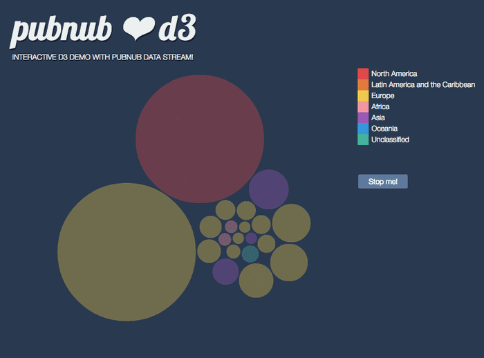
Bubble chart with varying sized bubbles
3D Earth with lines showing messages being sent
Heat maps based on Twitter traffic
Changing lights based on voting
Consider the interactive graphic below, where bubbles move and change size based on real-time data:
How do we build real-time visualizations?
To create a real-time visualization, two key components are required: a stream of data and a user interface.
A Stream of Data is a constant flow of data where packets are sent whenever the data is updated. This could range from weather forecasts to stock prices, large datasets like revenue, or tweets - to put it simply, any data that changes over time.
The User Interface provides a flexible, interactive platform where changes are easily displayed based on updates from the stream of data.
Data visualization technology
There are plenty of data visualization tools available for the job. Several libraries can be employed to construct a user interface that reflects changes in a stream of data. Among the most popular are D3.js and WebGL, but others like Chart.js, Plotly, and Three.js offer more features and improved capabilities for real-time data visualization. These tools are the backbone of any data visualization projects that deal with large datasets.
D3.js, or Data-Driven Documents, uses digital data to drive the creation of graphical forms entirely in a web browser. On the other hand, preprocessing tools like MS Excel and Power BI from Microsoft provide robust data handling before the visualization process.
Updating real-time visualizations has become even more immersive with newer libraries like Three.js, which allows for interactive 3D and 2D graphics in your browser, and Plotly, a high-level, declarative charting library that includes over 40 unique chart types.
To see examples of how these libraries can be used, check out the visualization tutorials for D3js, WebGL, Three.js, and Plotly.
What’s the importance of data visualization tools?
For businesses, real-time data and their visualization are essential. It allows for monitoring of systems or networks, spotting trends or issues, and providing up-to-the-millisecond financial data. But it isn’t just about business. Real-time visualizations have also found their way into art and infographics, as seen in the work of artists who created a data-driven performance. The use of color in these visualizations brings life to the data story and enhances the interactivity.

Above: Data-driven performance United Colors of Dissent creates a real-time visualization based on audience answers, and visualizes results on public facades.
This demonstrates how immediate data visualization changes the way we look at data. Current data is smart data, and the way we process and visualize data is getting smarter.
Get Started
The PubNub docs have everything you need to get started, whether you're looking to integrate SDKs, explore use cases, or see our real-time data streaming demo.
How can PubNub help you?
This article was originally published on PubNub.com
Our platform helps developers build, deliver, and manage real-time interactivity for web apps, mobile apps, and IoT devices.
The foundation of our platform is the industry's largest and most scalable real-time edge messaging network. With over 15 points-of-presence worldwide supporting 800 million monthly active users, and 99.999% reliability, you'll never have to worry about outages, concurrency limits, or any latency issues caused by traffic spikes.
Experience PubNub
Check out Live Tour to understand the essential concepts behind every PubNub-powered app in less than 5 minutes
Get Setup
Sign up for a PubNub account for immediate access to PubNub keys for free
Get Started
The PubNub docs will get you up and running, regardless of your use case or SDK


