You can subscribe to my RSS feed to get my latest posts.
Spending some time to personalise the look and feel of your editor can give your digital life a more homely feeling. It can give you a glow of satisfaction when you open some code you are proud of. It can make the horror of a messy codebase feel slightly less horrific.
That would be the marketing pitch to sell you on the idea! I'm not sure about the real benefits, but I do think it is worthy of a little bit of your time to make your virtual workspace more pleasant to trigger happy thoughts!
So, how can you find the winning combination of font and theme?
Step away from the editor! ⚠🛑😁
It is like going to a supermarket with an empty stomach, you will fill your cart with chocolate and junk food! 🤤🍫
Preview through Web Apps
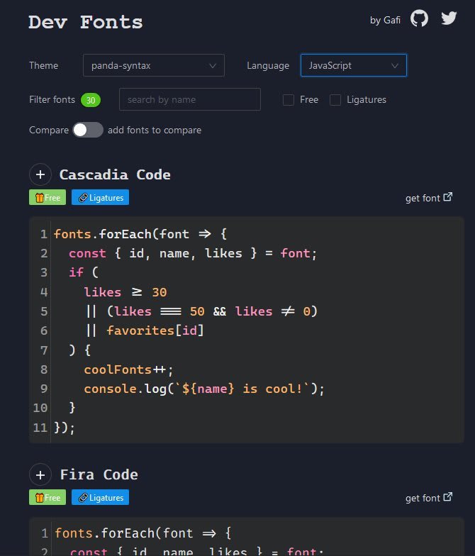
Mostafa Gaafar created a convenient web app called Dev Fonts. You can choose a theme from a list of popular themes, a language for syntax highlighting, and see how a code snippet looks in 30 different fonts. You can paste in your own code snippets to give a more accurate representation of how your code will look like with this configuration. There is a direct link to the font to download it.

Most recommended coding fonts are monospace, but there is no obligation to confine yourself to those. The advantage of monospace is the fixed width of characters makes alignment of text blocks look better.
What I found interesting is the impact of the widths of monospace typefaces, a line of code in Jet Brains Mono is shorter than in Fira Code with the same font size.
Some of the seemingly subtle differences between typefaces can have a big impact. There are different weights (light, semi-light, regular) available for font families also, you can try these to see if you prefer lighter or stronger characters.
I would recommend trialling out a typeface with ligatures, I find them appealing, but they are not to everyone's taste! They perform some visual voodoo to morph some language-specific character combinations into a single character, without changing the bytes in your file. I found this article insightful comparing some characteristics of monospace fonts with ligatures to help me in my decision.
For a bigger selection of themes, you can go to vscodethemes. The UX is very well done, it gives a collection of interactive minified VS Code Windows showcasing a particular theme, each one has 3 tabs previewing HTML, CSS, and JavaScript code. You can toggle the tabs to see different code snippets across all instances. On hover, you can access a direct link to the theme extension in the VS Code Marketplace.
Between these two web apps, you can narrow down the choices considerably, and move on to installing a font and a theme to try it in your editor.
Once you narrowed the field, try them out in your editor
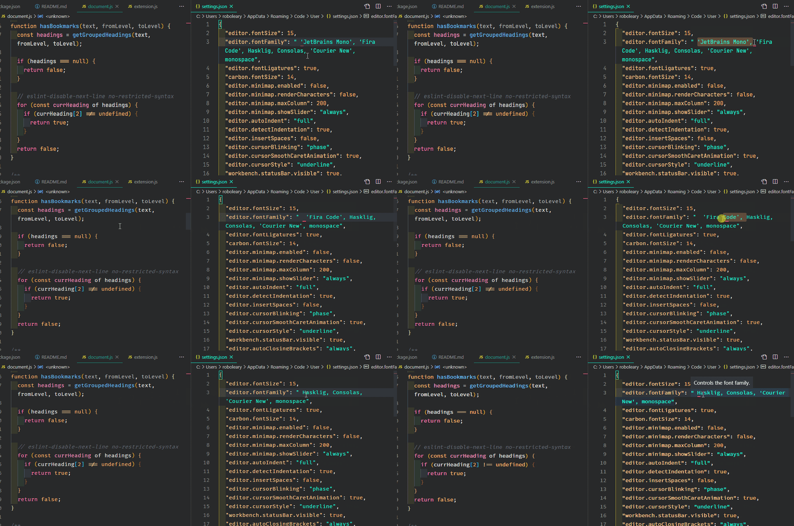
A nice little trick to compare fonts inside VS Code is to open setting.json in a split pane, add or delete a font from the list of editor.fontFamily, and save. It will refresh the adjacent editor pane to give a "live" preview. 😎 You can then undo or redo the edits to switch between them.
These are the most relevant settings in settings.json related to fonts and themes that you may want to change:
"editor.fontSize": 15,
"editor.fontFamily": " 'JetBrains Mono', 'Fira Code', Hasklig, Consolas, 'Courier New', monospace",
"editor.fontLigatures": true,
"workbench.colorTheme": "Panda Syntax",
"workbench.preferredLightColorTheme": "GitHub Light",
"workbench.preferredDarkColorTheme": "Panda Syntax",
You probably need to use a new font and theme for a while before you are confident that you will form a happy family. I hope I saved you some time to get there!


