Web Design Trends 2024
Well, web design trends are something that changes continuously. Thus it is a constantly developing field. It is all about creating and bringing revolution while looking to the future, or we can say be in that future. The web design field shares a relationship with technology, it can be a showcase for new ideas and innovations. You can execute your imagination through animation, interaction, and overall immersion.
In this article Rocking Web Design Trends 2023, we are going to discuss some of the path-breaking design trends. Such as behavioral design that triggers engaging behavior of visitors, Claymorphism which is an absolutely new one, an awesome web design trend in the list, the Memphis design which combines both the retro touch with minimal design, talking about some established trends like Retro look, it is something considered by the majority of designers in 2022 and it is not slowing down in 2023 as well. Typography is again taking a lead and many more.
There is a possibility we might have missed some as it’s a vast world..!! So if you feel that we should add any, then do let us know in the comment section below.👍
It is recommended to use the Best UI Kits to boost your designing process.
Also, check the previous year’s trends here: 25+Coolest web design trends 2023.
Now let’s take a look at the top 15+ innovative web design trends coming up in 2023.
Credit: Tenor
1. Complex Gradients
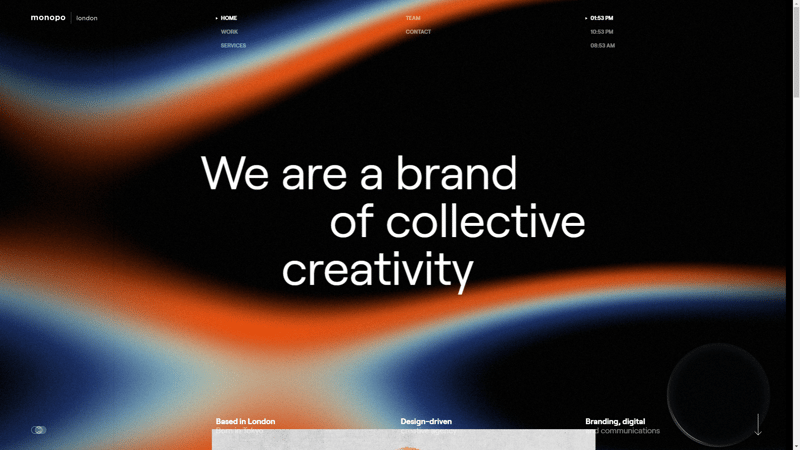
Credit: https://monopo.london/
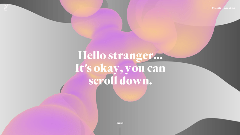
The first one on the list of web design trends in 2024 is Complex gradients. Well, gradients are not a completely new trend, as they’ve certainly come a long way over time. However, with time, Complex gradients are becoming one of the vibrant web design trends as it is being used in modern web design and is often used to add depth to flat images.
As per the web designers and experts, it is gaining more and more popularity. So this web design trend should not be ignored. Gradients made a comeback in 2018, with Instagram’s gradient logo. Since then, it has set up new standards in terms of creativity and interactivity.
Credit: https://juliebonnemoy.com/
The reason behind the popularity of this trend is, it offers more space for creativity. Secondly, the user is uncertain. On one side, they prefer minimalism and on the second side, they tend to think that the designer did not put work into the design if he sees just two colors.
In this case, the gradient can be helpful as it creates an illusion of movement while keeping the minimal design. That’s the reason why this web design trend is popular. In other words, you can call it an analog of motion design, without using animation.…!!
So, using complex gradients is a very good option even if you are designing a minimalistic design.
Websites using Complex Gradients:
- https://www.winamp.com/
- https://sarahguo.com/
- https://vitaarchitecture.com/
- https://www.richardsancho.com/
Following are some useful Gradient sources and generators:
For more Color Gradient generators check the collection of Free color palette generators and Gradient generators
A few tips for creating gradients:
Do not choose colors randomly. It must serve the mood of a particular element of the page or product. If you are unsure of what to pick, use the Adobe Color Wheel.
Use the colors of nature. Green, Yellow, Blue, etc. It attracts the eye of any person. Seeing such colors on the product, the user will be surely impressed.
Check the gradient generators
Also check the best Tailwind CSS Gradient Generator Free
2. Claymorphism
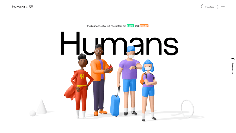
Credit: https://humans.wannathis.one/
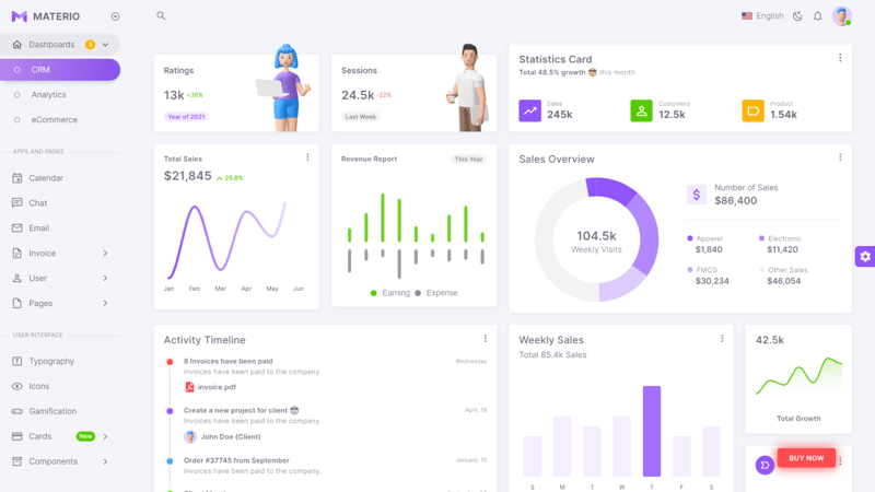
Claymorphism is one of the fresh and newest web design trends. Friendly, Engaging 3D hands/humans/ or you name any other illustration, you can use this emerging fresh and new web design trend to give a very interactive look to your website. It blends well in the minimalist design world.
Claymorphism is made by blending four styles:
- Light, pastel, and vivid colors
- Big rounded corners
- Double inner shadow
- Outer shadow
Credit: Materio Vuetify VueJS Admin Template
Check some websites that use 3d content:
Also, don’t forget to watch Adrian Twarogs’s YouTube Video:
3. Behavioral Design
Admit that you were lazy before the fitness apps made an appearance.😉
You started walking, keeping an eye on how many calories you burnt by walking and you do feel good seeing that numbers. It motivates you to maintain that habit by giving you amazing badges and rewards. That’s an example of behavioral design. It makes the user experience interesting enough to trigger certain behaviors.
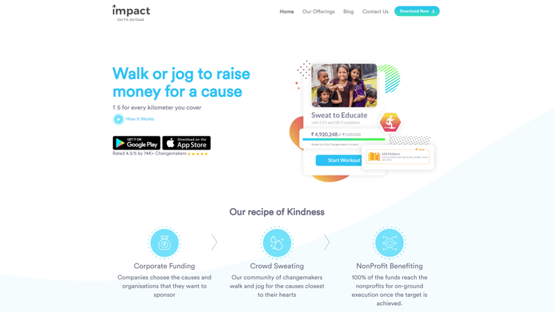
Credit:https://impactapp.in/
You see when you interact with such an app or site you take a certain action, develop habits, and do things be it walking, cycling, painting, meditation, etc. That’s what behavioral design is about. It combines Psychology, Design, Technology, and Creative Methods to find out why people do the things they do and to figure out through experimentation how to activate them to change their behavior.
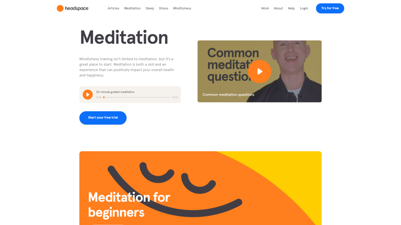
Many products have adopted behavioral design thinking, for example, the popular meditation app Headspace. The platform’s success is because of its ability to keep users active, by encouraging them to meditate every day.
Credit:Headspace
This web design trend 2024, is basically a process of ideas, techniques, and principles for changing behaviors. It is all about using visual cues to trigger user behavior. You can check some of the web apps that execute this amazing web design trend in a creative way.
Web apps examples:
4. Memphis Design
“Remember how we laughed away the hours
And think of all the great things we would doThose were the days my friend
We thought they’d never end” — Mary Hopkin
Nostalgia— We all feel it often, right? Well, even the web design field is not an exception here…!! Another one on the list of web design trends 2024 is Memphis design. It is more of an 80s thing but making a comeback as a web design trend in 2024. Yes, you heard it right. The ’80s are back…!!
It is becoming more popular than ever. Although, unlike the ‘Millennial Pink’ trend, the current version of Memphis we see on Pinterest and Instagram has evolved since the original’s debut. Modern web designers are giving their designs a more modern feel, with the same core foundation.
Credit: https://www.cartoonnetworkstudios.com/
Memphis is much more than just a design trend, it breaks the typical norm and encourages freshness, creativity, and uniqueness through the design. Also, it motivates boldness and bravery, not just in design but in life, and reminds us that our time on this earth should be fun. Thus, it can actually help you deliver the best impression.
Websites Examples Using Memphis Design:
- https://upperquad.com/
- https://shapefarm.net/
- https://www.cartoonnetworkstudios.com/
- https://www.orchestredeparis.com/resonance/
5. Visible Borders:
Credit: https://www.physioasten.at/
“Neatly arranged and placed exactly where it should be.”
Knowing the fact that websites are actually built on a strict grid and held together with the code, what can make them look real? Like, floating in a space within the limits, like neatly arranged by hand. Well, borders don’t just separate if they are used properly. They give a realistic touch to the website and can create a clean impression of your website.
Credit: https://gumroad.com/
That’s the reason why in 2024, web designers are preferring this trend. They try to make it a little more real with layouts that reveal their foundation just by using simple borders and frames. A visible border obviously has the benefit of separating two sections from one another. This makes an easy browsing experience for the visitor as well as you can show more content without making it crowded.
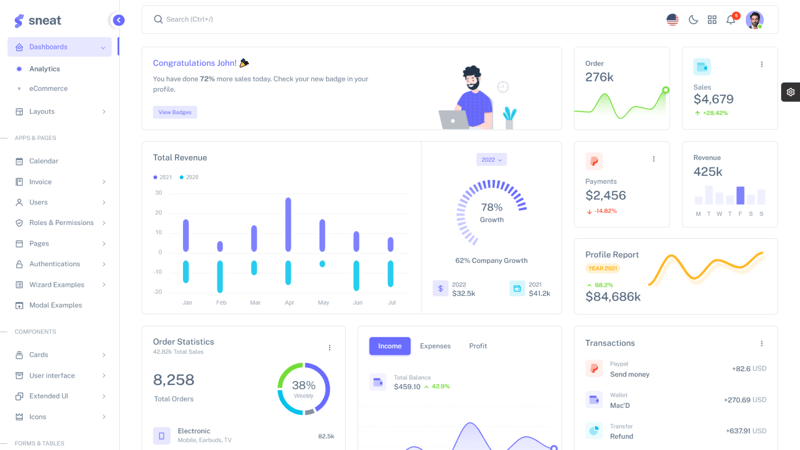
Credit: Sneat Bootstrap 5 HTML Admin Template By Themeselection
These simple borders also give websites a subtle touch that pairs well with other 90s-adjacent trends (such as Memphis) making a comeback. Thus, keep this web design trend in mind while designing your website, if you don’t want to lose your uniqueness.
Website Examples Using This Web Design Trend:
6. Moving Type
Floating, animated letters… Seems like a Harry Potter thing…!!😀
Well, this is one of the fresh and new web design trends in 2024. Combining animation with typos is the best way to make your website engaging and interesting. Typography is no longer just a way to convey information or message. You can show your creativity with it and make it interactive by animating them.
Credit: https://www.papertiger.com/
Animation is usually reserved for illustrated graphics, UI elements, and page transitions. Besides, animated or let’s say a moving text/typo can create a fresh and unique experience for the visitors. Even if the basic animations such as circular rotations can make a difference while browsing. Now, modern designers have broken this stereotype by mixing it with typography.
Such small touches allow the typography to be in the spotlight without overwhelming the reader with unnecessary animation. Although, it is advised not to over-animate the typos. Make them move in a creative way while keeping one thing in mind: Avoid over-animated typos as they can be overwhelming for visitors and may distract them from the website’s main motive.
Website Examples:
- https://atypikal.co/
- https://www.jomor.design/
- http://www.thegreat.agency/
- http://zoomanity.land/en/
7. Oversized Typographic Hero Image
Credit: https://aluminium.index.studio/
“First impression is the last impression.”
It matters the most how your website page is going to make an impression on your visitors.
Well, the top of a page, known as the “hero section”, is a crucial part of your website. It is the first thing your visitors gonna see. If it is not designed well, the visitor may not find it interesting enough to scroll further. Last year it was more about having an image in the hero section, now in the coming year, the scenario has changed. Images are now being replaced with eye-catching and oversized typography.
Credit: https://choreograffiti.com/
Big, fat, bold typography, with no videos and photography, used in a monochromatic color scheme is enough to get a user’s attention quickly. As the first part of a website that visitors see, the hero image must make a statement. That’s why modern designers are considering this web design trend in 2024.
Typography of unusual sizes is a fresh trend. Thus, opting for a bigger size of text can be great for creating a striking first impression, and also for tying other design elements together. This is a very unique technique that can be used in minimalist or maximalist designs effectively and can blend with many different styles.
Websites With Oversized Typographic Hero Image
- https://www.azzerad.com/
- https://perturbator.com/
- https://kirifuda.co.jp/
- https://www.dariaizbash.com/
Check the collection of Best Typography Resources Tools For Developers and Designers.
8. Engaging Interactives
Interactive web design is not just a trend, but it is one of the crucial requirements as it not only attracts visitors but adds value and elaborates your goal as well. Besides, it is a very vital factor for every designer. The main job of a web designer is to deliver an interactive and engaging website to make sure visitors don’t abandon the website.
Credit: https://www.mobia.io/
A visitor tends to leave your website the moment he finds it too straight and simple. Simplicity is good but too much of anything can make it unattractive. Thus using engaging interactives is a good idea.
The motive of an interactive web design is to keep visitors on the site as much as it is possible. You can make your website more engaging by using interactive such as 3D animation, Videos, Graphics, etc. to attract the attention of your visitors. Using engaging interactives motivates a meaningful engagement with the page, such as clicking, scrolling, swiping, and dragging.
Credit: https://matterapp.com/
This web design trend is also helpful in reducing the bounce rate as well, as visitors are more likely to stay on your site. It is one of the best ways to provide value for visitors, get them engaged with your website, and learn more about them.
If your design is interactive it will automatically create curiosity as well as interest for your company as well. So, keep this web design trend in mind while designing your website.
Website Examples:
9. Interactive Fonts:
Credit: https://smartupvisuals.com/
Fonts are no longer “Just Simple Things” in modern times. They can impact the website's performance. Fonts leave an impression on visitors. Thus, it is necessary to choose proper fonts and use them creatively. In current times, with highly advanced technology and the availability of sources, one can use their full creativity and imagination with Fonts.
For example, have a look at the website Dillinger. It uses a font that changes its weight when the cursor moves over the text. Note that, here the shrinking effect on text against the black background makes the selected text more readable, a great addition for usability.
Credit: https://www.dillinger.tv/
Unlike the previous times, it is now even easier to create more elaborate effects using modern no-code platforms. However, while applying interactivity to fonts, it’s important to keep one thing in mind, some people get distracted by moving characters. So, do not overuse it.
Website Examples:
10. Creative Scrolling Experiences/ Parallax Scrolling:
Credit: https://drinkcann.com/
Once it was recommended that sites should include as much information above the fold as possible in order to avoid the user having to scroll. But in this modern era, scrolling is considered as one of the IMP factors as visitors want to engage in a way where they can get information about the website in a tasteful way.
Parallax scrolling introduced a new way of allowing designers to break the stereotype by making the act of scrolling itself engaging for the user. Being the most common type of engagement a user makes with a page, scrolling is a constant opportunity for animated interactive feedback. By 2024, scrolling experiences are getting bigger and better than ever by taking visitors on imaginative journeys.
Credit: http://okkapi.agency/en/
Nowadays, pages are transforming into living worlds through cool parallax effects. As scrolling animations are not new, the main key to this trend is to surprise the visitor with a creative and meaningful experience.
This can be one of the most path-breaking web design trends 2024. So, make sure you consider this while designing a website. Note that, use this trend to entertain your visitor in a meaningful way. It should be beneficial to both the visitor and the website.
Website Examples:
11. Handmade Graphics
Credit: https://www.oatly.com/
Hand-drawn art is one of the most unique and different web design trends. It is becoming one of the popular styles and it is adopted by web designers quite well. Using these hand-designed elements to attract visitors is surely a good idea.
Well, a web designer’s main motive is to design and present the site in an interesting and fashionable way to attract users. To do so, web designers try fresh and unique ideas in their projects. Eventually, this urge to stand out differently led to the use of hand-drawn elements in the website.
Now, Hand-drawing is one of the most commonly used features of designers, graphic artists, and illustrators. Web designers are considering this web design trend 2024 as it offers the opportunity to experiment with design and show creativity and inspiration.
Website Examples:
- https://www.sweetmagnoliagelato.com/
- https://waltersophia.com/
- http://www.danieldiggle.com/
- http://themanyfacesof.com/leonardo-dicaprio/
12. More Glassmorphism
Credit: https://decimalchain.com/
Glassmorphism — A combination of transparency, blur, and translucent frosted glass-like effect. That gives a glassy effect. Glassmorphism adds depth and visual hierarchy to your UI. Also, it can be effectively utilized to put focus on the content you want to highlight in a unique way.
This technique is used in logos, illustrations, or even full sections. From website landing pages, mobile app interfaces, and dashboards, to UI components such as cards, onboarding screens, and login screens, designers are using the Glassmorphic effect in creative ways to add visual interest to the interface.
Credit:https://digital.vtb.ru/digest/2021-jul/
Tip: Glassmorphic elements work well when layered on top of Vibrant backgrounds, colorful shapes, and images. It gives a very rich look.
Websites using Glassmorphism
13. Illustrations
Well, Illustrations are considered one of the best ways to hold visitors to your website. It has been an established trend in the web design world and will remain the same in 2024 as well. Web designers are experimenting with every possible way to stand out from the crowd and they are doing it in a very unique style. They have now introduced illustrations in 2 different styles: Collage Style and Abstract style.
1. Collage Style
Credit: http://titanichistory.tilda.ws/
Collage style graphics can give site illustrations a tactile feel, open up more white space in a design, and allow you to incorporate images without focusing the entire design around a photograph. Make sure you blend shapes, colors, and patterns within a collage. You can add a monochrome effect, tint, or filter to photographs to help them blend with the overall design.
Website examples:
2. Abstract Illustration:
Credit: https://marketwise.io/
Now, Abstract illustrations that have a more organic texture and a sense of the human hand creating them are becoming more popular. While clean, poppy vector graphics and cute illustrations of humans and objects have ruled web design for a few years now, perhaps people are looking for something that feels a little more natural and sophisticated.
This sort of illustration can be created with ink and paper and scanned or created in illustration software. The key is incorporating various textures and natural irregularities like watercolor, ink, paint, silkscreen effects, or the texture of the paper. Lines can also be softer, mimicking variations in line weight that come from using graphite or ink.
Website Illustration:
14. Less Neumorphism
Neumorphism was one of the top 2020/2021 UI design trends and for fair reason. It is fresh, creative, and attractive as well. You may check Dribbble shots for examples. It is realistic, modern, futuristic, visually appealing, and extremely breathtaking due to its soft shadow and overall appearance.
However, most web designers are now dropping this.
Reason: Accessibility issue…!!
Credit: https://dribbble.com/shots/10494800-Nespresso-Light
Neumorphism looks good because it’s different from most web designs, but it doesn’t mean that you focus just on looks as a website should be designed in a standard way because it just works better. One should keep in mind Accessibility first as it is one of the crucial parts of web design,
For more details on this topic check Neuomorphism and accessibility.
Neuomorphism creates situational vision difficulties at some point, like bright environments that interfere with screen visibility, and neumorphism is hard to read in environments like that.
Credit:https://www.pfando.de/
The lack of contrast and clear differentiation makes sites in this style very hard to navigate for anyone with reduced vision. Apart from this, the shadowed elements can make it hard for the user to decide which button they are pressing.
While using any web design trend one should know that the main purpose is not just attracting visitors but also providing an easy and meaningful browsing experience and accessibility. Thus, using neumorphism is not a bad idea but use it wisely where it is needed.
16. Material Design
Well, it is not old yet…!! Material design still remains on the list of Web design trends 2024.
Credit: Vuexy VueJS Admin Template by Pixinvent
Material design is a design language that was introduced by Google back in 2014. Well, most of the time traditional web design looks simple and flat. That’s where the Material design comes to help. It allows using color and shadows to generate the effect of textures.
It’s basically a continuation of the biggest trend in the design world during the past few years: flat design. Also, Material can do things that flat design can’t. It can add enough embellishment to enhance user experience and usability. Instead of taking everything away to favor visual appeal, the aim of Material Design is usability.
Credit: Materialize Admin Template by Pixinvent
17. Retro Design in UI / Retro Futurism
“Old is gold” — Indeed…!!
Retro design has been one of the very popular web design trends. They are a great way to make your designs stand out. Retro design — It is a style that brings on a sense of nostalgia. It is s one of the most effective web designs when it comes to connecting sites with users.
When futuristic elements blend with retro design style there’s definitely going to be an out-of-the-box experience for the visitors.
Credit: https://www.exclusiveprs.com/
Designers are applying retro and vintage style elements to online shops, portfolios, corporate designs, and blogs on large and small scales. If implemented well, retro designs can be creative, and appealing, make websites stand out, and look very unique.
Be it Movies or Design, some old styles remain evergreen. In the web design world, retro style is often used to stand out from the regular design. Be it Movies or Design, some old styles remain evergreen. In the web design world, retro style is often used to stand out from the regular design.
Website Examples:
- https://www.dayln.design/
- https://basement.studio/
- https://www.bulleitgroup.com/
- https://harvardfilmarchive.org/
Conclusion:
So, we have mentioned some of the path-breaking and out-of-the-box Web Design Trends 2024.
Designers this year are more likely to have an approach of delivering different web designs while keeping accessibility and seamless navigation in mind that engages with visitors in a unique yet meaningful way.
In 2024, we can expect to see more innovative and experimental design trends to enhance engagement with visitors and improve their user experience.
Do tell us which web design trends in 2024 are your favorite. Also, suggest any web design trend that you think we can add here in the comment section below. Also, don’t forget to share.🎉
Happy Designing…!!
About Us:
We at Themeselection, provide selected high-quality, modern design, professional, and easy-to-use Free Admin Dashboard Template, HTML Themes, and UI Kits to create your applications faster!
If you want to try out the mentioned trends above then do use the Bootstrap Admin Template and Vue Admin Template. It will help you get a better idea.

