If you’re a developer or technical writer who publishes content on the internet, you’ll want to make sure your code examples are presented beautifully for your audience to consume.
The good news is, there are plenty of tools available to adorn your website with fancy-looking code blocks in your blog posts, that mimic current and trendy IDE themes. For example, whitep4nth3r.com uses the Okaidia theme from Prism.js to present code blocks.
The bad news is, most prebuilt themes (especially those with darker colour palettes) come loaded with accessibility issues such as failing colour contrast checks, meaning your audience may have difficulties consuming your code examples. Additionally, your website will be penalised in web search results for failing accessibility checks.
This means we need to do a little more work in CSS to make our code blocks accessible. Let’s take a look.
How to check accessibility on your website
If you’re developing in Google Chrome or Microsoft Edge, you can access the Google Lighthouse tools from your developer console.
Quick tip — some Chrome plugins can affect the way Lighthouse runs in your browser — so it’s always recommended to run these checks in an incognito window without any plugins activated.

You can use Google Lighthouse to run a variety of reports on your web pages. Check the 'Accessibility' checkbox and click ‘Generate report’.

Here’s an accessibility check for this blog post (including code blocks) which produces a satisfying score of 100%! 🎉 But remember — as the report shows — there are always areas of your website that automated tools might not be able to assess correctly — so you should always carry out manual checks as well.
axe — Web Accessibility Testing
I’ve been using this Chrome plugin for a number of years, and it has helped me incredibly in improving my knowledge of accessibility.
Install the plugin, open your Chrome dev tools, and navigate to the ‘axe’ tab.
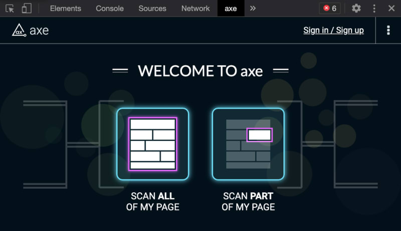
What’s great about axe is that it shows the HTML code for any issues that it has detected. For the same blog post we scanned with Lighthouse above, axe finds 11 issues.
That's not so good! But let’s investigate.

Axe is describing colour contrast issues inside a YouTube iframe embed. It’s not related to any CSS that's bundled with the web page, and it’s not ideal. We might be able to fix it if we can target the iframe CSS effectively, or use a different thumbnail on the YouTube video. But for now, it's good to know!
WAVE Evaluation Tool
The third tool that is integral to my accessibility workflow is the Wave Evaluation Tool Chrome extension. This tool is great for highlighting semantic HTML and ensuring you’ve included the necessary aria labels.
Here’s an example of Wave in action.
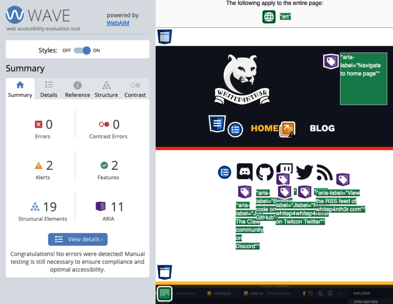
Click on ‘View details’ to see a detailed breakdown of the summary.

Fixing code block accessibility issues
There are two main issues to look for in your code blocks, both of which axe picked up for me.
Ensure the contrast between foreground and background colors meets WCAG 2 AA contrast ratio thresholds
The theme I chose to use from Prism.js is beautiful, but some of the colours failed the colour contrast checks.
Here is a code block that failed a colour contrast check:
This is described in axe alongside the underlying HTML:

Finding accessible colours
Another neat tool I use is the Colour Contrast checker that’s also available as a Chrome extension. Activate the extension, and use the eyedropper to select background and foreground colours to view whether it passes Web Content Accessibility Guidelines (WCAG).

The beautiful thing about this tool is you can move the hue, saturation and light sliders to find colours that pass accessibility guidelines without having to leave your browser page. Using the slider tools, I was able to find colours that passed colour contrast checks, and added the following overrides to my global CSS file:
 /* accessibility fixes for prismjs */

  .token.comment {
    color: #adb8c2 !important;
  }

  .token.important {
    color: #f3a344 !important;
  }

  .token.tag,
  .token.property,
  .token.constant {
    color: #fc92b6 !important;
  }
Elements that have scrollable content should be accessible by keyboard
This accessibility violation was a little trickier to solve, and is the primary reason for writing this blog post.

Prism.js ships with the following code that caused this violation, which causes overflow text to scroll rather than wrap:
pre[class*="language-"] {
   padding: 1em;
   overflow: auto;
   border-radius: 0.3em;
}
Code blocks are not focusable by a keyboard (whereas anchor tags are focusable, for example). This means that if your audience is using only a keyboard to navigate the site, they will be unable to access the content that has overflowed the container, which would usually be scrolled with a mouse.
The way to fix this accessibility issue is to ensure the text will wrap when necessary inside the <code> tag.
Here’s the code I used to prevent the scrolling behaviour and make the text wrap onto a new line:
code[class*="language-"] {
  white-space: pre-wrap;
  word-break: break-all;
}
In conclusion
Prebuilt IDE-like code block themes like the ones available from Prism.js are beautiful, but if you want to use one, ensure you check for accessibility issues such as colour contrast and scrolling behaviour. This will ensure your audience can use your site effectively, and your site ranks well in search engines for accessibility.
And remember: Build stuff, learn things, love what you do.


