xxxxxxxxxxxxxxxxxxxxxxxxxxxxx xx ABSTRACT TEXT GOES HERE xx xxxxxxxxxxxxxxxxxxxxxxxxxxxxx
Session Replay for Developers
Uncover frustrations, understand bugs and fix slowdowns like never before with OpenReplay — an open-source session replay suite for developers. It can be self-hosted in minutes, giving you complete control over your customer data.

Happy debugging! Try using OpenReplay today.
Introduction
CSS continues to evolve rapidly, bringing new features that greatly expand styling capabilities. Recent additions like container queries and cascade layers enable more responsive, modular designs. Upcoming capabilities like nesting and view transitions will enable more app-like, interactive experiences on websites.
Keeping up with the latest CSS innovations allows for the creation of flexible, future-ready interfaces. By understanding and experimenting with these modern specifications early while browser support continues to grow, you can craft resilient websites and unlock the full potential of these new CSS powers.
This article explores some of the most exciting new and upcoming CSS features across areas like advanced selectors, text and layout adjustments, color manipulation, nesting and scoping, functional additions, and more.
Part I: Advanced Selectors
This section explores advanced CSS selector capabilities like container queries, style queries, and the :has() selector. These features open up new possibilities for conditional styling based on parent contexts and nested elements.
Container Queries
Container queries allow styling elements based on characteristics of their parent container rather than just global viewport dimensions.
Container queries introduce the @container @-rule that scopes styles to a container element. The container can be defined using the container-type and container-name properties, and the @container rule accepts media query-like conditional logic based on the container's dimensions:
.card {
  padding: 20px;
  border: 1px solid #ddd;

  /* Make .card a container */
  container-type: inline-size;
  container-name: card;
}

/* Container query scopes styles to .card */
@container card (width < 400px) {
  .card-image {
    display: none;
  }
}

@container card (width >= 400px) {
  .card {
    display: flex;
  }

  .card-image {
    flex: 1;
  }
}
<div class="page">
  <div class="card">
    <h2>Card Title</h2>
    <p>Card content text...</p>
    <div class="card-image">
      <img src="image.jpg">
    </div>
  </div>
</div>
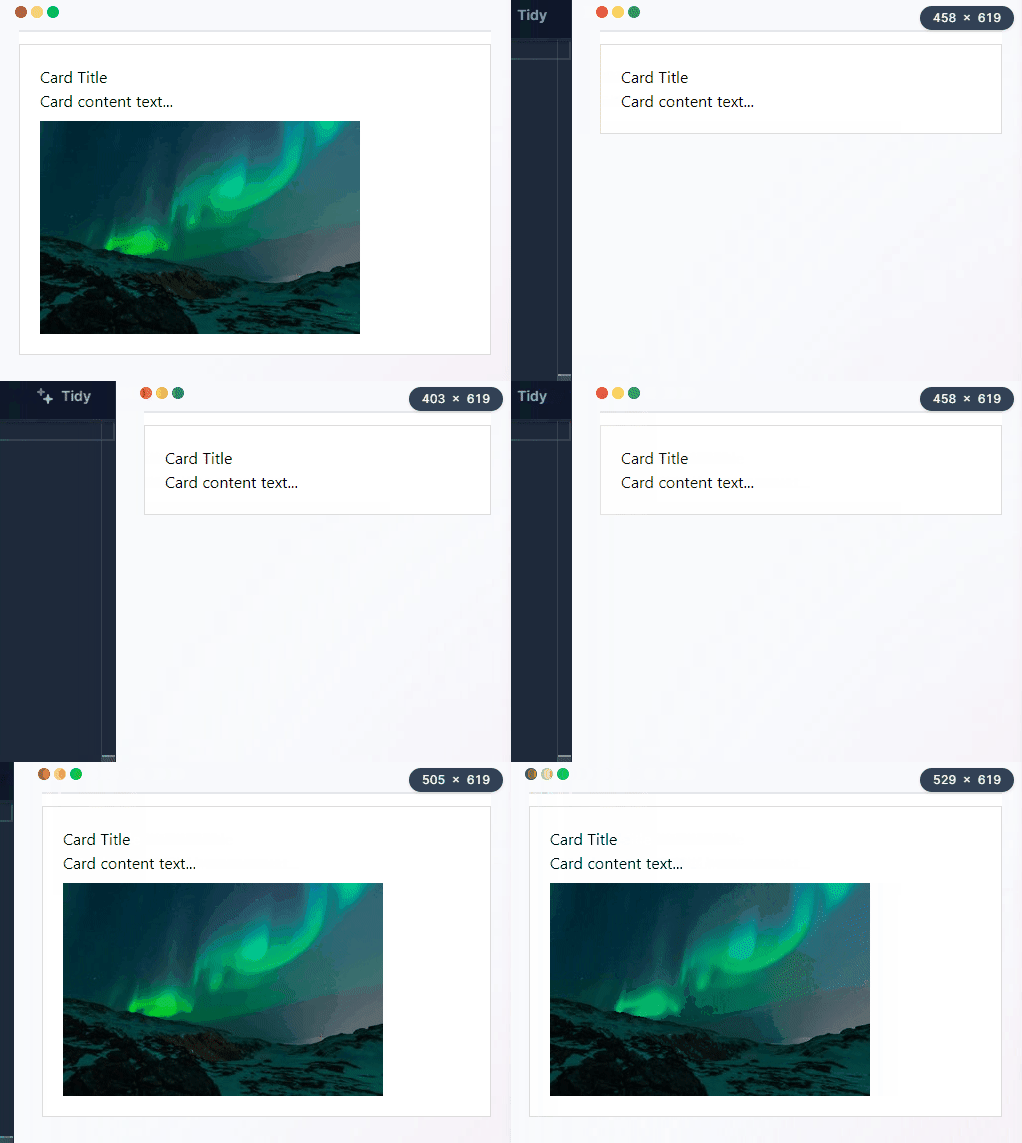
In the code above, we define a .card container element, then use @container rules and container query media features to conditionally set different layouts and hide/show the image based on the .card width.
Key benefits:
- Scope styles based on parent container sizes: Container queries allow you to style elements based on the dimensions of their parent container, allowing components to respond to the space constraints of their immediate parent rather than the entire page.
- Build reusable components with context-based styles: Container queries allow you to create reusable UI components that adapt layouts to specific parent containers, eliminating the need for global page dimensions and ensuring built-in responsiveness.
- Create more responsive designs without media queries: Container queries offer you a more responsive alternative to media queries, as they respond to changes in parent width, resulting in designs that can respond fluidly to nested container resizing.
- Useful for fluid typography, responsive images, etc. Container queries can help with adaptive behavior, such as resizing text or images to fill available space, enhancing design proficiency without the need for hardcoded values.
Use cases:
- Change component layout based on parent width: With container queries, you can reorder, show/hide, or completely alter component layouts based on the parent container width using container query rules.
- Modify text size based on container dimensions: You can also scale text size up or down dynamically based on container size changes to maximize readability at different widths.
- Swap images based on container aspect ratio: - You can also adapt imagery based on parent aspect ratios to ensure images are always cropped/composed appropriately for the container dimensions they render within.
Style Queries
Style queries allows you to apply styles conditionally based on values of a parent container's CSS properties. This enables styling elements according to inherited values like font-size or non-inherited ones like padding.
The @container rule is used along with the style() function to check for property values on the container. If a match exists, the nested styles are applied.
<div class="container">
  <h1>Heading</h1>

  <div class="content">
    <h2>Subheading</h2>
    <p>Lorem ipsum dolor sit amet...</p>
  </div>
</div>
.container {
  font-size: 1.2rem;
  padding: 20px;
}

@container style(font-size: 1.2rem) {
  h2 {
    font-size: 1rem;
    color: red;
  }
}

@container style(padding: 20px) {
  .content p {
    padding: 10px;
  }
}
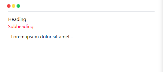
In the example above:
- The
.containersetsfont-sizeandpaddingCSS properties - The first style query checks for
.containerfont-size - If it matches
1.2rem, it sets responsiveh2sizes andredcolor - The second query checks for
20px.containerpadding - If true, it applies
10pxpadding to paragraphs
This shows applying conditional styles to descendants based on inherited (font-size) and non-inherited (padding) container property values using style queries.
Benefits:
-
Conditional inheritance: With style queries, you can create styles that only apply when inherited properties like
font-sizematch certain parent values. This allows adaptive styling based on cascading settings. -
Context-based non-inherited rules Non-inherited container properties like
paddingcan also be checked. This can help you with context-sensitive styles according to ancestor layout metrics. - DRY principles: Checking for parent property values avoids repetition by reusing already defined CSS variables from container elements.
Use cases:
-
Fluid typography: With style queries, you can modify descendant font-sizes responsively based on changes to container
font-size. - Theming: You can also switch color palettes and schemes based on variables set on parent wrapper elements.
- Responsive UI: You can also use it to query container widths to change nested layouts or reflow and transform descendant components as ancestor dimensions change.
:has () Selector
The :has() selector is a new feature in CSS that allows you to select elements that contain other elements matching the selector passed into its arguments. Because of its capacity to apply styles to the parent and select a parent element depending on the child elements it contains, it is usually referred to as the parent selector.
Illustratively, let's consider a webpage that should change the background color of a <div> only when it contains a <p>.
<div class="parent-div">
  <p>This is a paragraph inside of a div.</p>
</div>
div:has(p) {
  background-color: lightblue;
  padding: 4px;
}
In the illustration above, the :has() selector code selects the .parent-div element only when it contains a nested p element inside and sets a background color and padding on it when the selector matches.
Browser Compatibility for Advanced Selectors
| Container Queries | Style Queries | :has () Selector | |
|---|---|---|---|
| Chrome Web | 105 (August 30, 2022) | 122 (Not yet released) | 105 (August 30, 2022) |
| Edge | 105 (September 1, 2022) | 119 (November 29, 2023) | 105 (September 1, 2022) |
| Safari Web | 16.0 (September 12, 2022) | 17.2-TP (November 28, 2023) | 15.4 (March 14, 2022) |
| Firefox Web | 110 (February 14, 2023) | 123 (Not yet released) | 121 (Not yet released) |
| Opera Web | 91 (September 14, 2022) | 104 (October 23, 2023) | 91 (September 14, 2022) |
| Chrome Mobile | 119 (November 29, 2023) | 119 (November 29, 2023) | 119 (November 29, 2023) |
| Android WebView | 119 (November 29, 2023) | 119 (November 29, 2023) | 119 (November 29, 2023) |
| Safari Mobile | 16.0 (September 12, 2022) | 17.2 (November 28, 2023) | 15.4 (March 14, 2022) |
| Firefox Mobile | 119 (October 24, 2023) | 119 (October 24, 2023) | 119 (October 24, 2023) |
| Opera Mobile | 73 (February 2, 2023) | 73 (February 2, 2023) | 73 (February 2, 2023) |
In some cases support requires enabling the feature with a flag, and in other cases support may be only partial.
Part II: Text and Layout Adjustments
Next, we will look at how recent additions enhance text formatting control and unlock more robust grid-based layouts.
text-wrap: Balance
The text-wrap: balance property provides a way to balance the length of lines of text within an element. This property is particularly useful for enhancing the layout quality and legibility of text, especially in headings or pull quotes.
A balanced text is a text that has been wrapped across lines in a way that aims to create the most aesthetically pleasing and readable layout.
Specifically, the lines are wrapped to be as close as possible to the same length. This creates balance and symmetry.
<p class="balanced">Lorem ipsum dolor sit amet, consectetur adipiscing elit, sed do eiusmod tempor incididunt ut labore et dolore magna aliqua.</p>
<p class="unbalanced">Lorem ipsum dolor sit amet, consectetur adipiscing elit, sed do eiusmod tempor incididunt ut labore et dolore magna aliqua.</p>
.balanced {
  max-width: 40rem;
  text-wrap: balance;
}
.unbalanced {
  max-width: 40rem;
}
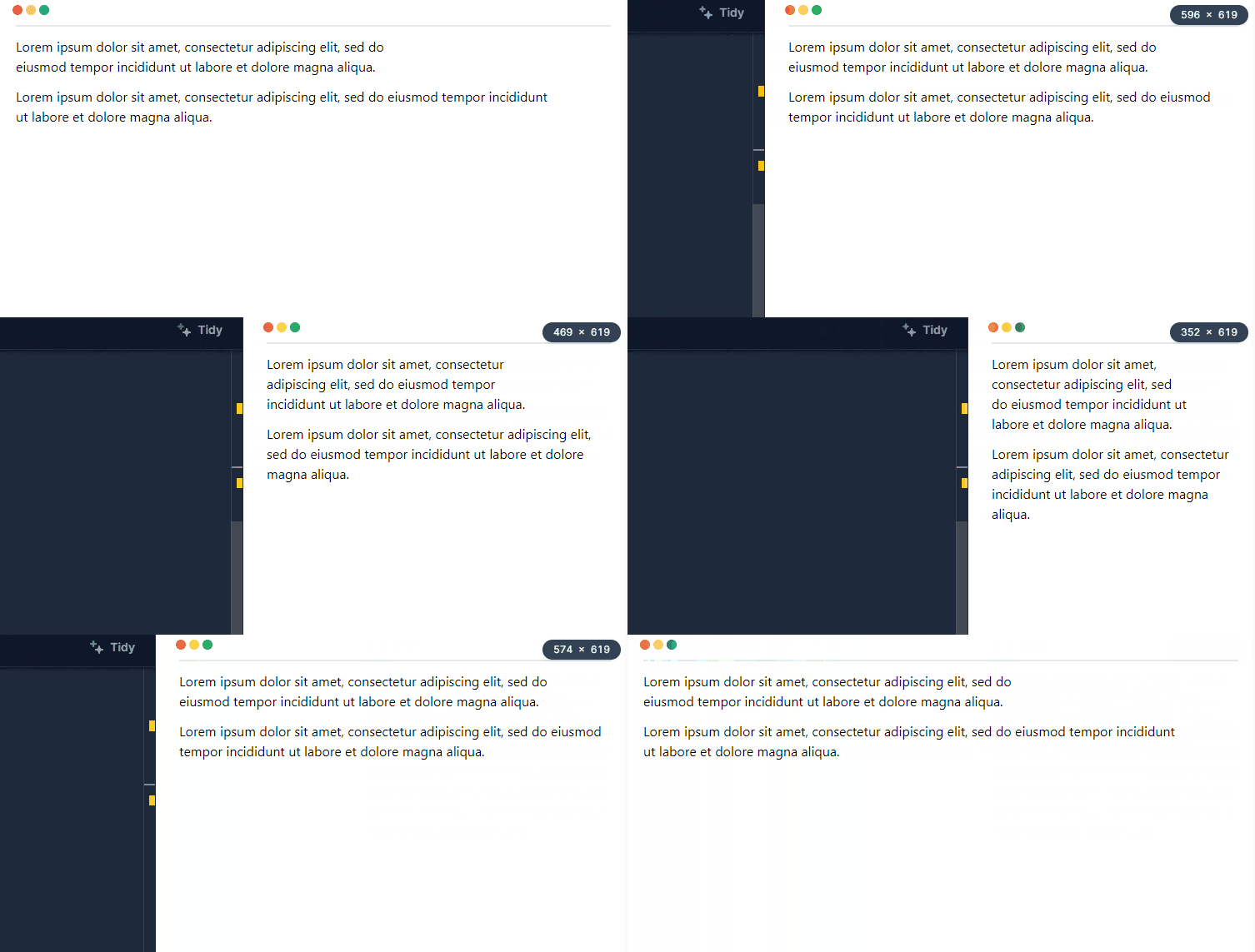
In the illustration above, the text-wrap: balance code sets this property on the text element to balance and adjust the lengths of wrapping lines. This significantly improves readability.
Dynamic Viewport Units
Dynamic viewport units provide a way to create responsive designs that adapt to the size of the user's viewport. These units, represented as dvh, dvw, dvmin, and dvmax, are relative to the viewport size with dynamic consideration of any User Agent (UA) interfaces.
This means that these units will automatically adjust themselves in response to UA interface elements being shown or not. The value will be anything within the limits of 100vh (maximum) and 100svh (minimum).
<section class="full-height-section">
  This section takes up the full height of the dynamic viewport.
</section>
.full-height-section {
  height: 100dvh;
  background-color: lightblue;
}
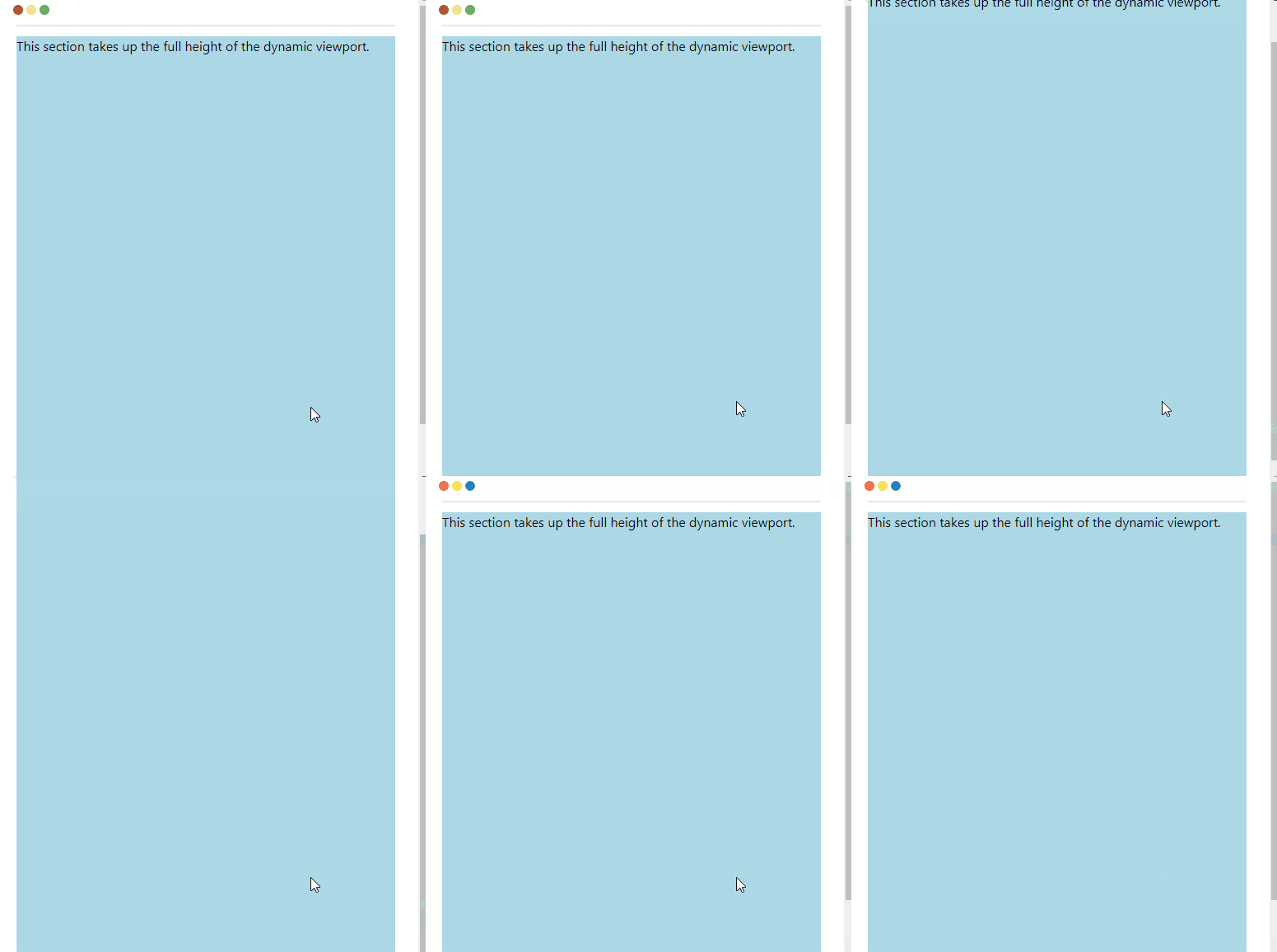
This example sets the section to take up 100% of the viewport height using the dvh unit, so its height resizes dynamically relative to the viewport height.
Subgrid
The Subgrid feature allows for the nesting of grids, enabling more advanced and complex layouts. This is particularly useful when you want child elements to align with the main grid. Here's a simple example of how you can implement a subgrid:
.container {
  display: grid;
  grid-template-columns: 1fr 1fr 1fr;
}

.item {
  grid-column: 2;
  display: grid;
  grid-template-columns: subgrid;
  background-color: lightblue;
}
<div class="container">
  <div class="item">
    Nested grid items go here.
  </div>
</div>
In this example, we create a parent grid container, then we nest a child grid item and set its grid-template-columns to subgrid so its lines align with the parent grid.
Browser Compatibility for Text and Layout Adjustments
| text-wrap: Balance | Dynamic Viewport | Subgrid | |
|---|---|---|---|
| Chrome Web | 114 (May 20, 2023) | 108 (November 28, 2022) | 117 (September 13, 2023) |
| Edge | 114 (June 2, 2023) | 108 (December 8, 2022) | 117 (September 14, 2023) |
| Safari Web | TP (July 12, 2023) | 15.4 (March 14, 2022) | 16.0 (September 12, 2022) |
| Firefox Web | 121 (Not yet released) | 101 (May 31, 2022) | 71 (December 3, 2019) |
| Opera Web | 99 (May 16, 2023) | 94 (December 15, 2022) | 103 (October 9, 2023) |
| Chrome Mobile | 119 (November 29, 2023) | 119 (November 29, 2023) | 119 (November 29, 2023) |
| Android WebView | 119 (November 29, 2023) | 119 (November 29, 2023) | 119 (November 29, 2023) |
| Safari Mobile | 17.2 (November 28, 2023) | 15.4 (March 14, 2022) | 16.0 (September 12, 2022) |
| Firefox Mobile | 119 (October 24, 2023) | 119 (October 24, 2023) | 119 (October 24, 2023) |
| Opera Mobile | 73 (February 2, 2023) | 73 (February 2, 2023) | 73 (February 2, 2023) |
In some cases support requires enabling the feature with a flag, and in other cases support may be only partial.
Part III: Color Manipulation
Expanding color options is another area of innovation. We will cover accessing wider color gamuts and programmatically mixing colors.
Wide-gamut Color Spaces
Wide-gamut color spaces are a new feature in CSS that provides a way to access colors outside of the sRGB gamut. This means that you can support HD displays using colors from HD gamuts. The colorspace you need to specify in order to use wide-gamut color is display-p3, which uses three numeric values representing the red, green, and blue channels of the color.
The color () function, which provides a normalized method of accessing colors inside any RGB color space, is also supported by browsers. This covers Display P3, Rec2020, and sRGB.
--srgb: color(srgb 111);
--srgb-linear: color(srgb-linear 100%100%100%/50%);
--display-p3: color(display-p3 111);
--rec2020: color(rec2020 000);
--a98-rgb: color(a98-rgb 111/25%);
--prophoto: color(prophoto-rgb 0%0%0%);
--xyz: color(xyz 111);
Several other functions that provide access to color spaces other than sRGB through the use of lch(), lab(), oklch(), and oklab() are also supported. Below is an example of how to implement it:
<section class="wide-gamut-section">
  This section uses a wide-gamut color.
</section>
.wide-gamut-section {
  color: color(display-p3 1 0 0);
}
In the example above, the color: color(display-p3 1 0 0) property makes the text color of the section total red in the display-p3 color space. This means that the section displays a color that may not be available in the sRGB color space.
color-mix()
The color-mix() function is a new feature in CSS that allows you to mix two colors in a given color space by a given amount. This function takes in a couple of parameters: the color space you want to use and the colors you want to mix.
Its syntax is as follows:
color-mix(in lch, plum, pink);
color-mix(in lch, plum 40%, pink);
color-mix(in srgb, #34c9eb 20%, white);
color-mix(in hsl longer hue, hsl(120 100% 50%) 20%, white);
Let's consider the code below for illustration:
<section class="mixed-color-section">
  This section uses a mixed color.
</section>
.mixed-color-section {
  background-color: color-mix(in srgb, #34c9eb 50%, white);
}
In the illustration above, the background-color: color-mix(in srgb, #34c9eb 50%, white) property mixes 50% of the color #34c9eb with the color white in the srgb color space. This means that the section displays a color that is a mix of #34c9eb and white.
Browser Compatibility for Color Manipulation
| Wide-gamut Color Spaces | color-mix() | |
|---|---|---|
| Chrome Web | 111 (March 9, 2023) | 111 (March 9, 2023) |
| Edge | 111 (March 14, 2023) | 111 (March 14, 2023) |
| Safari Web | 15 (September 20, 2021) | 16.2 (December 13, 2022) |
| Firefox Web | 113 (May 9, 2023) | 113 (May 9, 2023) |
| Opera Web | 98 (April 20, 2023) | 97 (March 22, 2023) |
| Chrome Mobile | 119 (November 29, 2023) | 119 (November 29, 2023) |
| Android WebView | 119 (November 29, 2023) | 119 (November 29, 2023) |
| Safari Mobile | 15 (September 20, 2021) | 16.2 (December 13, 2022) |
| Firefox Mobile | 119 (October 24, 2023) | 119 (October 24, 2023) |
| Opera Mobile | 73 (February 2, 2023) | 73 (February 2, 2023) |
In some cases support requires enabling the feature with a flag, and in other cases support may be only partial.
Part IV: Nesting and Scoping
Now, we explore new syntax for logically structuring CSS rulesets through nesting and explicitly containing styles to local scopes.
Nesting
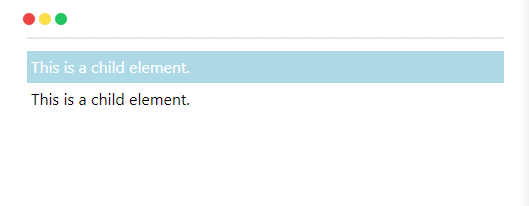
CSS nesting allows you to structure your CSS selectors in a hierarchy, making your stylesheets more readable and maintainable. This feature, traditionally available only through preprocessors like Sass and Less, is now accessible in native CSS.
<div class="parent">
  <div class="child">This is a child element.</div>
</div>
<!-- Outside the parent-->
<div class="child">This is a child element.</div>
.parent {
  /* styles for parent */
  background-color: lightblue;

  .child {
    /* styles for child */
    color: white;
  }
}
In this example, we nest the .child selector inside the .parent selector to apply the white text color only to .child elements that are descendants of the .parent, while other .child elements remain unaffected.
Scoped Styles
The @scope syntax in CSS allows you to scope CSS rules so they only apply within a specific portion of a document. This helps contain the impact of styles to a defined scope.
The @scope rule takes a selector as a parameter to define the scope for the CSS rules contained within. Any rules inside will only apply to elements matching that selector.
It also allows setting a lower boundary selector that stops the scope, which is useful for components with holes.
Notably, a scoped attribute previously existed in HTML but was deprecated. The
@scopesyntax is its replacement, bringing scoped styling capabilities back to CSS.
@scope (.component) to (.child) {
  p {
    color: red;
    font-weight: bold;
  }
}
<div class="component">
  <p>Styled</p>

  <div class="child">
    <p>Unstyled</p>
  </div>

  <div>
    <p>Styled</p>
  </div>

  <div class="child">
    <p>Unstyled</p>
  </div>
</div>
In our example above, we styled all the paragraphs red within elements matching .component, except those nested under .child elements.
@scope solves issues like styling based on proximity and setting boundaries on CSS rules. This leads to more modular and maintainable CSS.
Browser Compatibility for Nesting and Scoping
| Nesting | Scoped Styles | |
|---|---|---|
| Chrome Web | 120 (December 5, 2023) | 118 (October 4, 2023) |
| Edge | 119 (November 29, 2023) | 118 (October 13, 2023) |
| Safari Web | 17.2-TP (November 28, 2023) | 17.2-TP (November 28, 2023) |
| Firefox Web | 117 (August 29, 2023) | 123 (Not yet released) |
| Opera Web | 104 (October 23, 2023) | 104 (October 23, 2023) |
| Chrome Mobile | 119 (November 29, 2023) | 119 (November 29, 2023) |
| Android WebView | 119 (November 29, 2023) | 119 (November 29, 2023) |
| Safari Mobile | 17.2 (November 28, 2023) | 17.2 (November 28, 2023) |
| Firefox Mobile | 119 (October 24, 2023) | 119 (October 24, 2023) |
| Opera Mobile | 73 (February 2, 2023) | 73 (February 2, 2023) |
In some cases support requires enabling the feature with a flag, and in other cases support may be only partial.
Part V: Functional Additions
Finally, we overview functional CSS upgrades that add advanced math and scroll-driven animation powers.
Trigonometric Functions
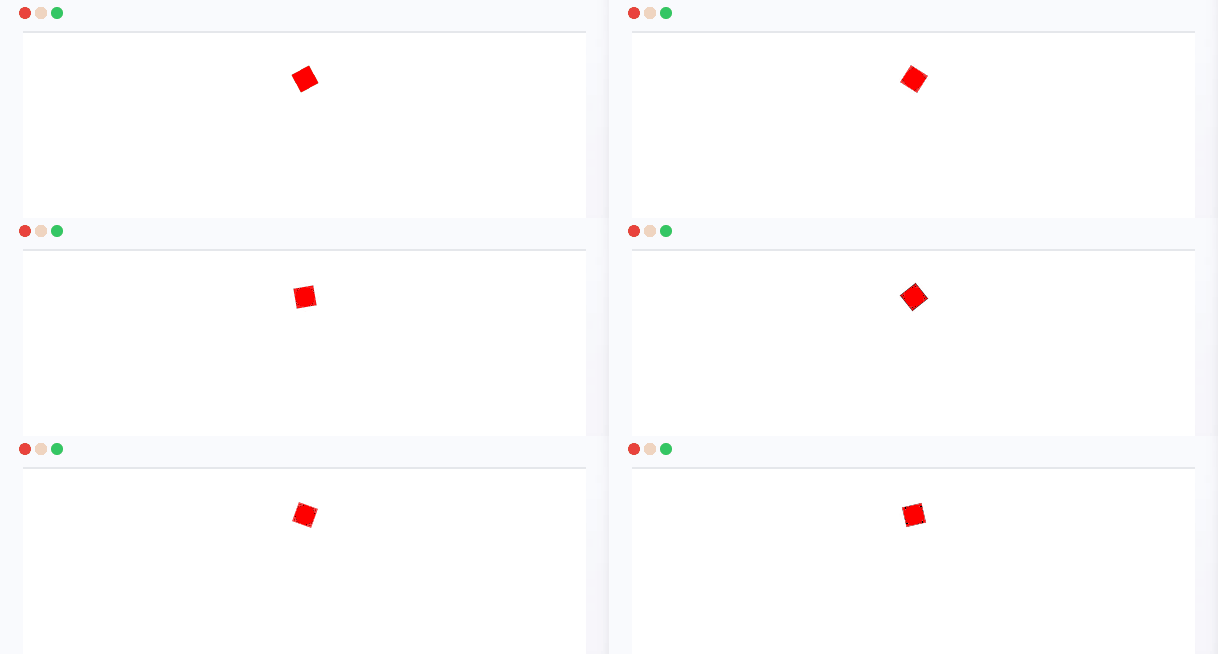
Trigonometric functions like sin(), cos(), tan() and their inverses are now natively supported in CSS. This allows performing trigonometric calculations and getting sine, cosine, and tangent values directly in stylesheets.
The sin(), cos(), and tan() functions take an angle as a parameter and return a value between -1 and 1, except tan(), which ranges from minus Infinity to plus Infinity while the inverse functions asin(), acos() and atan() take a numeric value as a parameter and return its corresponding angle in radians.
These open up new possibilities for animation transforms and data visualizations that leverage trigonometric relationships and wave functions.
Here is an example of using trigonometric functions in CSS with accompanying HTML:
<div class="rotate"></div>
.rotate {
  width: 20px;
  height: 20px;
  background-color: red;
  animation: rotation 2s infinite linear;
}

@keyframes rotation {
  from {
    transform: rotate(calc(45deg + sin(2) * 45deg));
  }
  to {
    transform: rotate(sin(105deg));
  }
}
In this example, we use the sin() and cos() CSS trigonometric functions to calculate angle values that are passed to rotation transforms, creating an animation that leverages trig relationships to rotate an element through different angles in a circular path.
Scroll-driven Animations
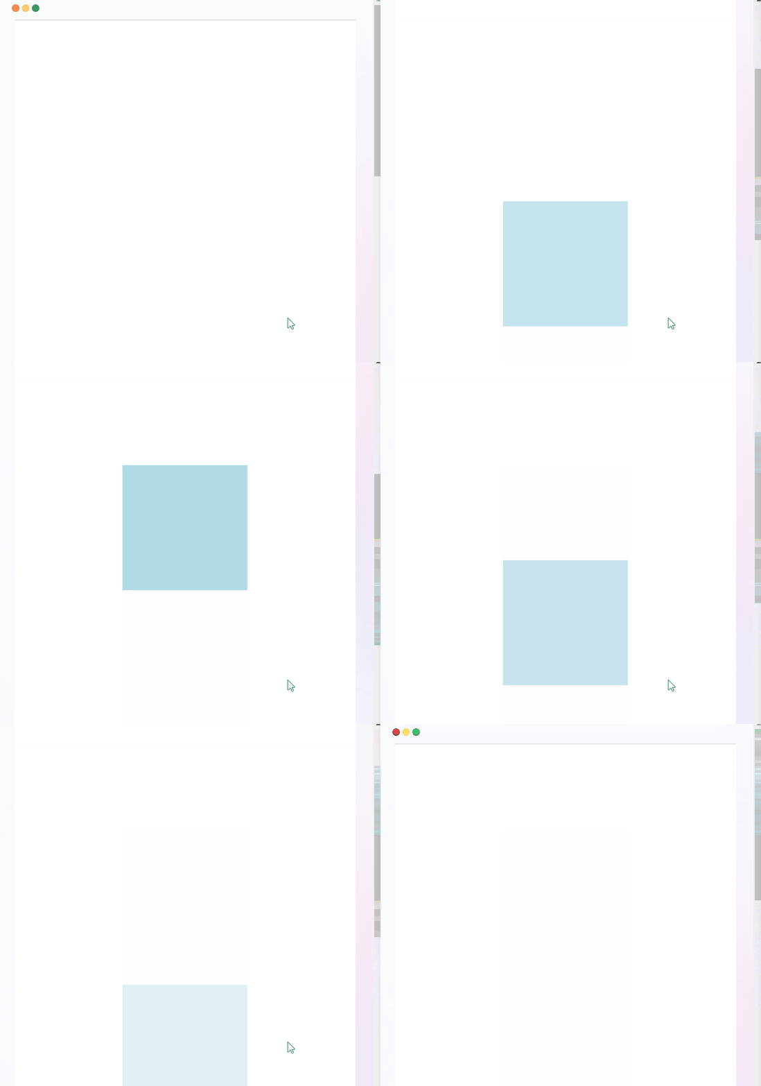
Scroll-driven animations are a powerful new capability enabling animations to be linked to scroll position without needing JavaScript. This feature allows scrubbing through animation progress as users scroll the page, creating cinematic scroll effects. They allow the simulation of native app behaviors without libraries.
The CSS Scroll-driven animations feature introduces scroll progress and view progress timelines that can drive animations:
- Scroll Progress Timeline connects animation to the scroll position of a container along an axis.
- View Progress Timeline links the animation timeline to the relative position of an element within a container.
The animation-timeline and animation-range properties attach animations defined in @keyframes to these timelines.
.container {
  height: 200vh;
  width: 100%;
  display: flex;
  align-items: center;
  justify-content: center;
}

.figure {
  width: 200px;
  height: 200px;
  background-color: lightblue;
  view-timeline-name: --photo;
}

.fade-in-photo {
  animation: fade-in 1s both;
  animation-timeline: --photo;
  animation-range: 10% 70%;
}

@keyframes fade-in {
  from {
    opacity: 0;
  }
  to {
    opacity: 1;
  }
}
<div class="container">
    <div class="figure fade-in-photo"></div>
</div>
In this example, we link a fade-in animation on an element to its view progress timeline so that the animation plays when the element scrolls into view between 10% and 70% of the scroll range, creating cinematic scroll effects without JavaScript.
Browser Compatibility for Functional Additions
| Trigonometric Functions | Scroll-driven Animations | |
|---|---|---|
| Chrome Web | 111 (March 9, 2023) | 115 (July 18, 2023) |
| Edge | 111 (March 14, 2023) | 115 (July 21, 2023) |
| Safari Web | 15.4 (March 14, 2022) | 17.2-TP (November 28, 2023) |
| Firefox Web | 108 (December 13, 2022) | 123 (Not yet released) |
| Opera Web | 97 (March 22, 2023) | 101 (July 26, 2023) |
| Chrome Mobile | 119 (November 29, 2023) | 119 (November 29, 2023) |
| Android WebView | 119 (November 29, 2023) | 119 (November 29, 2023) |
| Safari Mobile | 17.1 (October 25, 2023) | 17.2 (November 28, 2023) |
| Firefox Mobile | 119 (October 24, 2023) | 119 (October 24, 2023) |
| Opera Mobile | 73 (February 2, 2023) | 73 (February 2, 2023) |
In some cases support requires enabling the feature with a flag, and in other cases support may be only partial.
Conclusion
New CSS features allow more flexible and complex designs - like styles based on parent sizes, wider color options, scroll-linked animations, and animated page changes.
As browser support for these modern specifications continues to grow, you can start applying them today to craft resilient, flexible UIs with native-app polish. Keep up with the latest recommendations at caniuse.com.
Debugging across browsers and devices remains challenging. Tools like OpenReplay provide session replay and visual debugging to help build for the diverse matrix of user agents in the wild. Sign up and instantly replay issues users encounter on your site as if looking over their shoulder.

