What is Grid?
What is Grid
CSS Grid is a two-dimensional grid-based layout system which allows us create any layout we can imagine either small-scale or large-scale as we needed. We can create implicit rows and columns with it. We can build the whole layout of our website in single property and a lot more. So Grid is basically blessing for us developers to build layouts in ease. And it works awesomelly well with Flexbox which is one-dimensional layout module and so they both together helps us avoid the need to use layout hacks such as tables, float, positioning.
Grid Structure
Grid Container
Grid container is HTML element whose display property is set to grid
Grid Item
Grid item is direct child element of grid container. And any grid item can also be grid container by setting its display property to grid
Grid Line
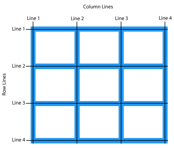
Grid is basically squares that made up from intersection of horizontal and vertical lines. And keep it in mind that a single column or a single row consists of 2 lines which makes sense

Grid Cell
Grid Cell is a single unit or a single square that is in between two parallel row and column lines

Grid Track
Grid Track is basically column or row

Grid Area
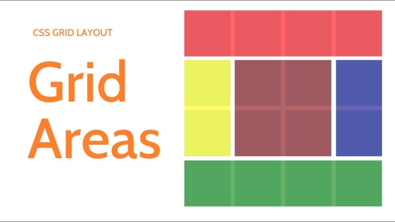
Grid Area is combination of Grid Cell which is space surrounded by 2 parallel row and column lines

Grid Container Properties
display
There are two types of grids which are:
- grid - makes element block-level grid container
- inline-grid - makes element inline-level grid container
grid-template-columns and grid-template-rows
By using this property we create amount of columns or rows we want and the size we want. And it uses following two values to create columns or rows. Never forget for x amount of rows or columns, there will be x + 1 grid lines.
- size of the column or the row - which can be sized with relative units or absolute units or fr unit
- name of the line - we can name grid lines instead of using numbers to place grid items in the grid.
fr unit
fr unit is basically fraction of available sapce on grid container. So after all relative and absolute units are assigned to columns or rows, remainder of available space is assigned to grid item.
grid-template-areas
We can create the whole layout using this property all we have to do is to inlcude name of the grid areas that grid items given to grid area property. And it has 3 values
- name of the grid area property - which is defined by grid item based on that
- a dot . - wherever it's used, it leaves that grid cell or grid areas empty
- none - indicates that grid area is not defined in this spot
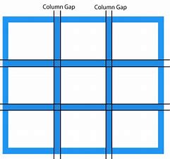
grid-column-gap
It creates space in between columns and any relative or absolute units can be used to do so
grid-row-gap
This property creates space in between grid rows

grid-gap
Grid gap is shorthand property to use grid column and row gap in single declaration. And if second value is omitted, the first value applies for both sides of the grid items

justify-items
Aligns grid items inside grid cell in main-axis. And when grid items move inside their cells, they only occup width of their content and padding. And it has following values
- start - moves all grid items to the start of the grid cell
- end - moves all grid items to the end of the grid cell
- center - centers all grid items to the center of the grid cell
- stretch (default) - is a default value which makes grid item stretch to occupies all available width of the grid cell

align-items
Aligns grid items in the grid cell in cross-axis. And when grid items moves inside their cells, the only height they have, will be their content and padding. It has following values
- start - moves all grid items to the top of the grid cell
- end - moves all grid items to the bottom of the grid cell
- center - moves all grid items to the center of the grid cell
- stretch (default) - makes grid items occupy all available height of the cell

place-items
Place items is a shorthand property where we can use jusify items and align items in the single declaration. And if only single value is provided, it will be used as jusify and align items.
justify-content
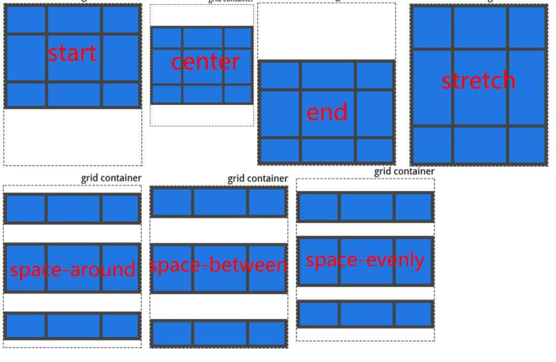
Sometimes total sizes of grid might be smaller than the size of the grid container, this happens when size of grid columns/rows are defined with non-flexible units such as px. When this happens you can use justify-content values to move grid items in main-axis (horizontal direction)
- start - moves grid items to the start edge of the grid container
- end - moves grid items to the end edge of the grid container
- center - moves grid items to the center of the grid container
- stretch - makes resize grid items to let grid to occupy full width of the grid container
- space-around - creates equal space in between grid items but half of that space in both edges
- space-between - creates equal space in between grid items but no space in both edges
- space-evenly - creates equal space both in between and in edges of grid items

align-content
Sometimes total sizes of grid might be smaller than the size of the grid container, this happens when size of grid columns/rows are defined with non-flexible units such as px. When this happens you can use align-content values to move grid items in cross-axis (vertical direction)
- start - moves grid items to the top edge of the grid container
- end - moves grid items to the bottom edge of the grid container
- center - moves grid items to the center of the grid container
- stretch - makes resize grid items to let grid to occupy full height of the grid container
- space-around - creates equal space in between grid items but half of that space in both edges
- space-between - creates equal space in between grid items but no space in both edges
- space-evenly - creates equal space both in between and in edges of grid items

place-content
Place content property is shorthand for using justify-content and align-content in single declaration. the first value is align-content and the second value is jusfity-content. And if use only single value, it will be applied to both main and cross axis
Implicit and Explicit tracks
So columns and rows can be create in 2 ways
-
Explicit tracks which is columns and rows that we awaringly created with following properties
- grid-template-columns
- grid-template-rows
- grid-template-areas
Implicit tracks are created for example when you create 3 columns grid but there are more grid items than that. When this happens rows are created implicity to accomadate other columns.
grid-auto-flow
Wheter implicit rows or columns created controlled by grid-auto-flow property which accepts following values
- row (default) - so this is default value that's why rows are created when grid items exceed created grid columns
- column - and when you set value to column, implicit columns are created. For example if you create 3 columns but there are 10 grid items, they all are placed in single row, creating scroll. That's why default value is row and it should stay in that unless needed
- dense - it fills in holes that bigger grid items created in grid with smaller grid items that come up after grid items those created the holes NOTE: dense only changes visual order but is very bad for accessibility
grid-auto-row
It sets height of the implicitly created row and the most used way of using it as following
- grid-auto-row: minmax(200px, auto); So here we setting height of the implicit row track to be at minimum 200px and if grid items height gets larger than it height of the row can be as large as it needs to be
grid-auto-column
With this property we set the width of the implicitly created grid columns and we can use minmax() function as we used in above
Grid Item properties
NOTE - following properties do not work on grid items: float, display: inline-block, display: table-cell, vertical-align and column-* properties have no effect on a grid item.
justify-self
justify-self property override justify-items property in grid container and moves grid item inside cell in main axis(horizontal direction). And when moving inside cell width of the grid item will be its content and its padding
- start - moves grid item to start of the cell
- end - moves grid item to the end of the cell
- center - moves grid item to the center of the cell
- stretch - (default) grid item occupies the whole width of the grid cell

align-self
align-self property override align-items in parent and moves grid item inside cell in cross axis(vertical direction). And when moving inside cell width of the grid item will be its content and its padding
- start - moves grid item to the top of the cell
- end - moves grid item to the bottom of the cell
- center - moves grid item to the center of the cell
- stretch - (default) grid item occupies the whole height of the grid cell

place-self
place-self is shorthand for justify-self and align-self. if the second value is omitted the first value applies for both directions
grid-area
Grid area property is used for two purposes
To specify grid-area-name to be used in grid-template-areas in parent container to layout grid items in grid
grid-area: header
grid-area: footerTo combine grid-column-start/grid-column-end grid-row-start/grid-row-end into single declaration
grid-area: grid-row-start/grid-column-start/grid-row-end/grid-column-end
grid-area: 1 / 1/ 5 / 3


