 Mads Stoumann
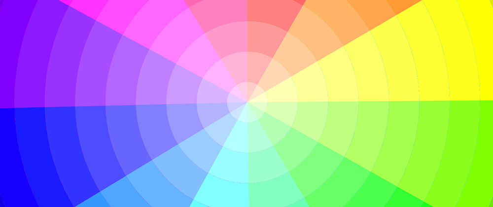
I've built a handful of color pickers through the years, so when I in this book stumbled upon a color-wheel with “built-in” shades and tints, I had to code it:

At first, I thought: “That's easy – it's just a conical gradient with hard stops for the colors, and a radial gradient for the tints and shades”.
But, alas, look at how “un-crisp” the edges in the conical gradient are (Chrome, MacOS):

So – I had to do it in <svg>.
Each “ring” in the circle is built up by 12 circles with different colors and stroke-dasharray:
<g id="wheel">
  <circle class="c3" cx="16" cy="16" r="16"></circle>
  <circle class="c2" cx="16" cy="16" r="16"></circle>
  <circle class="c1" cx="16" cy="16" r="16"></circle>
...etc
And the CSS:
--u: calc(100 / 12);

.c1 {
  stroke: hsl(0, var(--s), var(--l));
  stroke-dasharray: var(--u) 100;
}
.c2 {
  stroke: hsl(30, var(--s), var(--l));
  stroke-dasharray: calc(2 * var(--u)) 100;
}
.c3 {
  stroke: hsl(60, var(--s), var(--l));
  stroke-dasharray: calc(3 * var(--u)) 100;
}
/* ... etc */
The circles are wrapped in a <g>-tag with id="wheel", so I can use <use> (pun intended) to clone the rings:
<use href="#wheel" class="r3" />
<use href="#wheel" class="r2" />
<use href="#wheel" class="r1" />
etc...
Each ring-class then sets a different --l (lightness) and stroke-width:
.r1 {
  --l: 40%;
  stroke-width: 3;
}
.r2 {
  --l: 45%;
  stroke-width: 6;
}
/* ... etc */
In the final result I've chosen more tints than shades, so it's not as dark as in the book-example. Firefox has issues with setting some svg-attributes in CSS, so check it out in Chrome, Edge or Safari:
Let's have some fun!
How about rotating those color rings – or changing the saturation? Scroll down to see and try the controls, if they're not at the top of the Pen:
To have an automated animation, animating the --r custom property, we need to register a Custom Property:
@property --r {
  syntax: "<angle>";
  initial-value: 0deg;
  inherits: false;
}
And the animation:
@keyframes rotate {
  100% {
    --r: 360deg;
  }
}
Resulting in this (you need Chrome/Edge with Houdini):
Don't stare at it too long – or you'll be hypnotized!
Thanks for reading!


