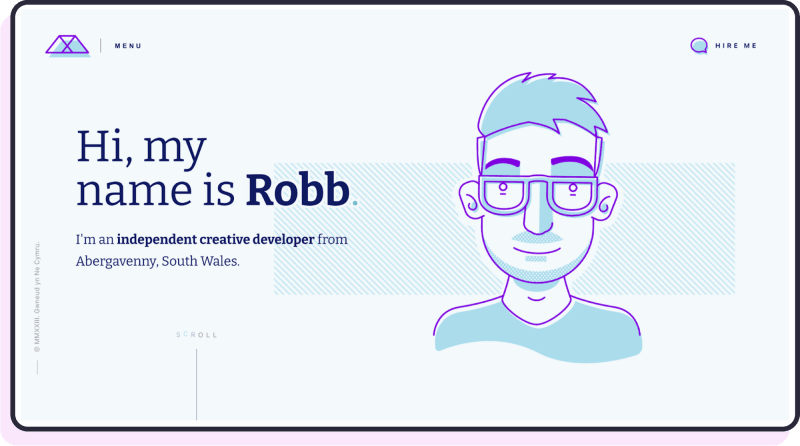
There are many decisions that a recruiter makes while evaluating your application for your first junior developer role.
Do you have the personality and capacity to confront technical challenges? Do you have a genuine passion for coding and the dedication to improve despite not having professional experience?
Your secret weapon to convince them?
An amazing web developer portfolio.
A web developer portfolio is a showcase of who you are. It shows recruiters that you have the right skills, enthusiasm, and desire to complete technical challenges. It's your opportunity both to impress them and standout from another dozen of candidates in the hiring process.
If you're ready to create your web developer portfolio and yet you don't know how to turn it into something beautiful, this article is the only resource you will ever need.
I've gone through dozens of forums, portfolio directories and design websites to find the most stunning, yet unseen portfolios for you to take examples from.
Let's dive deep into them now and find out what makes them great.
Do I really need a web developer portfolio?
No. A web developer portfolio is not a requirement to be hired for a junior position. However, missing one means missing a tremendous opportunity to prove to recruiters your skills and dedication to the role despite your lack of professional experience.
Without one, you're limited to your words during the interview process, and as always, showing your skills is better than telling them.
What Should I Know Before Creating My Web Developer Portfolio?
Before diving into creating your own web developer portfolio, keep in mind the following fundamentals:
- Display only your best work: don't mind using your first program where you used a while loop. Your portfolio is a place to show complete, meaningful projects. Also remember: you don't need a dozen of significant projects. Usually, two to four is a perfect balance.
- Use your name as the domain's name: this is the absolute best way to make sure you're found during the interview process when recruiters search for you on Google.
- Include a contact form: to make sure recruiters can easily contact you.
- Add honorable mentions: if somebody mentions your work in a publication or praises you online for it, mention it in the portfolio. There's no better way of selling yourself than social proof.
- Do not use tutorial projects: your portfolio should be a place for originality, so don't use projects from Udemy courses or YouTube tutorials. It might surprise you how many devs do and how easily recruiters will spot that.
⚠️ Important note: while a great web developer portfolio can help you a long way in your career search, a bad one will for sure damage your image in the eyes of recruiters. So always strive for a website that is looking beautiful, both on mobile and desktop, which you maintain regularly. You never want recruiters to click on your portfolio only to find a 404-page error.
Our Top 30 Stunning Web Developer Portfolio Examples
Let's know deep dive into our favorite portfolio examples for you to take inspiration from.
Our top 30 stunning web developer portfolio examples
Let's know deep dive into our favourite portfolio examples for you to take inspiration from.
Safet Pojskic
I love the simplicity of Safet's portfolio. He follows a classic structure of an introductory line + nice photo of himself. He also placed a contact button as a call to action, which is very smart as it directs website's visitors to their next step when interacting with him.
After listing his skills, he also gives recruiters the opportunity to download an updated version of his CV with a button click.
I really enjoyed the particle animation they used for the background of the portfolio, adding a sense of dynamic to a spotless color palette, using simply black, red and white.
Tip: if you want to implement particles effect in your portfolio too, you can use Anime.js as Safet did.
Ben Scott
Ben's description of himself is uncomplicated. His portfolio is very similar to Safet's one in terms of background effects and palette colors. I loved his choice of displaying his skills as images and, most of all, all his projects list a live link to test the final result, allowing recruiters to visualize his work without having to pull down the project from GitHub.
Tip: want to create a dynamic lightning background like Ben? He usedHTML's canvas API for that.
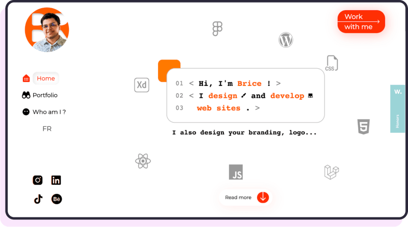
Brice Clain
Brice's portfolio feels alive thanks to the animation he placed across the whole page. Visiting this website feels like having a conversation with him, where he explains the history behind each one of his projects and how they came to life. A really memorable experience for the eyes.
Tip: Anime.js is the library behind his typewriting effects on the text.
Iuri De Paula
The first time I visited Iuri's portfolio, I realized how a beautiful web design mixed with storytelling can make for a masterpiece website. His portfolio is an award-winning experience, where he guides you step-by-step through his career via stunning graphics and scrolling effects.
Tip: want to create a portfolio just like Iuri? The code for his website is open-source, and you can find ithere.
Uroš Ignjatović
Despite Uroš portfolio's simplicity, he did an amazing job of creating an elegant website with a traditional black and white color palette and an amazing font choice.
Tip: the font used for this website is called "Segoe UI".
Bruno Figueiredo
Bruno's portfolio is a visually appealing website. This is possible thanks to a pleasant choice of the color purple, a great illustration to welcome visitors, and various nice scroll effects spread across the page.
Tip: if you want to adopt this website's scroll animations, you can use a library called AOS.
Hakim El Hattab
If you want your portfolio to be uncomplicated, you can opt for the approach used by Hakim. He composed this website with a simple description of himself plus links to his work, making it for an easy yet effective way of displaying who he is to potential employers.
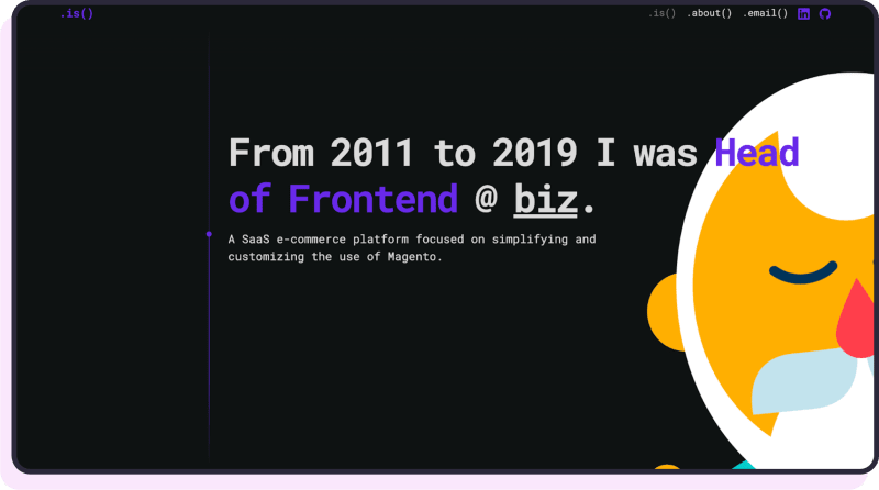
Jeremy Thomas
While this is not exactly a developer portfolio aimed at getting hired for the first time, it still uses a lot of great ideas you can integrate into your design. First, Jeremy lists the company he worked with, which fits perfectly in with the principle of using, when available, social proof to impress visitors.
In addition, his case study section is a magnificent example of presenting yourself as a professional. He lists every challenge he faced for each client, the solutions he adopted, and why. An approach you can use for your portfolio too.
✅Pro Idea: Don't just show your project, talk about them. Create case studies around your work, explain your challenges, choices you made and the tradeoffs you had to come up with, it will impress recruiters and give you a huge help during the interview process.
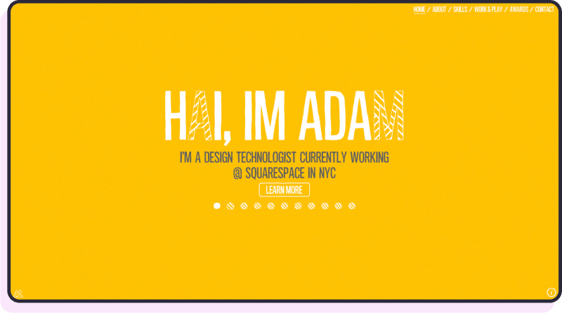
Adam Hartwig
I loved this site from the first moment I laid my eyes on it. The lively color palettes welcomes its visitors into a memorable experience, where nothing is trivial, from the animations to the way its author Adam uses them to describe his skills. I'm sure he had fun creating this portfolio, and that reflects perfectly into this piece of work.
Tip: Textillate.js is the text animations library you can use to animate your texts like Adam did.
Timothèe Roussilhe
This website is very simple, yet memorable thanks to a choice of colors that add an artistic aura to Timothèe's portfolio, making it very stylish and notable in the panorama of dev portfolios.
✅Pro Idea: not sure about which color palette to use for your website? Check out this free color palette generator here.
Adam Greenough
Adam's portfolio is simple. He uses a beautiful color and a moving background to make the website look more lively. He has some amazing projects listed, and I really appreciated his listed coding blog posts, which increase Adam's credibility as a professional.
Tip: Vanta.js is the library used for the background effects.
✅Pro Idea: if you ever wrote technical blog posts during your path to learn coding, add them to your website. Recruiters love to see this kind of community engagement and efforts. Actually, I landed my last dev job also thanks to my contribution online on Medium!
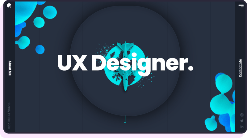
Andy Patrick
As a UX designer, Andy uses a very creative approach to narrating his story, with an airplane landing through the various stages of his career, making this portfolio remarkable thanks to this minor detail, despite his simplicity in other sections.
Tip: to create loading effects as cool as Andy's portfolio, Loading.io is an impressive library I discovered for this purpose.
✅Pro Idea: sometimes a memorable animation is everything needed to make a portfolio easy to remember.
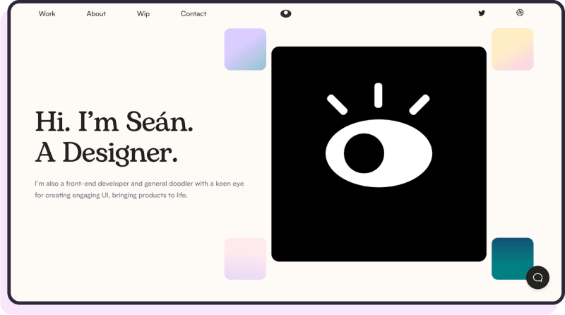
Sean Halpin
This portfolio is my favorite on the entire list. The palette of pastel colors is delightful, the "Bogart" font makes the whole page look slick, and the above the folder content has the genius touch of an eye animation looking at the text, directing the user's eye where Sean wants.
The author describes his work with amazing case studies, where he shows the entire process of creating a project, including his personal notes and sketches. A true masterpiece thanks to his care for details and overall look.
Tip: You can also create a moving eyeball in CSS using this tutorial.
Gilles Vermeulen
Despite Gille's portfolio comprising a single series of scrolling images and descriptions, he went big on creativity, with this animated character head opening to reveal all his cool projects and a background effect. A very witty approach to showcase his work in a fun way.
✅Pro Idea: never be afraid of showing personality on your portfolio, whether that's via a witty copy or an image of yourself.
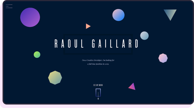
Raoul Gaillard
What impressed me the most about Raoul's website is his elegance in using colors, and the way he presents every detail beautifully thanks to amazing parallax effects, 3D images and a 3D matrix's background that will make you feel as if the website is constantly moving.
Tip: Here's an amazing guide on creating 3D-looking images with CSS. Here you can find a guide to the 3D matrix in HTML for the background effects used by Raoul.
Sean Wilson
Sean's portfolio is a minimalist website. Yet, what makes it worthy of notice is his use of great copy to catch his visitors. Instead of simply presenting himself, he targets the specific audience of people in need of a website's redesign, explaining how he can help them and why he's the solution to their problem. A great example of how a well-thought copy can increase your portfolio's effectiveness.
Eli.wtf
Eli describes himself as a developer who loves creating weird websites, and his portfolio is a perfect example of that. The website has a high visual impact thanks to an initial moving skull animation, with quirky animations leading you from one page to another.
He also lists the conferences he took part in as a speaker for added credibility, besides an amazing use cases section where he describes how his clients benefited from his work. Truly an amusing experience as a website.
Tip: the animations on the website were made using HTML's canvas API. I found also a CodePen explaining to you how to create a moving head animation like his, here.
Lucas Bebber
This portfolio is proof of how simplicity, when accompanied by great visuals can make for an amazing portfolio. The initial image of moving mountains make the whole project feel alive, and it welcomes users to the projects created by Lucas and live demo links to try them.
Tip: here's a tutorial on creating moving mountains like Lucas did.
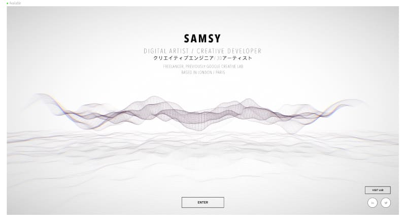
Samsy.ninja
Samsy's portfolio opens with a stunning effect of moving lines and a minimalistic color palette made of gray colors. I loved his approach to transitioning between sections by creating a zoom-in effect, rather than a classic scroll. Plus, every use case he lists has videos attached to it, making the experience a delight for the eyes.
Damien Seguin
Damien describes himself as a creative developer, and that shines clearly through his portfolio. This website speaks volumes about the artistic personality of the author, showcasing his work in an easy yet remarkable way, with beautiful use cases built around his projects and great images to give the whole thing a retro, artsy look.
Luigi de Rosa
Luigi adopted quite an unusual color palette for his portfolio, making the result truly distinctive. Bubbles animations also helped the entire website to achieve an impressive and admirable ultimate effect.
Tip: The bubbles on this website were realized using translate3D in CSS.
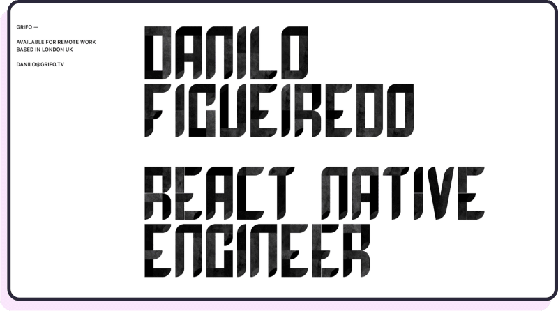
Danilo Figueiredo
Danilo chose a text only approach to welcome users into his portfolio, which I found quite effective thanks to a great font choice (SF pro). I also appreciated his idea of mentioning the tech stack he used for each one of his use cases.
Riccardo Zanutta
This portfolio feels rich thanks to many small details: the rotating background matrix scattered with geometric figures, the beautiful and colored loading states, the detailed case studies (which list also the color preferences adopted for the clients), plus an experiments section which is a great idea to display creativity and willingness to try, the very essence of a developer.
Tip: I found no specific info about the effects implementation on this website, but matrix3D should do the trick.
Prashant Sani
I find the most beautiful thing about this portfolio is its synthwave palette, which is helped by amazing animations to display texts and loading states, plus motivational quotes placed carefully to reflect the personality of Prashant and his work.
Tip: The images on this website were realized using translate3D in CSS.
Matt Farley
Matt's portfolio has a very simple above the folder content, with a witty description of himself and a nice illustration as a profile pic. I enjoyed how he described his skills using a table rather than classing images. He also lists the companies he worked with and specifies his coding experiments, which adds for added respect for him for showing he's a truly passionate developer.
✅Pro Idea: got some extra cool experiments you tried you could mention on your portfolio? Do it. Always show creativity and inventive .
Rob Owen
Rob's portfolio palette makes the entire website feel light and lively. What I appreciated the most about his work was the way he described himself and his work policy, opening up to his personality and adding charisma to the character. His projects section is amazing thanks to relevant projects he created, like Syntwave 84, the popular Visual Studio Code extension.
Tip: try Befunky to turn your website into drawing illustrations.
Michael Pumo
Michael set up a great color palette for his website, adding a unique touch to it thanks to a scrolling effect which shows you his project while keeping his description of himself always highlighted. In addition, I really appreciated his choice of images for his projects, which he accompanies with reviews and logos from his clients to show his expertise.
Tip: If you're interested in checking out the source code for this portfolio, check it out here.
Omar Moquete
Omar's portfolio is easy in its structure, yet very polished and with an amazing animation of an IDE greeting visitors, which is what made this creation memorable for me.
Tip: If you're interested in how he realized his project, you can visit his open source portfolio project here.
Ahmed Zougari
Ahmed's portfolio feels smooth, with a description of himself and a great photo. What makes it standout is his choice of the font "Fingerprint", which makes the entire website feel playful and minimalistic, thanks also to a classic black and white palette.
Alex Michailidis
What I loved the most about interacting with Alex's award-winning portfolio was its storytelling. You can follow through with it and click on each one of his experiences to get a full description of what he did. Plus, this website gave me nostalgic feelings, with its color palette reminding me of a Linux terminal, really a well-done creation.
Tip: Anime.js is the library behind this website's animations.
The key takeaways from these portfolios
- Top portfolios always have a beautiful above the folder content, with a description of the author plus their image or illustration, and a nice background.
- Slick animations placed around portfolios make them memorable.
- Aim for a minimalistic color palette to make your web developer portfolio look neat and elegant.
- Most portfolios are usually a Single Page Application, with the possibility of scrolling to view through the different sections.
- Most portfolios list around four projects.
- Build case studies around your portfolio, explain which challenges you faced and how you went about solving them.
- Remember to always list your skills, but never use percentages to describe your knowledge of a programming language. More info about this common error here.
- Add testimonials if you have them available.
Conclusion
Creating your web developer portfolio is a serious task, but it all becomes worth it once you have a beautiful website showcasing your personality and skills to potential recruiters, becoming your secret trick to standing out during the hiring process.
P.S: do you need a free video guide on how to create your web developer portfolio? We have created one for you here.


