CSS
So I decided to add CSS to my game to make it look a bit better.
Problem is, I'm not that great at CSS, so I tried as much as I could.
First I created a file called style.css in the folder static and then gave it a url in app.py:
@app.route("/style.css")
def stylecss():
  return send_file("static/style.css")
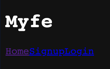
After that I linked the css file to every HTML page, by doing the code below:
<link href="/style.css" rel="stylesheet" type="text/css" />
Then I added some simple dark mode code in the CSS file:
body {
  background-color: #121212;
  color: white;
  font-family: 'Source Code Pro', monospace;
  scroll-behavior: smooth;
}
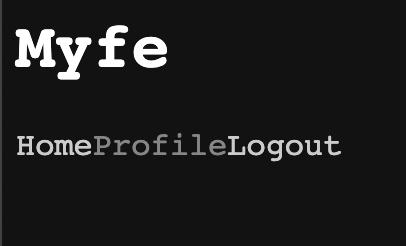
which gave the background a dark grey colour, made the text colour white, gave the text have the Source Code Pro font, add gave the page a smooth scroll-behavior, just incase I needed it for the later.
The output looked like this:
So I decided to work on the links and added the following code:
a {
  text-decoration: none;
  color: rgb(206, 203, 203)
}

a:hover {
  color: rgb(136, 133, 133)
}
and that gave the output of:

with the Profile link being hovered.
The navbar didn't look that good, so I added the following code to make it look better:
.navbar {
  text-align: center;
  overflow: hidden;
  border-bottom: 1px solid #2b2a2a;
  background-color: #121212;
  position: sticky;
  top: 0;
}

.nav-link {
  font-weight: bold;
  font-size: 14px;
  text-transform: uppercase;
  text-decoration: none;
  color: rgb(204, 206, 209);
  padding: 20px 0px;
  margin: 0px 20px;
  display: inline-block;
  position: relative;
  opacity: 0.75;
}

.nav-link:hover {
  opacity: 1;
}

.nav-link::before {
  transition: 300ms;
  height: 5px;
  content: "";
  position: absolute;
  background-color: rgb(204, 206, 209);
}

.nav-link-ltr::before {
  width: 0%;
  bottom: 10px;
}

.nav-link-ltr:hover::before {
  width: 100%;
}
That gave me the output of:
with the Profile link being hovered on.
That looked much better!
And for the finishing touches I changed the text-align of the header to the center:
.header {
  text-align: center;
}
Now it looks like:
Yay! Next time I'll be working on the Python part and MongoDB.
Thanks for reading and if you liked it make sure to follow me!


