Learn JavaScript is my flagship JavaScript course. It helps people go from knowing nothing about JavaScript to becoming a professional JavaScript developer.
Today, I want to share with you how I designed Learn JavaScript's course portal.
The lessons page
I started by designing the lessons page because most of your time would be spent on the lessons if you're going through a course.
Each lesson in Learn JavaScript is an article. They contain images, gifs, videos, and code blocks.

I started by choosing the typeface for the body text. This was easy for me because I knew I wanted to use Adelle Sans. I chose Adelle Sans because I wanted the course portal to mirror the product page (which uses Adelle Sans).
Font size
I used a large font-size for the body text because I want students to have an easier time reading the course. After playing around with different sizes, I eventually decided on the following sizes:
- 18px on mobile
- 25px on laptop
I set the line-height to 1.4 for both viewports. This line-height was enough since I limited the measure to 32em (which is approximately 64 characters).
Layout
I wanted a single-column layout for students to focus on the course contents.
I had two choices here:
- Align the column in the middle (like Medium style)
- Align the column closer to the left edge (like this blog)
I chose to align the column closer to the left edge because the left edge had a strong alignment (caused by the left edge of the screen). This strong alignment allows readers to find the start of the next line easily. (which makes it easier to read).
The extra whitespace on the right creates breathing room as well.
Headings
When I wrote Learn JavaScript, I consciously limited headings to h2 and h3 to keep lessons concise and understandable. I realised that adding a h4 into a lesson makes it difficult to understand. When I had a h4 in the lesson, I knew it's time to break it up into two lessons.
This meant I only had to design for three heading levels: h1, h2, and h3.
h1 was easy. I used a large (but workable) font-size to draw attention. While creating h1, I also toyed around with using Adelle Condensed, but I decided that Adelle Sans was good enough. There was no need to introduce another typeface.
h2 was easy as well.
h2 is the main separator between sections of text. I chose to set h2 at a larger font-size and bolder font-weight to separate it from body text.
I also added more whitespace to above each h2 to separate sections of text. This allows users to associate h2 with the next set of content.
h3 is a subheading. It needs to be significantly different from h2 so students immediately tell that the h3 is a subheading. At the same time, it needs to have enough contrast with the body text.
h3 was hard. It wasn't enough to change the font-size and font-weight. The contrast wasn't enough if I changed only font-size and font-weight. I needed a different way to accentuate the h3.
I had to work on other elements before coming back to it.
Eventually, I went with a gradient underline. I'll explain why I did this below.
Code
You need to use a monospace typeface for all code-related stuff. Here, I went with Dank Mono because I use it as my main coding font. And I liked it.
I'll talk more about I designed inline code and code blocks in the "colors" section below.
Other elements
I had to create lists and figures for the page as well. They're pretty standard so I don't think there's a need to say more.
Colors
When I choose colors, I start by thinking about the message I want to convey to the user. In this case, I wanted to tell the user that JavaScript can be fun and easy to learn.
Yellow comes to mind when I think of fun. Yellow is bright, has high energy, and conveys a sense of optimism. So I chose yellow as my primary color.
It also helped that JavaScript is usually associated with yellow. (No idea why though).
Color for links
Besides fun, I wanted to emphasise on the importance of fundamentals. When I think about fundamentals, I think about origin and history.
If you trace the web back to its starting point, you'll know that links were blue in color. I wanted to retain this "blueness" as a sign of the fundamentals.
Picking colors from Refactoring UI
I'm serious! I followed Steve Schoger's advice on building color palettes for this project.
On top of the primary colors we chose, we also need these colors:
- A neutral color
- Green for success
- Yellow/orange for warnings
- Red for errors
Steve suggested we should create 9 different shades of each color we use.
I didn't have the luxury to pick colors from scratch for this project. I only gave myself a week to design and build the course portal.
So I grabbed one of the color palettes Steve created for Refactoring UI. I looked for one that contains blue and yellow.
The yellow hue was different from the one I wanted, so I had to tweak most of the yellows a bit.
Gradient links
Speaking of links, I got to tell you about gradient links.
I love the gradient links in CSS Trick's redesign. When I saw them, I told myself I'm going to try using gradients for my links in the next project. This next project happens to be Learn JavaScript's course portal.
Here's the links I created:
Notice I used orange and yellow for the gradient. I did this because yellow is hard to work with. Darker shades of yellow were muddy. It doesn't convey the vibrancy and energy that I wanted. So I went with orange instead.
I wrote how I created these links in a separate article if you want to replicate them.
Text color
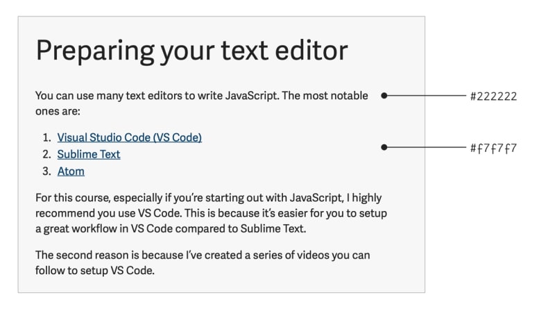
I wanted to use a light background with dark text because it's easier to read.
However, the contrast between black and white is too strong. Many people choose to reduce the contrast by using a dark grey text on white background.
I chose to reduce the contrast further by setting a light grey background. This eases the strain on the eyes, which allows my students to concentrate for a longer period.
Inline code
Inline code requires a boundary. I can either create this boundary with background-color or border. In this case, since my primary color was yellow, I decided to try a light yellow background.
I was quite happy with the result.
Code blocks
Code blocks require syntax highlighting. Here, I went with Dracula because the emotional temperature of the colors match what I'm trying to convey. They're bright and kinda funky.
Circling back to h3
Since I used gradients for links, I thought about trying gradients to emphasize h3. I was surprised by the results. It looked good.
There are three reasons why it looked good.
First: The colors from the orange-yellow gradient created enough contrast so the h3 stands out from h2 and the body text.
Second: I needed to repeat yellow to convey the "fun" message I was trying to convey. There were enough h3 elements around for this repetition.
Third: Repetition breeds familiarity. It unites a design. You should repeat things as much as possible. (This is also why Vertical Rhythm is an important design principle). I decided to use the greater unifying principle across the site.
Since the gradients looked so good with the h3, I decided it add another gradient to separate the lesson and the navigation.
That's all the considerations I made for the lessons page. Next week, I'll share how I created other pages.
Thanks for reading. This article was originally posted on my blog. Sign up for my newsletter if you want more articles to help you become a better frontend developer.


