Hello Fellow Codenewbies 👋
We've learned in the previous post that applying display: flex to a flex container by default will turn flex items into columns.
And when the total width of flex items is bigger than the container, they will stretch to fit the horizontal axis of the flex container.
There could be a case where we have extra space when the flex container's width is bigger than the total width of the flex items as below:
Spacing Out The Columns With Flexbox
How to give space to the columns so the layout would fall nicely into places?
There is a property that controls the space on the main axis (horizontal position) of a flex container.
That property is justify-content.
📝 Note:
We always put flex properties in the same place where we assign display: flex.
The Values of justify-content
space-between
What it does is it takes the extra space, divides it, and put them between the columns.
⭐ This value is commonly used to space out columns.
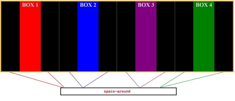
space-around
It does the same as space-between, but the difference is that it puts the extra space around a column.

I draw partitions so you can see the spaces on the left and the right of each column.
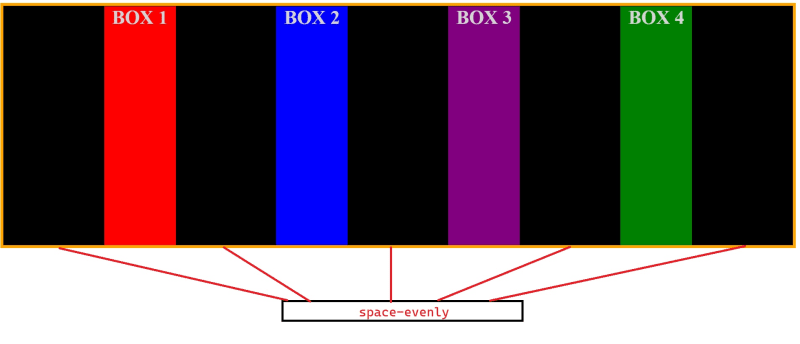
space-evenly
Visually space-evenly makes the layout look balance because it divides and puts the extra space evenly.
Now, what if we want to position all of our columns on one side and not worrying about the space?
flex-start
This is the default value of justify-content.
It makes the columns positioned to the left (start) of the flex container.
center
As the name stated, it is positioned the columns to the center of the flex container.
flex-end
It is positioned the columns to the right (end) of the flex container.
Conclusion
-
justify-contentproperty works with main axis (horizontal position) and is used to space out columns in a flex container. - When we care about spacing for the layout, we can use one of these values:
- space-between
- space-around
- space-evenly
- When we are not worrying about spacing and want to position the columns on one side, we can use one of these values:
- flex-start (default)
- center
- flex-end


