In this short tutorial, we’ll look at how we can integrate Storyblok into a React application with the help of the new @storyblok/react, the official Storyblok React SDK. We will see how we get the data from Storyblok and how we enable Storyblok Bridge to preview live changes in the Visual Editor.
HINT: You can find the final code for this tutorial in this repo.
Requirements
Here are a few requirements to follow this tutorial:
- Basic understanding of React and Javascript.
- Node.js LTS version (npm or yarn installed).
- A Storyblok App account for creating project in Storyblok.
Project Setup
Start by creating a new React Project.
npx create-react-app storyblok-react-boilerplate
Then install the package @storyblok/react. This is the only package needed for this tutorial.
cd storyblok-react-boilerplate
npm install @storyblok/react
# yarn add @storyblok/react
The package @storyblok/react allows us to set up everything. It helps us get the data from Storyblok, loads Storyblok Bridge for real-time visual updates, and provides us with a storyblokEditable function to link editable components to the Storyblok Visual Editor.
Once the packages are installed we can start our development server.
npm run start
# yarn start
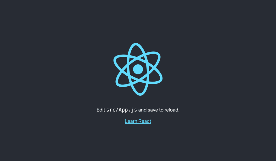
It should open a tab in the browser automatically with the url http://localhost:3000, or we can manually go to the url after the project starts running. You should see this screen.
If you’re using Storyblok V2, you will need to setup the dev server with an HTTPS proxy. We will use port 3010, so the url to access the website will become https://localhost:3010/
HINT: If you don’t know how to setup an HTTPS proxy on macOS, read this guide.
Space Configuration
Now create a new space in the Storyblok App by clicking "+ Create New". Select the first option to start from scratch {1} and then give it a name {2}.
We will get a space with sample content already created for us. After this, we need to configure our Visual Editor to get the live preview of our website. For this, go to Settings {1} > Visual Editor {2}, and set the Location (default environment) {3} to https://localhost:3010/.
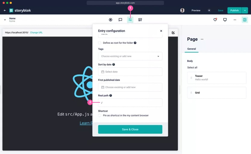
Now go to the Home Page from the Content section. You should already see our React app. Click on the Entry Configuration {1} and set the Real Path {2} to “/”. This will be useful later when we get the data depending upon the slug.
We can also see some of the components created for us on the right-hand side, which we will create later in our app.
Connect React to Storyblok
Connect the React Application to Storyblok with the help of the SDK. We use two things from the package in the index.js file storyblokInit and apiPlugin. We need to add the following code to the index.js file.
// index.js
...

import { storyblokInit, apiPlugin } from "@storyblok/react";

storyblokInit({
  accessToken: "YOUR_PREVIEW_TOKEN",
  use: [apiPlugin],
  components: {}
});

...
storyblokInit allows us to set up the connection with the space and also loads the Storyblok Bridge, which helps us to see the real-time changes when editing the content. The apiPlugin here helps us get the data. If you don't want to use apiPlugin, you can use your preferred method or function to fetch your data.
We have a components key here to declare all the React components that we need to create, according to the ones we have in our space. These components are dynamically rendered with the StoryblokComponent which we will see in a bit. We need to keep the names the same at both places for it to work while creating the components.
Get the preview token and replace the value at accessToken. To do this, go to Settings {1} > Access Tokens {2}, and copy the Preview access token.
To get data and dynamically load it, change the code of app.js to the following:
// App.js
import { useStoryblok, StoryblokComponent } from "@storyblok/react";

function App() {

  let slug =
    window.location.pathname === "/"
      ? "home"
      : window.location.pathname.replace("/", "");

  const story = useStoryblok(slug, { version: "draft" });
  if (!story || !story.content) {
    return <div>Loading...</div>;
  }

  return <StoryblokComponent blok={story.content} />;
}
export default App;
Here we use useStoryblok after getting the slug, which helps us get the new story every time we change anything in the editor. It has three parameters, the first one being the slug. The second parameter is the apiOptions where we have all of the API options for getting the data, and the third one is the bridgeOptions which is optional for configuring the bridge.
| Parameter | Description |
|---|---|
| slug* | The first parameter of type string. Slug of the required story |
| apiOptions* | The second parameter of type object, for configuring the API options |
| bridgeOptions | This is an optional parameter of type object, for customizing the bridge options. |
We also see StoryblokComponent in action here. It can be used anywhere in the code to render the React components we created according to our space. We can pass the content for a story with blok prop. For this to work, it’s important to list them in storyblokInit.
In Storyblok, the content is structured as components. As we already have some components created in our space, let’s create those in our React app. This allows us to reuse the components dynamically.
Creating Components
When we create a new space, the default components are: Page, Teaser, Grid and Feature. Now create the mentioned components in our app.
In the components folder:
// Page.js
import { StoryblokComponent, storyblokEditable } from "@storyblok/react";

const Page = ({ blok }) => (
  <main {...storyblokEditable(blok)}>
    {blok.body
      ? blok.body.map((blok) => (
          <StoryblokComponent blok={blok} key={blok._uid} />
        ))
      : null}
  </main>
);

export default Page;
We also use a storyblokEditable function from the SDK. It allows us to mark the react component editable in the Visual Editor. With the help of this function, we can click the components in the Visual Editor and easily edit them. Hence we will use this for all the Storyblok components.
// Page.js
import { storyblokEditable } from "@storyblok/react";

const Teaser = ({ blok }) => {
  return <h2 style={{textAlign: 'center'}}
    {...storyblokEditable(blok)} >{blok.headline}</h2>;
};

export default Teaser;
// Grid.js
import { StoryblokComponent, storyblokEditable } from "@storyblok/react";

const Grid = ({ blok }) => {
  return (
    <div style={{display: "flex", justifyContent: "space-around"}}
      {...storyblokEditable(blok)} className="grid">
      {blok.columns.map((blok) => (
        <StoryblokComponent blok={blok} key={blok._uid} />
      ))}
    </div>
  );
};

export default Grid;
// Feature.js
import { storyblokEditable } from "@storyblok/react";

const Feature = ({ blok }) => (
  <div {...storyblokEditable(blok)} className="column feature" >
    {blok.name}
  </div>
);

export default Feature;
Now, just add these components in storyblokInit. It should look something like this:
// index.js
import { storyblokInit, apiPlugin } from "@storyblok/react";
import Page from './components/Page'
import Grid from './components/Grid'
import Feature from './components/Feature'
import Teaser from './components/Teaser'

storyblokInit({
  accessToken: "YOUR_PREVIEW_TOKEN",
  use: [apiPlugin],
  components: {
    page: Page,
    teaser: Teaser,
    feature: Feature,
    grid: Grid
  }
});
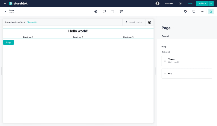
And that’s all! You should be able to see your content in the Visual Editor, now that you’ve unlocked the power of live editing. You can start playing with the content and see live changes. It should look something like this:
Wrapping Up
In this tutorial, you saw an overview of how to create and integrate a React Application with Storyblok with the help of the official React SDK. Additionally, you learned how to use the data and enable the real-time Visual Editor.
| Resource | Link |
|---|---|
| Demo Repository | https://github.com/storyblok/storyblok-react-boilerplate |
| React Docs | https://reactjs.org/docs/getting-started.html |
| Storyblok React SDK | https://github.com/storyblok/storyblok-react |
| Storyblok Visual Editor | https://www.storyblok.com/docs/guide/essentials/visual-editor |
| Storyblok JS Bridge | https://www.storyblok.com/docs/Guides/storyblok-latest-js |
| Storyblok React Hub | https://www.storyblok.com/tc/react |


