
 Chelsea Devereaux
ComponentOne FlexChart is a cross-platform .NET chart component supported in WinForms, WPF, UWP, WinUI, Xamarin, ASP.NET MVC, and Blazor. There’s even a JavaScript version. The API is mostly the same across each platform as it enables flexible customization of the chart.
In this blog post, we’ll look at how to customize the chart axis using C# (csharp). We will configure the axis line visibility, labels, tick marks, gridlines, title, and position. Plus, we will show how to group the axis labels, display multiple axes, and scale the axis with scrollbars.
In this post, we cover:
- Display or hide the chart axis line
- Display axis titles
- Manage overlapped axis labels
- Format axis labels
- Configure tick marks, gridlines and intervals
- Configure hierarchical axis grouping
- Change the axis scale
- Enable axis scrollbars
- Plotting multiple axes
Display or Hide the Chart Axis Line
FlexChart does not display the vertical axis line by default because it follows modern style trends that emphasize minimal design. This behavior can be changed by setting the AxisLine property of either axis to true or false.
The following snippet makes the y-axis visible in FlexChart:
flexChart.AxisY.AxisLine = true;

Figure 1 - Hide the chart axis line
Display C# Chart Axis Titles
All chart axes can be identified by a title that helps clarify the values being plotted. In FlexChart this can be done by setting the Title property of either axis. You can also customize the title’s font and color using the TitleStyle property.
The following snippet sets and styles the axis titles:
    flexChart.AxisX.Title = "Day of Week";
    flexChart.AxisX.TitleStyle.StrokeColor = Color.Blue;
    flexChart.AxisY.Title = "Amount - In Dollars";
    flexChart.AxisY.TitleStyle.StrokeColor = Color.Blue;
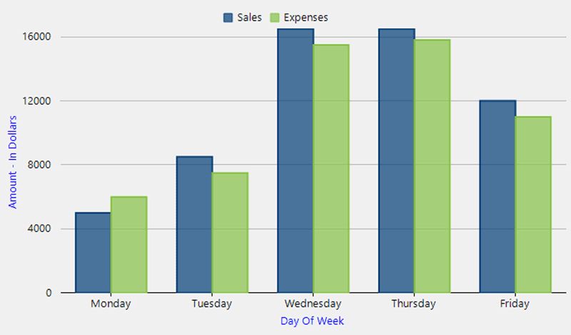
Figure 2 - Style the axis title
Manage Overlapping Axis Labels
A common problem when designing a modern chart with minimal design is loss of data. This happens when you have a chart with too many ordinal axis labels. A common solution is to hide overlapping labels, which results in a loss of data readability.
FlexChart is designed to provide flexible options for any scenario. It can show all the labels, rotate the labels, hide overlapping labels, trim or wrap long labels, and even stagger the labels to make the most readable chart.
Configure the overlapping axis label behavior in FlexChart by setting the axis OverlappingLabels property and the StaggeredLines property.
Overlapping options include: Show, Auto (hides to avoid overlap), Trim, and WordWrap.
    flexChart.AxisX.OverlappingLabels = OverlappingLabels.Show;
    flexChart.AxisX.StaggeredLines = 2;
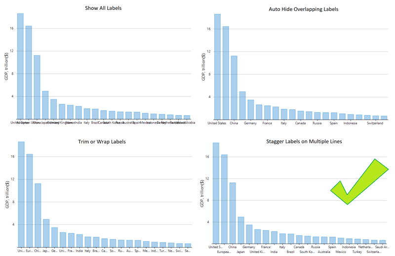 Figure 3 - Overlap or stagger axis labels
Additionally, you can rotate labels as well by setting the LabelAngle property. FlexChart even has a smart built-in feature where you can set the LabelAngle property to Double.NaN, and it will only rotate the labels when necessary.
flexChart.AxisX.LabelAngle = Double.NaN;
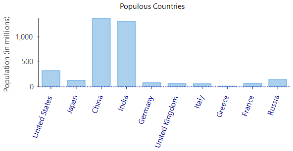
Figure 4 - Rotate axis labels
Format Axis Labels
You can present the axis labels in a variety of formats, including dates, currency, percentage or custom formats. This can be done by setting a .NET standard or custom format string to the Format property of the axis. The following table shows some common axis format strings that you can use in FlexChart.

Tip: to create a modern chart with minimal design, consider formatting long axis labels to display with fewer digits, such as displaying 40,000,000 million as 40M.
The following snippet shows a couple examples.
    flexChart.AxisX.Format = "MMM-dd-yyyy";
    flexChart.AxisY.Format = "C0";
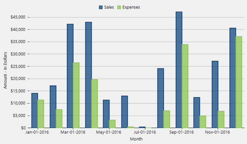
Figure 5 - Format date axis labels
Configure Tick Marks, Gridlines and Intervals
FlexChart lets you configure every element of the axis interval, such as the major and minor gridlines and tick marks. The following snippet shows how to set several of these properties.
    flexChart.AxisY.MinorTickMarks = TickMark.Outside;
    flexChart.AxisY.MajorTickMarks = TickMark.Outside;
    flexChart.AxisY.MajorGrid = true;
    flexChart.AxisY.MinorGrid = false;
    flexChart.AxisY.MajorUnit = 5000;
    flexChart.AxisY.MinorUnit = 1000;
    flexChart.AxisY.MajorGridStyle.StrokeColor = Color.Red;

Figure 6 - Style axis gridlines and ticks
Configure Hierarchical Axis Grouping
To visually organize axis labels by category or quarter, you can enable axis grouping. FlexChart supports flexible options from simple to custom. If your data set already has the grouping field, you can simply set the axis GroupNames property to the field name by which to group.
To display more than one group level on the axis, specify a comma-separated string to the GroupNames property.
flexChart1.AxisX.GroupNames = "Continent";
You can also customize the display of horizontal and vertical lines between the groups to further aid with the visualization.
 Figure 7 - Configure axis grouping
But there’s more! You can use hierarchical data by specifying the GroupItemsPath property of the axis. You can also provide axis grouping for numbers and dates that work with any data set.
To provide numerical and date axis grouping, FlexChart includes a custom IAxisGroupProvider interface and a couple samples to get started.
Check out this UWP axis grouping sample.

Figure 8 - Configure collapsible axis grouping
Change the Axis Scale
When you create a chart using FlexChart, it uses a linear axis scale by default. You can control the axis bounds by setting the axis Min and Max properties. You can also customize the scale to better meet your needs when the data is spread over a large range by configuring a logarithmic scale (log scale).
FlexChart will use a logarithmic axis when you set the LogBase property of the axis.
flexChart.AxisY.LogBase = 10;

Figure 9 - Create logarithmic axes
Enable Range Scrolling with Axis Scrollbars
Axis scrollbars allow the user to scale the axis and zoom into a chart on the fly. Axis scrollbars can be used to help visualize more data in a smaller space or allow a user to drill-down into a region of the plot without much additional coding from the developer.
With FlexChart, you can enable a range axis scrollbar with one line of code.
The range scrollbar is more than a standard scrollbar because it allows the user to adjust the scale of the axis to essentially “zoom” into the chart.
    // WinForms code
    AxisScrollbar scrollbar = new C1.Win.Chart.Interaction.AxisScrollbar(flexChart.AxisX);
    //WPF and UWP code
    flexChart.AxisX.Scrollbar = new C1AxisScrollbar();

Figure 10 - Add chart axis scrollbars
The steps to add the axis range scrollbar are a bit different for Blazor. Here’s the C# code and razor syntax:
    <FlexChart @ref="chart" Class="chart" ChartType="ChartType.Line"
               BindingX="Day" Binding="Value" ItemsSource="Data" >
        <SeriesCollection>
            <Series />
        </SeriesCollection>
        <AxisCollection>
            <Axis Position="Position.Left" AxisType="AxisType.Y" Scrollbar="sby" />
            <Axis Position="Position.Bottom" AxisType="AxisType.X" Scrollbar="sbx"/>
        </AxisCollection>
    </FlexChart>

    @code {
        C1.Blazor.Chart.Interaction.AxisScrollbar sbx = new C1.Blazor.Chart.Interaction.AxisScrollbar();
        C1.Blazor.Chart.Interaction.AxisScrollbar sby = new C1.Blazor.Chart.Interaction.AxisScrollbar();
        FlexChart chart;
        }
Plotting Multiple Axes
Mixing different scales with multiple axes and plot types is sometimes necessary to visualize your most complex data sets.
With FlexChart, you can visualize different chart types in a single plot area. Plots can share axes, or each have their own. You’re not even limited to two Y axes, as FlexChart can display any number of X or Y axes as shown below.

Figure 11 - Add multiple Y axes
In order to plot a series on the secondary axes, you can define its AxisX and AxisY properties as new Axis objects. Then, just set the axis position and other properties to customize the display. The axes get added to the chart once they’re assigned to a series.
    var yAxis2 = new Axis
    {
        AxisLine = false,
        Position = Position.Right,
        MajorGrid = false,
        MajorTickMarks = TickMark.None,
        Title = "Velocity – in m/sec",
        Format = "n0",
    };
    var series = new Series
    {
        SeriesName = "Velocity",
        ChartType = ChartType.Line,
        Binding = "Velocity",
        AxisY = yAxis2,
    };
    flexChart.Series.Add(series);
Download Chart Samples for Visual Studio C# .NET
Check out a live demo of these chart features, and more, in your browser using our FlexChart Explorer demos for ASP.NET Core and Blazor.
To try these features yourself in Visual Studio, and to see WinForms, UWP, WinUI and Xamarin samples, you can download our samples on GitHub using the links below. Look under Core for .NET 6+ or .NET Framework folders for the FlexChart C# (CS) folders.


