
 Chelsea Devereaux
In the latest ComponentOne 2023 v1 release, we’ve made theme customization easier for our WPF controls. You usually picked a theme as-is from our collection, created a new look by just setting brush properties, or had no theme. But now you have a fourth option which starts with our modern, material theme, and you can make it your own with different brush combinations.
We designed our material theme following best practices defined by Material.io. By customizing our WPF material theme, you can choose a light or dark background and add a pop of accent color to match your application or company branding. Our WPF material theme even supports standard .NET controls.
This blog shows how to modify our .NET 6 Material theme to easily use a different color scheme across an entire WPF application.
How to Customize the WPF Material Theme
In this example, we will customize an existing theme. It helps first to understand how to use an existing theme which you can learn more about here: How to Add WPF Themes to Style Your Desktop Applications.
That topic detailed the three ways that you can set a WPF theme. For this example, we will use the 2nd approach by code to set the ComponentOne material theme (C1ThemeMaterial). It looks something like this:
    C1.WPF.Themes.C1ThemeMaterial myTheme = new C1.WPF.Themes.C1ThemeMaterial();
    myTheme.Apply(this); // applies theme to entire window
Note: You will need to update the 2023 v1 .NET 6 version of ComponentOne WPF controls (6.0.20231.*), and you will need to add the C1.WPF.Themes and C1.WPF.Themes.Material (or MaterialDark) packages.

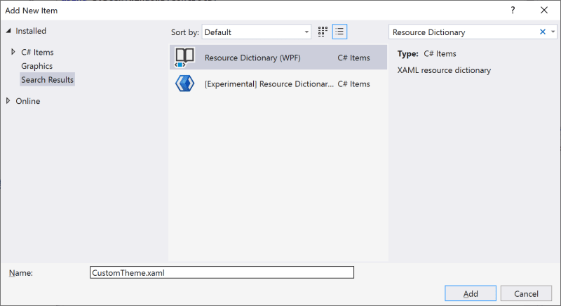
Next, in your WPF application, add a Resource Dictionary XAML file. You can name it something like CustomTheme.xaml.
In this file, we will override key brushes by names such as PrimaryColor, BackgroundColor, OnSurfaceColor, and others specific to menus, hyperlinks, and alternate colors. This is how we can easily customize the existing theme. Set the build action of the dictionary to Embedded Resource and copy in the XAML below as a starting point.
    <ResourceDictionary xmlns="http://schemas.microsoft.com/winfx/2006/xaml/presentation"
                        xmlns:x="http://schemas.microsoft.com/winfx/2006/xaml">

        <!-- Color & Brush used to build Base brushes -->
        <Color x:Key="PrimaryColor">#a31688</Color>
        <Color x:Key="BackgroundColor">#1688a3</Color>
        <Color x:Key="OnSurfaceColor">White</Color>
        <SolidColorBrush x:Key="MenuHighlightBrush" Color="{StaticResource PrimaryColor}" Opacity="0.04"/>
        <SolidColorBrush x:Key="SubtotalBackground" Color="#0d5060" />
        <Color x:Key="SelectedColor">#026a81</Color>

        <!-- C1HyperLinkButton Foreground-->
        <SolidColorBrush x:Key="HyperLinkForeground" Color="#dafdf7" />
        <SolidColorBrush x:Key="IndicatorBrush" Color="#93edf1" />

        <SolidColorBrush x:Key="SliderThumb.Pressed.Background" Color="#026a81"/>
        <SolidColorBrush x:Key="SliderThumb.Pressed.Border" Color="#93edf1"/>

        <SolidColorBrush x:Key="FocusBrush" Color="{StaticResource SelectedColor}"/>
        <SolidColorBrush x:Key="AccentBrush" Color="{StaticResource PrimaryColor}"/>

    </ResourceDictionary>
The brush names are based on the material.io color system. If you need to customize more, you can find more brushes in the source XAML of our Material theme (installed to C:\Program Files (x86)\ComponentOne\WPF Edition\Resources\v6\C1WPFThemesMaterial)
Lastly, modify the code from above with a new overload that passes this CustomTheme.xaml file. You must pass in the assembly type and file name with a full namespace. In my sample called “MyProject” it would look like this below:
myTheme = new C1ThemeMaterial(typeof(MyProject.App).Assembly, "MyProject.CustomTheme.xaml");
And that’s it! You can download the full sample here on GitHub.
Material Theme Builder
If you are not a designer - do not worry! You can take advantage of the material.io Theme Builder to help.
Build a custom color scheme to map dynamic color, use as fallback colors, or implement a branded theme. The color system automatically handles critical adjustments that provide accessible color contrast. Use the colors output here as your primary and secondary on surface brushes.


