
 Chelsea Devereaux
You want a cell in your FlexGrid to have a dropdown that contains colors to select. You can accomplish this in different ways, depending on the circumstances of your application. One way is to use Wijmo's InputColor, and another is to use ComboBox, which we will use in this example.
Wijmo's ComboBox control combines an input element with a drop-down list. You can use it to select and/or edit strings or objects from lists.
You can use a similar approach to add any other icons and do customization to change the view on the grid and ComboBox.
Getting Started
Create a FlexGrid as you normally would, and in the column you want to display colors, set these properties:
    <wj-flex-grid-column
        header="Color Dropdown"
        [binding]="'colorsMapped'"
        [editor]="theColorCombo"
    ></wj-flex-grid-column>
- header displays the header title
- [binding] are the values the column will bind to in our app.component.ts file
- [editor] is what will edit our column and is assigned to the combo box that is also in our app.component.html file
Add the combo box to the app.component.html file as well and set these properties:
    <wj-combo-box
      #theColorCombo
      [itemsSource]="colors"
      [displayMemberPath]="'name'"
      (initialized)="initCombo(theColorCombo)"
      (formatItem)="formatCombo(theColorCombo, $event)"
    ></wj-combo-box>
- The #id is what will link the column to this combo box as the editor
- [itemSource] is our data we are binding to
- [displayMemberPath] specifies which member (property) will be displayed as text in the dropdown.
- (initialized) is an event that is fired when the component has been initialized
- (formatItem) fires every time a cell is rendered in the grid and allows the user to modify the contents
Now, we need the code that will get this combo box working. In your app.component.ts file, start by adding this code:
    import { Component, ElementRef } from '@angular/core';
    import { DataSvcService } from './data-svc.service';

    import * as wjCore from '@grapecity/wijmo';
    import * as wjGrid from '@grapecity/wijmo.grid';

    @Component({
      selector: 'app-root',
      templateUrl: './app.component.html',
      styleUrls: ['./app.component.css'],
    })
    export class AppComponent {
      data: any;
      grid: any;
      colors;

      constructor(private dataSvc: DataSvcService, private el: ElementRef) {
        this.data = new wjCore.CollectionView(dataSvc.getData(10500));
        this.colors = dataSvc.getColorMap();
      }
    }
Here, we are adding our module imports, injecting dependencies into the constructor, and assigning the data and colors variables with data.
Next, we will add this code:
    gridInit(grid) {
        this.grid = grid;

        grid.formatItem.addHandler((s, e) => {
          let col = s.columns[e.col],
            row = s.rows[e.row];
          if (
            e.panel.cellType == wjGrid.CellType.Cell &&
            col.binding == 'colorsMapped'
          ) {
            let colorName = this.findCorrespondingColor(row.dataItem[col.binding]);
            colorName = colorName ? colorName.color : e.cell.textContent;
            let html = wjCore.format(
              `<span class='coloritem' style='background:${colorName};'></span><span class='colorname'> ${e.cell.textContent}</span>`,
              e.data,
              (data, name, fmt, val) => {
                return wjCore.isString(data[name])
                  ? wjCore.escapeHtml(data[name])
                  : val;
              }
            );
            let colorBoxhtml = document.createElement('div');
            colorBoxhtml.className = 'colorDiv';
            colorBoxhtml.innerHTML = html;
            e.cell.insertBefore(colorBoxhtml, e.cell.firstChild);
            e.cell.lastChild.textContent = '';

            //update background color of cell according to cell data
            e.cell.style.backgroundColor = colorName;
          } else {
            e.cell.style.backgroundColor = '';
          }
        });
      }
The gridInit() function will be called when the FlexGrid is initialized. Here, we are adding logic to determine the columns' properties and set them accordingly.
Next, we will add the remaining methods to get the other code working:
    initCombo(cb) {
        //update color icon initially
        this.addCustomColorIcon(cb);
        //handle of item change from dropdown
        cb.selectedIndexChanged.addHandler((s, e) => {
          let colorDiv = s.hostElement.querySelector('.colorDivCb');
          if (colorDiv) {
            colorDiv.remove();
          }
          this.addCustomColorIcon(s);
        });
      }

      addCustomColorIcon(comboBox) {
        let item = comboBox.selectedItem;
        let colorBoxhtml = document.createElement('div');
        colorBoxhtml.className = 'colorDivCb';
        colorBoxhtml.innerHTML = `<span class='coloritem' style='background:${item.color};'>`;
        comboBox.inputElement.parentElement.insertBefore(
          colorBoxhtml,
          comboBox.inputElement
        );
      }

      formatCombo(s, e) {
        let html = wjCore.format(
          "<span class='coloritem' style='background:{color};'></span><span class='colorname'>        {name}</span>",
          e.data,
          (data, name, fmt, val) => {
            return wjCore.isString(data[name])
              ? wjCore.escapeHtml(data[name])
              : val;
          }
        );
        e.item.innerHTML = html;
      }
In this code, we have initCombo, which is called when the comboBox is initialized. We also have the addCustomColorIcon function, which is used in our initCombo function, where it creates a div and adds a class for styling. Finally, we have formatCombo, which is used as a directive in our app.component.html so an event can format the cells for display.
The completed file should look like this:
    import { Component, ViewChild, ElementRef } from '@angular/core';
    import { DataSvcService } from './data-svc.service';

    import * as wjCore from '@grapecity/wijmo';
    import * as wjGrid from '@grapecity/wijmo.grid';

    @Component({
      selector: 'my-app',
      templateUrl: './app.component.html',
      styleUrls: ['./app.component.css'],
    })
    export class AppComponent {
      data: any;
      grid: any;
      colors;

      constructor(private dataSvc: DataSvcService, private el: ElementRef) {
        this.data = new wjCore.CollectionView(dataSvc.getData(10500));
        this.colors = dataSvc.getColorMap();
      }

      gridInit(grid) {
        this.grid = grid;

        grid.formatItem.addHandler((s, e) => {
          let col = s.columns[e.col],
            row = s.rows[e.row];
          if (
            e.panel.cellType == wjGrid.CellType.Cell &&
            col.binding == 'colorsMapped'
          ) {
            let colorName = this.findCorrespondingColor(row.dataItem[col.binding]);
            colorName = colorName ? colorName.color : e.cell.textContent;
            let html = wjCore.format(
              `<span class='coloritem' style='background:${colorName};'></span><span class='colorname'> ${e.cell.textContent}</span>`,
              e.data,
              (data, name, fmt, val) => {
                return wjCore.isString(data[name])
                  ? wjCore.escapeHtml(data[name])
                  : val;
              }
            );
            let colorBoxhtml = document.createElement('div');
            colorBoxhtml.className = 'colorDiv';
            colorBoxhtml.innerHTML = html;
            e.cell.insertBefore(colorBoxhtml, e.cell.firstChild);
            e.cell.lastChild.textContent = '';

            //update background color of cell according to cell data
            e.cell.style.backgroundColor = colorName;
          } else {
            e.cell.style.backgroundColor = '';
          }
        });
      }

      findCorrespondingColor(name) {
        return this.colors.filter((i) => i.name == name)[0];
      }

      initCombo(cb) {
        //update color icon initially
        this.addCustomColorIcon(cb);
        //handle of item change from dropdown
        cb.selectedIndexChanged.addHandler((s, e) => {
          let colorDiv = s.hostElement.querySelector('.colorDivCb');
          if (colorDiv) {
            colorDiv.remove();
          }
          this.addCustomColorIcon(s);
        });
      }

      addCustomColorIcon(comboBox) {
        let item = comboBox.selectedItem;
        let colorBoxhtml = document.createElement('div');
        colorBoxhtml.className = 'colorDivCb';
        colorBoxhtml.innerHTML = `<span class='coloritem' style='background:${item.color};'>`;
        comboBox.inputElement.parentElement.insertBefore(
          colorBoxhtml,
          comboBox.inputElement
        );
      }

      formatCombo(s, e) {
        let html = wjCore.format(
          "<span class='coloritem' style='background:{color};'></span><span class='colorname'>        {name}</span>",
          e.data,
          (data, name, fmt, val) => {
            return wjCore.isString(data[name])
              ? wjCore.escapeHtml(data[name])
              : val;
          }
        );
        e.item.innerHTML = html;
      }
    }
These methods format the combo box's data and properties to fit our requirements. Please reference the code and adjust it to fit your needs.
This is our app.component.html file for our example.
    <wj-flex-grid #grid [itemsSource]="data" (initialized)="gridInit(grid)">
      <wj-flex-grid-filter></wj-flex-grid-filter>
      <wj-flex-grid-column [header]="'Id'" [binding]="'id'"></wj-flex-grid-column>
      <wj-flex-grid-column
        [header]="'Colors Mapped'"
        [binding]="'colorsMapped'"
        [width]="250"
        [editor]="theColorCombo"
      ></wj-flex-grid-column>
      <wj-flex-grid-column
        [header]="'Country'"
        [binding]="'country'"
      ></wj-flex-grid-column>
      <wj-flex-grid-column
        [header]="'Date'"
        [binding]="'date'"
      ></wj-flex-grid-column>
      <wj-flex-grid-column
        [header]="'Time'"
        [binding]="'time'"
      ></wj-flex-grid-column>
      <wj-flex-grid-column
        [header]="'Sales'"
        [binding]="'sales'"
        format="n2"
      ></wj-flex-grid-column>
      <wj-flex-grid-column
        [header]="'Expenses'"
        [binding]="'expenses'"
        format="n2"
      ></wj-flex-grid-column>
      <wj-flex-grid-column
        [header]="'Time'"
        [binding]="'time'"
      ></wj-flex-grid-column>
      <wj-flex-grid-column
        [header]="'Time'"
        [binding]="'time'"
      ></wj-flex-grid-column>
      <wj-flex-grid-column
        [header]="'Sales'"
        [binding]="'sales'"
        format="n2"
      ></wj-flex-grid-column>
      <wj-flex-grid-column
        [header]="'Expenses'"
        [binding]="'expenses'"
        format="n2"
      ></wj-flex-grid-column>
      <wj-flex-grid-column
        [header]="'Time'"
        [binding]="'time'"
      ></wj-flex-grid-column>
    </wj-flex-grid>

    <!-- custom editors -->
    <wj-combo-box
      #theColorCombo
      [itemsSource]="colors"
      [displayMemberPath]="'name'"
      (initialized)="initCombo(theColorCombo)"
      (formatItem)="formatCombo(theColorCombo, $event)"
    ></wj-combo-box>
This is our data-svc.service.ts file that will help with the data for our FlexGrid.
    import { Injectable } from '@angular/core';

    @Injectable()
    export class DataSvcService {
      constructor() {}

      getData(count): any[] {
        // create some random data
        var countries = 'US,Germany,UK,Japan,Italy,Greece'.split(','),
          colors = this.getColorMap(),
          data = [];
        for (var i = 0; i < count; i++) {
          data.push({
            id: i,
            date: new Date(2015, i % 12, (i + 1) % 25),
            time: new Date(2015, i % 12, (i + 1) % 25, i % 24, i % 60, i % 60),
            country: countries[i % countries.length],
            colorsMapped: colors[i % colors.length].name,
            downloads: Math.round(Math.random() * 20000),
            sales: Math.random() * 10000,
            expenses: Math.random() * 5000,
            checked: i % 9 == 0,
          });
        }
        return data;
      }

      getColorMap(): { name: string; key: number; color: string }[] {
        return [
          { name: 'Red', key: 0, color: 'red' },
          { name: 'Orange', key: 1, color: 'orange' },
          { name: 'Green', key: 2, color: 'green' },
          { name: 'Light Blue', key: 3, color: 'lightblue' },
        ];
      }
    }
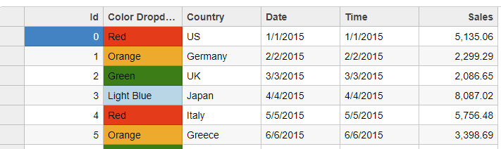
When running, your FlexGrid should look something like this:
We hope you find this helpful! Please be sure to reference the Wijmo documentation and demos if you need additional information about ComboBox.
Example code can be found here on JS CodeMine.


