I recently wrote an article about the importance of colour in web accessibility. However, there are many other things to consider when creating an accessible website. For this reason, in this article, we are going to review the types of visual impairments, and everything we have to take into account when developing a website.
Types of visual impairment
The World Health Organisation estimates that there are 246 million people with impaired vision and some 39 million are blind. Within these visually impaired people, we can find several types that condition the creation of a website.
- Visual acuity: This refers to the clarity and sharpness with which one can see. Depending on the degree, this blurred vision can be corrected with glasses or surgery, or it cannot be counteracted.
- Light sensitivity: Some people are sensitive to light, so the brightness of the screen or ambient lighting makes it difficult for them to read or perceive what they are seeing. For this segment the dark theme is essential.
- Contrast sensitivity: This is a difficulty in seeing contrast between colours, such as between grey and black.
- Field of vision: Humans in general have a fairly wide field of vision. However, there is a group of them who have a smaller one. An example would be people with vision loss in the centre, or, conversely, those who can only see the central part.
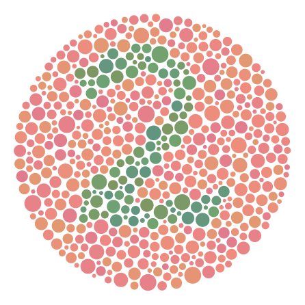
- Colour vision: There is a segment of the population that has difficulty seeing certain colours. Within this there are several disabilities, but the most common is colour blindness, ranging from difficulty distinguishing green and red to the inability to differentiate any colour. We distinguish several types of colour blindness:
- Achromatopsia: Impairs the ability to distinguish any colour. Their vision is in black and white.
- Monochromatopsia: Only white, black and one primary colour are perceived.
- Dichromatopsia: You can only see black, white and two of the three primary colours.

Test to test for a type of colour blindness Source under Creative Commons licence
Once these disabilities are known, it is useful to experiment with how a person with these difficulties views a website using tools such as NV Access.
Developing in an accessible way
Now, knowing the disabilities mentioned above, we are going to review everything we can do to create accessible developments.
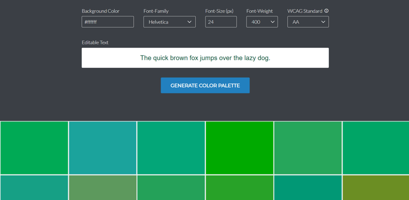
- Design an accessible colour palette from the start. This will save you a lot of trouble later on. To create them you can use coloursafe.
- Give the document a good structure. It will make it easier for people with difficulties to determine what is the most relevant information.
- Don't just use colour to communicate information. For example, if the user has made a mistake and you want to let them know, don't just put the text in red, place a visual indicator that reinforces that idea, through an icon or a texture.
- Avoid placing text over images. They can often cause contrast problems.
- Create a dark theme that will help those who have difficulty with contrast or with the brightness of a light theme.
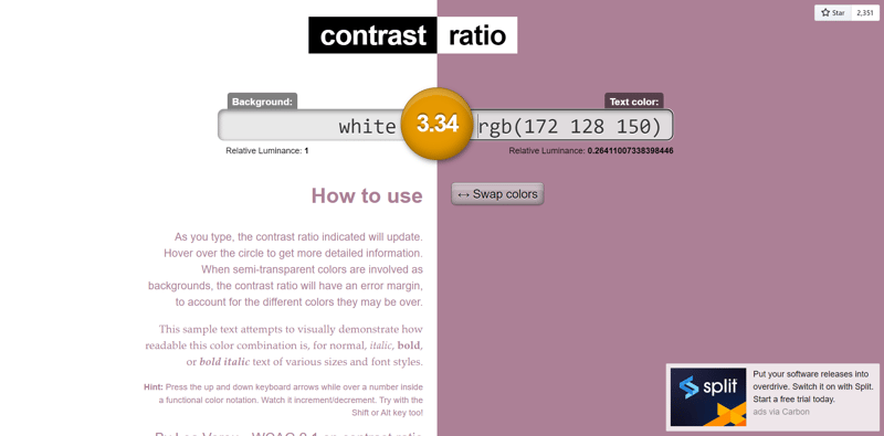
- There should be sufficient contrast between the text colour and the background colour. You can learn about useful contrast tools here.
- The font you use for the text must be readable. For example, readable allows you to check this.
- Texts must also be understandable. You can use tools like Readability Analyzer to check this.
- Make the texts large enough so that most people will be able to read them correctly.
- Use relevant text for linking. Screen readers have a way of reading all the links on a page. If all text is "click here", it can be very confusing.
- Reduce advertisements. They create a lousy user experience for screen readers and make processing difficult for visually impaired humans.
- The page should be navigable with the keyboard. This could be the subject of another article on its own.
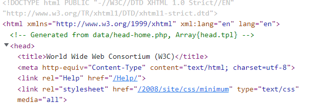
- Use descriptive headings in the HTML document. The first thing screen readers do is announce the title, putting the person in context.
- Add descriptions to images for people who may not be able to view them correctly. This can be done with the alt attribute or the aria-label attribute, among others.
Finally, if you want to read more in detail about this topic, you can see the article written by W3C.


