There is a segment of the population that has problems seeing colours. This issue can be due to several circumstances: they may have a type of blindness that only allows them to see certain colours, or they may be in a situation where they cannot distinguish colours, such as people who are colour-blind.
Contrast
Sufficient contrast between text colour and background will ensure good legibility of the text in general. This includes people with impaired vision, or situations where there is a lot of ambient light or where we are using a screen with low brightness. For these reasons, contrast on websites is a very important factor for accessibility.
According to the Web Content Accessibility Guideline, to achieve an AA level, i.e. the minimum contrast, it should be 4.5:1 for normal text (18px) and 3:1 for large text (24px). On the other hand, to achieve AAA level, the highest level, requires a contrast of 7:1 for normal text and 4.5:1 for large text.
How to check contrast?
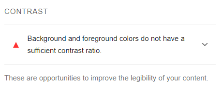
There are several tools to check the contrast in our projects. The easiest one is to use the Lighthouse tool itself, which can be found in Chrome's development tools. This feature, if you launch it, gives you certain scores for several things, including accessibility. For example, it can warn you that you're overcoming the contrast ratio.
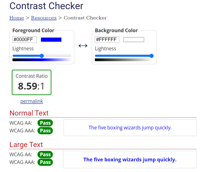
On the other hand, WebAIM provides an online tool to check contrasts. Here you can set the text colour and the background colour. Once both are set, it displays the contrast ratio and underneath whether the AA or AAA level is met. It is worth noting that this tool is very powerful, as it distinguishes the ratios that are maintained at both levels, taking into account whether the text is normal or large.
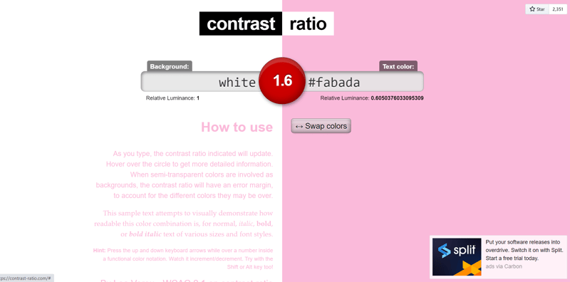
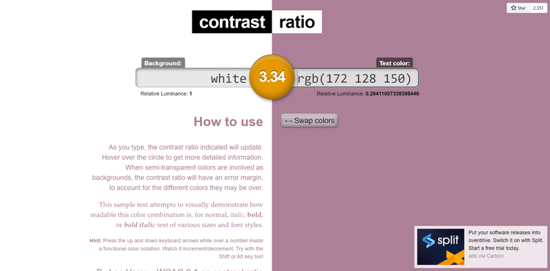
Another online tool that is also very visual is Contrast Ratio. On this website, you can enter both colours to be compared either with a hexadecimal, with an RGBA colour or with the CSS colour names (lime, red, white, wheat...). What makes this tool different is that it shows you the resulting contrast both with a number and with 3 colours according to their accessibility:
- Green: 100% accessible
- Orange: Not fully accessible
- Green: Not accessible
How can I improve the contrast?
Once we have detected that we do not have good contrasts, it is important to be able to solve this problem.
One of the ways to find a better colour contrast is to use the WebAIM tool. This contrast checker comes with options where you can change the brightness of the colour you enter, and you can see how the contrast ratio changes as you change it.
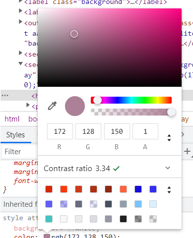
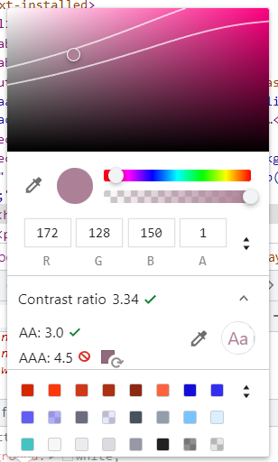
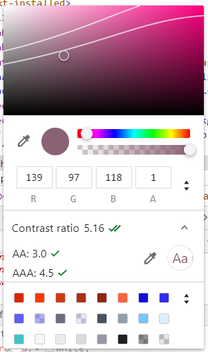
On the other hand, in Chrome's developer tools, if we click on the colour in the styles area, we can see where that colour is located and its RGBA colour. We also see two handles that allow us to change the brightness of the colour and change its hue. As we change the colour, the contrast ratio offered by this tool will be updated, one tick is level AA and two ticks, level AAA.
If we click on the arrow next to the contrast ratio, it will offer us more options, showing us the ranges from which the AA level is achieved (upper line) and from which the AAA level is reached (lower line).

