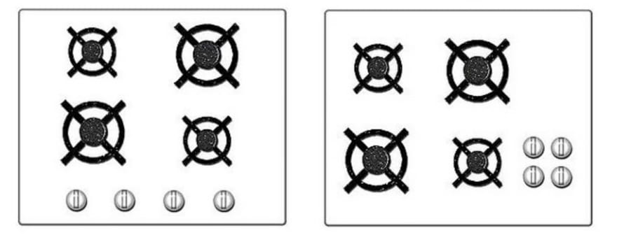
As a UI/UX designer, if your end users need documentation, then you’ve already lost, no matter how usable is your interface. Nowadays, especially on the web, solutions are everywhere and users allow very little time on an interface to understand its behavior and interact with it. If they don’t learn quickly enough how to use a piece of software, they’re likely to switch on another available solution.
That's why learnability is a key factor in human computer interfaces and it's important to take a special care of it.
This article does not aim to lead to perfect learnability, but focuses on a widely used trick to improve it.
But first let's focus on defining what exactly is learnability, so we can make it easier.
Learnability
Learnability is a difficult concept to catch. What does it mean for a software to be easy to learn ?
According to Grossman T. et al. who did a review of how researchers define learnability during the past 25 years, it can firstly be divided in two : Initial Learning and Extended learning.
Here we'll focus more precisely on initial learning as extended learning is more about mastering the use of a software.
Even in initial learning, definitions in scientific documentation vary, but let's take Shneiderman's view :
”The time it takes members of the user community to learn how to use the commands relevant to a set of tasks.”
From this definition we can extract two important things that initial learning relies on :
- The user community, its initial knowledge and habits
- Learning process itself Learning is about creating mental and conceptual models of a system. Therefore, when facing something new, users will try to find its familiar features in order to conceptualise and categorise it. So the learning process is mainly about building knowledge upon existing experience, especially physics laws, mechanics and so on. This is where the concept of affordance becomes a very powerfull tool to ease learning.
Affordance
Affordance designates the ability of a device to suggest a particular kind of use by virtue of some physical attribute. In Don Norman’s 1988 book, The Design of Everyday Things, affordances became defined as :
Perceivable action possibilities—i.e., only actions users consider possible
The real world offers tons of examples of great interfaces using affordances
How would you open this door ?
If you answered by pushing on the grey plate, congrats your brain is fully functionnal.
You just faced an unknown object (you’ve - probably - never interacted with it before) and two things happened:
- By seeing it you inferred it’s behaviour.
- You had enough confidence in this inference to try to interact with it without using a manual. This door just afforded its behavior.
Physical objects tend to have great affordances because their behaviour relies upon basic physics laws that everyone is familiar with. (By applying a force on the right side of a door which rotation axis is on the left will cause it to rotate around it.)
Here is an example of how a simple change in design can increase the affordance of the system :

Unfortunately, 1s and 0s, first components of the digital world, tend to be less explicit about that. That is why UXs tried to represent real world into softwares to use physical affordances so the user could try to infer behaviour based on an existing knowledge.
That is what metaphors are all about.
Metaphors
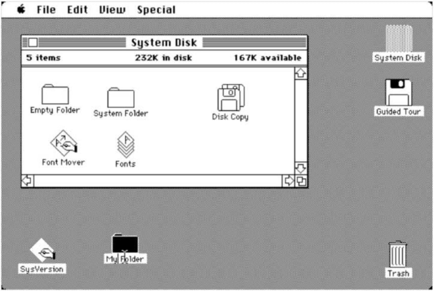
It all began with Alan Kay's "Desktop Metaphor" :
These familiar items (desktop, folders, files etc.) have the same rules as their physical equilvalent:
Everything is represented on the desktop, usual working environment, where you can put files and folders. Files gather data and can go into folders if you drag and drop them in.
Files and folders can be thrown away by putting them into the trash bean that you will empty once in a while.
Thinking about it for a minute is enough to realise it makes no sense at all to put files into a trash bean and then empty it to actually free some disk memory. But it is easy to learn.
Nowadays one does not see these similarities as we're more used to computers than dealing with actual files and folders, but back then it was a key point to acceptation of new born computers.
Implementing these similarities allows us to build on something we know, to reuse a known mental model.
Metaphors are present within the smaller detail of interfaces guiding us on how to interact with it.
Skeumorphic design makes metaphoric use of physical analogies that indicate which parts a user can press, click, or slide, etc. These phenomena have been described as ‘indicating functions’ in product semantics, and as ‘affordances’ in cognitive psychology.
Theses metaphors are everywhere in software interfaces. I'll take an Apple product as example once again (sorry windows lovers, I really tried...).
Here it seems pretty obvious what action the UX designer wants us to perform, and its output.
Apple used skeumorphic design to suggest that the white 'slider' could be moved within the boundaries defined by its black environment, from left to right.
Using signs like the arrow and text, they finish to encourage the user to perform the action and make the interface predictable.
But users evolve constantly, and one must nuance this result.
In 2001 Prensky introduced the term Digital Natives to describe a new generation of users who ‘have spent their entire lives surrounded by and using computers, videogames, digital music players, video cams, cell phones, and all the other toys and tools of the digital age’.
The idea that interfaces are being learned by transferring knowledge from the ‘real’ (i.e. analogue) world to the digital world may be loosing its dominance.
Experienced Digital Immigrants rather transfer knowledge they previously acquired using other interfaces,
That is why design is evolving and flat design is a great example of this dynamic. Skeumorphism is becoming less usefull, in favor of clean, neat design that satisfies the eye.
A perfect example of this dynamic is the new Iphone's unlocker :

Conclusion
Finally, injecting physical properties into digital interfaces is an efficient way to improve its learnability, especially initial learning.
But one must not forget that the learning process deeply relies on already known mental models as it is all about building over it and finding similarities.
Users have been evolving since the birth of computers and their global knowledge over this technology follows. Where complex interactions will highly benefit in term of learnability from rich skeumorphic design, more usual interactions will satisfy from a more minimalist design.
Wether or not you choose skeumorphism of flat design, consider taking a great care of affordances, they're a - complex - way to make your interface simple to use.
“Simple can be harder than complex: You have to work hard to get your thinking clean to make it simple. But it’s worth it in the end because once you get there, you can move mountains.”


