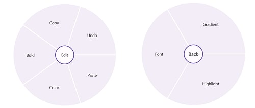
TLDR: Illustrating the features of the new Syncfusion .NET MAUI Radial Menu control and the steps to integrate it into your .NET MAUI app.
We are happy to introduce another navigation control in the Syncfusion .NET MAUI suite for the 2024 Volume 1 release, the .NET MAUI Radial Menu!
The new .NET MAUI Radial Menu control displays a hierarchical menu in a circular layout. It is optimized for touch-enabled devices. Typically, it is used as a context menu and can expose more menu items in the same space as traditional menus.
In this blog, we’ll explore the key features of the .NET MAUI Radial Menu control and the steps to get started!
Key features
The key features of the new .NET MAUI Radial Menu control are:
Font icons
The .NET MAUI Radial Menu control has a built-in icon font option that helps users easily add vector images. This prevents them from experiencing image glitches often faced with traditional image icons.
Center button customization
The center or back button is a view in the center of the Radial Menu. It can be used to perform operations such as opening and closing the rim and navigating to the next level items. You can customize the center or back button with a font icon, custom view, and caption.
Nested items
You can populate nested levels of items within a menu to group similar actions based on their result. For example, you can group clipboard operations by adding a clipboard as the main menu and cutting, copying, and pasting as its children.
Placing and dragging
You can place the Radial Menu anywhere on its parent layout. The position of the Radial Menu is calculated based on the center position of the parent layout. We can also make the Radial Menu float over the parent layout to avoid obscuring the content behind it.
Note: For more details, refer to the .NET MAUI Radial Menu documentation.
Getting started with the .NET MAUI Radial Menu control
We have seen the key features of the .NET MAUI Radial Menu control. Let’s learn how to integrate it into your .NET MAUI app and utilize its features by following these steps:
Step 1: Create a .NET MAUI application
First, create a new .NET MAUI application.
Step 2: Add the required NuGet package
The Syncfusion .NET MAUI controls are available on the NuGet Gallery. To add the .NET MAUI Radial Menu control to your project, open the NuGet package manager in Visual Studio and search for Syncfusion.Maui.RadialMenu package, and install it.
Step 3: Register the Syncfusion core handler
Now, register the handler for the Syncfusion core in the MauiProgram.cs file. Refer to the following code example.
using Microsoft.Maui;
using Microsoft.Maui.Hosting;
using Microsoft.Maui.Controls.Compatibility;
using Microsoft.Maui.Controls.Hosting;
using Microsoft.Maui.Controls.Xaml;
using Syncfusion.Maui.Core.Hosting;
namespace CarouselSample
{
   public static class MauiProgram
   {
     public static MauiApp CreateMauiApp()
     {
       var builder = MauiApp.CreateBuilder();
       builder
           .UseMauiApp<App>()
           .ConfigureSyncfusionCore()
           .ConfigureFonts(fonts =>
           {
              fonts.AddFont("OpenSans-Regular.ttf", "OpenSansRegular");
           });
       return builder.Build();
     }
   }
}
Step 4: Add the required namespace
Then, add the Syncfusion.Maui.RadialMenu namespace in your XAML page. Refer to the following code example.
xmlns:radialMenu="clr-namespace:Syncfusion.Maui.RadialMenu;assembly=Syncfusion.Maui.RadialMenu"
Step 5: Initialize the Syncfusion .NET MAUI Radial Menu control
Finally, initialize the Syncfusion .NET MAUI Radial Menu control. Refer to the following code example.
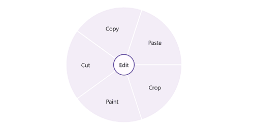
<ContentPage.Content>
 <syncfusion:SfRadialMenu x:Name="radialMenu"
                          CenterButtonText="Edit"
                          CenterButtonFontSize="15">
  <syncfusion:SfRadialMenu.Items>
   <syncfusion:SfRadialMenuItem Text="Cut"
                                FontSize="15"/>
   <syncfusion:SfRadialMenuItem Text="Copy"
                                FontSize="15"/>
   <syncfusion:SfRadialMenuItem Text="Paste"
                                FontSize="15"/>
   <syncfusion:SfRadialMenuItem Text="Crop"
                                FontSize="15"/>
   <syncfusion:SfRadialMenuItem Text="Paint"
                                FontSize="15"/>
  </syncfusion:SfRadialMenu.Items>
 </syncfusion:SfRadialMenu>
</ContentPage.Content>
After executing the above code examples, we will get the following output.
GitHub reference
For more details, refer to the .NET MAUI Radial Menu GitHub demo.
Conclusion
Thanks for reading! In this blog, we’ve explored the features of the new .NET MAUI Radial Menu control introduced in the 2024 Volume 1 release. Check out our Release Notes and What’s New pages for the other updates in this release, and leave your feedback in the comments section below.
For current Syncfusion customers, the newest version of Essential Studio is available from the license and downloads page. If you are not a customer, try our 30-day free trial to check out these new features.
You can contact us through our support forums, feedback portal, or support portal. We are always happy to assist you!
Related blogs
- Syncfusion Essential Studio 2024 Volume 1 Is Here!
- Chart of the Week: Creating a .NET MAUI Fast Line Chart to Visualize the Arctic Sea Ice Extent Since 2000
- Introducing the 11th Set of New .NET MAUI Controls and Features
- Enhancing User Experience: Implementing Typos Tolerance in .NET MAUI Autocomplete


