Under the Hood
More than 70% of Indians travel via trains or railways because railways are affordable for other options, such as aeroplanes.
Being a country of 1.3 billion people where 70% of people travel via trains, imagine how much traffic the train booking website has.
Website
The government of India runs the Indian railway system, from providing train booking facilities to running and maintaining trains.
In the 21st century, the train booking procedure is completely shifted online, and the government provides a dedicated website called IRCTC.
Problem
But the problem is that website looks pretty old and confusing. Most of the time, the website crashes due to heavy server loads.
The image below himself tells a lot of things. The UI looks ugly, and some texts are not even readable. We need to change the website UI and experience.
Importance of Website UI
I googled the daily active users of the website, and the number is 6.6Cr = 66 million 🥲🥲🥲
Updates
So I’ve decided to use my design skills and improve the website UI. This real-world example will undoubtedly help many designers, entrepreneurs and government officials(if reading) to understand the pain points and chances of improvements.
Let’s begin the story —
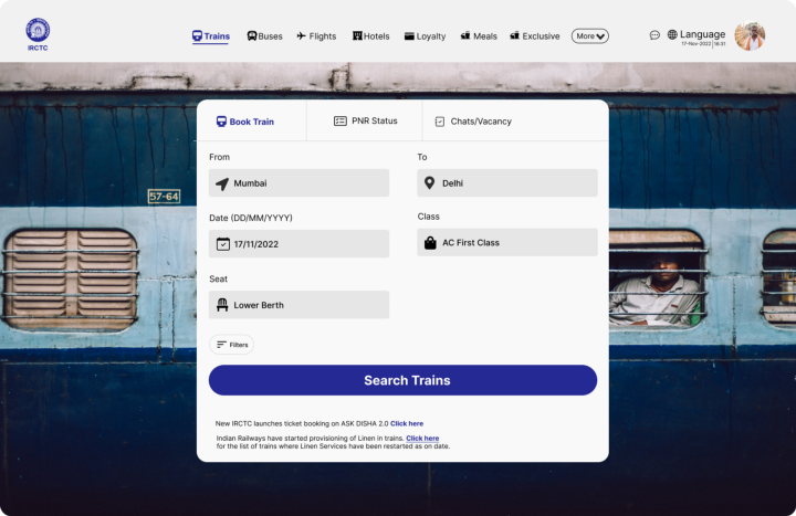
I will divide the improvements in the section called Navbar, Body (the background image) and the search form.
Navbar
Too many options are confusing, so we will segregate them using the dropdown.
- Login, Agent Login and Register can come under one section.
- Contact us; ask Disha will come under one section.
- Date and font sizes with language can also be segregated under one section.
- IRCTC EXCLUSIVE is a good dropdown that needs CSS changes like font type and weight.
- Buses, Flights, Hotels, Holidays, Meals and Loyalty are external links again under one section.
- The More button is a suitable dropdown that needs some UI changes.
Background/Body
The image is quite good, but the text on the image is not readable. We need some grid or background effect on the image to make the text more appealing.
Search Form
This is the most basic form because the user will primarily interact with this form. Providing a better user experience should be the topmost priority for this search form.
- PNR STATUS & CHARTS/VACANCY are the external tabs, so we can make them feel like external links. Currently, they are not.
- All the search inputs are good and working fine; not touching them, and only colours can be changed.
- The radio buttons are not appealing and need CSS changes.
- The search Button width can be increased, and the colour should be changed.
- The message below is not too good to look at; blue is challenging to read and puts a lot of pressure on the eye.
Implementation
Once we understand the problem in the UI, the next and easy part of the make the implement the changes discussed.
Navbar
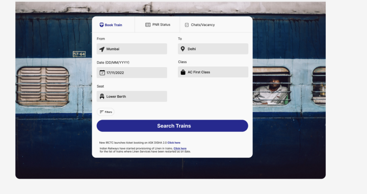
Search Form
Conclusion
This final product is more appealing, easy to navigate and easy to read. The easy-to-search form with proper indications of errors will provide a good user experience.
Better user experience => Fast ticket booking => Less time spent on a website
=> Less load on the server
Ultimately both the user and government will be benefited if the UI and experience are improved.
I hope you liked it and learnt the way to deal with real-world problems.
Until next time, have a good day.
Keep developing
Shrey
iHateReading


