Under the Hood
Well, when I started using Material UI I became a fan. But as time passes I find that Material UI is not easy to customise. Well, if you think customisation is not that important, my friend, you should read this story.
New currency in software development
Coming back, customisation becomes a considerable bottleneck with material UI existing components but somehow we managed it in iHateReading. Until we get bigger problems called breakpoints and responsiveness.
I know we are new and the problem might seem a cakewalk but everyone gets stuck on the first attempt and during the first learning.
Responsiveness — Hate & Love Story
Actually, if you asked me personally the most boring part of the front is writing CSS or specifically handling responsiveness.
Even the CSS didn’t leave me when I get into react-native development. I thought before getting deep dive into mobile app development that we don’t have to handle many edge cases for responsiveness but I was wrong over there also.
The hate story begins with our website(iHateReading) as we are facing a lot of issues with UI glitches in all kinds of devices.
Some phones can’t have proper alignment, and desktops and large screens all are having some or other kind of UI or CSS glitches.
The approach we use to follow to solve the issues is addressing them one by one.
Hate & more Hate
I mean we tried to add media queries, edge cases and bla bla whatnot else. But how here and there some kind of screens get broken or not fixed or some devices were so rigid in not showing proper UI as expected.
Love Story
So we move back to basics after hustling for a long time. Yesterday, before changing our website UI we thought of finding a proper responsiveness solution.
Key Step — We end up reading Material UI documentation again.
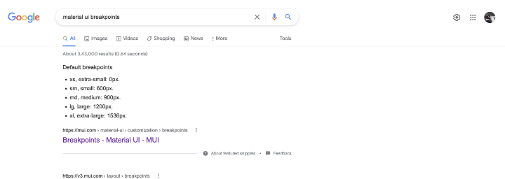
So I googled out the Material UI breakpoints.
I found the dedicated page documentation about it and how to use it properly. Earlier when I started with Material UI breakpoints we use to deal with using down and up methods to add media queries for multiple devices.
That is where we were facing problems of not handling all edge cases because sometimes the card component will look the same or have the same width on phones such as Ipad and on desktops such as MacBooks.
That is ofcourse not the expected behaviour, every designer design the components differently for phone and desktops. They are brothers or siblings very less or a rare chance that they will be twins.
So when we design the look for phones and desktops we decided to make them siblings but not twins and change their looks using props and media queries.
But breakpoints methods such as “down” and “up” for material UI were too much pain.
Hack
Material UI provides makeStyles methods to add media queries using theme objects.
For example,
import { makeStyles } from '@material-ui/core";

const styles = makeStyles((theme) => {
  root: {
    width: "50%",
    margin: "auto",
    [theme.breakpoints.down("sm")]: {
      width: "100%",
    }
  }
})
Look at the root styles in the above code, we add a breakpoint for devices of the size below "sm" that is 600px.
Here is the dimension mapping for each prop in Material UI.
xs = 0px;
sm = 600px;
md = 900px;
lg = 1200px;
xl = 1500px
Well, this s quite straightforward so why we were facing problems?
The issue exists between 900 and 1200 px where most of the desktops and devices exist.
For that, we use another breakpoints method called between.
And this is the most powerful method that saves a lot of time in writing multiple media queries.
Now devices that exist between 900 and 1200 px can be given CSS using between method.
Look at the code below, instead of adding max-width and min-width media queries we simply use the text sm, md and our responsiveness will be handled.
import { makeStyles } from '@material-ui/core";

const styles = makeStyles((theme) => {
  root: {
    width: "50%",
    margin: "auto",
    [theme.breakpoints.between("sm", "md")]: {
      width: "80%",
    },
     [theme.breakpoints.between("xs", "sm")]: {
      width: "100%",
    },
     [theme.breakpoints.between("md", "lg")]: {
      width: "40%",
    },
     [theme.breakpoints.between("lg", "xl")]: {
      width: "30%",
    }
  }
})
Conclusion
Material UI provides tonnes of components and now we have a way to handle responsiveness easily. Another thing about the customisation is that Material UI has released MUIBase — Headless UI library using Material UI or Unstyled Material UI library.
Meaning we will only use the MUIBase UI components and provide our own theming system or styles. Highly customisable according to designs. The world is heading towards headless UI so material UI is also thinking in the same direction.
Headless UI - New trend in frontend UI libraries
Keep developing
Shrey
iHateReading


