A couple of months ago, I started doing some UI challenges✨ in Flutter. The goal of these challenges was to be creative and explore building unique UI experiences in Flutter while sticking to what the framework offers.
As a result, I created some 😁 really interesting animations and designs in Flutter that showcase what you can build with it. In this article, I’ll walk you through one of my creations, inspired by the macOS dock experience.
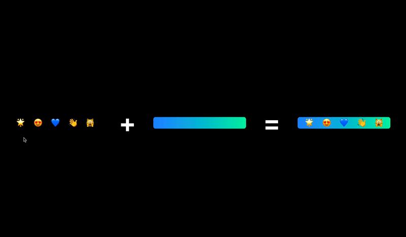
The finished macOS dock animation.
By the end of this article, along with how to build this Flutter dock, you’ll have learned a little more about:
- Constraints in Flutter
- Implicit Animations
- Design breakdown
Getting Started
Download the starter project. If you're not familiar with Flutter, check out this guide to building a Flutter app from scratch.
Once you build it, you’ll see a black screen, but we’ll soon add our animated dock there.💻
Build & run:
Constraints And Implicit Animations
Before getting our hands dirty in the code, are you familiar with Constraints and Implicit Animations in Flutter?🤔
If you are, then you can skip the next two sections, which talk about Constraints and Implicit Animations, and race straight up to the Design Breakdown section.
But if you’re not familiar, then you should read through the following two sections to understand some basics of these two topics.
Understanding Flutter Constraints
UI development in Flutter is quite different from the way it is in HTML and other frameworks.
We don’t deal with sizes directly, but rather with constraints. The constraints are basically a set of four points: the min-max width and the min-max height.
There’s one rule of thumb that guides Flutter UI development:
 From flutter.dev
While you’re building Flutter UI, you will see this parent-child composition. When the parent widget wants to lay out on the screen, it checks if it has any children. If it does, then it passes its constraints to its children and asks them how big/small they want to be. The child widget may repeat this process if it has children of its own.
Once the Parent gets the sizes for each of its child widgets, it then checks those sizes against its own constraints. Based on this, it calculates the final size for each of its child widgets and lays them out.
As you can see, the one in control of determining the size and position of a widget is the Parent widget, not the Child widget.
This is too big a topic to continue in this article; if you want to read about this in more depth, check out the official docs.
Implicit Animations
One of the reasons it's easy to build beautiful Flutter animations is that it provides many ways to animate widgets depending on your use case.
One of the ways is using AnimatedFoo widgets (also called Implicit Animation Widgets), where Foo is the property that you want animate.
Examples of 5 different Flutter Implicit Animations.
When working with AnimatedFoo widgets, you only have to worry about providing the property value. AnimatedFoo widgets handle the animation flow, or the transition from the old value to the new value whenever the property value changes. These will be important for our Mac dock later!
There are different AnimatedFoo widgets for animating the different properties of a widget, like AnimatedScale, AnimatedOpacity, AnimatedSize, AnimatedContainer, etc. We’ll be making use of some of these AnimatedFoo widgets. You can learn more about them in the official docs.
Mac Dock Design Breakdown
When you’re trying to build animations or any kind of interaction, try to always break down the design into parts. Then, understand each part and its animations and how it’s affected by other components in the design.
Below is a breakdown of our MacOS dock design:
As you can see, there are two main components here:
- The row of items
- The Mac dock
The item’s row is stacked on top of the dock. Both of these components have different behaviors when you hover over any one of the items. Our items scale and translate along the Y-axis while the dock’s width increases as items are scaled.
In the next sections, we’ll explore how these Flutter animations work in detail and see how we can implement them.
Adding The Items
In lib/macos_doc.dart, replace the //TODO: add items ui with the following code:
Let’s go over the code step-by-step:
Items Row: The row holding the items has the mainAxisSize set to mainAxisSize.min. This tells the row to size itself to the combined width of the items within it, instead of expanding to capture all of the available width along the main axis.
MouseRegion: Flutter provides a MouseRegion widget which we can use to be notified when the user hovers on our item. When the mouse is within the item hover region, we set the hoveredIndex to that item’s index and reset it to null when the mouse exits the item’s hover region.
AnimatedContainer: This is the container that holds our item. It’s an AnimatedContainer which will animate its scale and translate itself depending on the hoveredIndex.
FittedBox: If the child of this widget has a size larger than the constraints passed down to it, then this widget will scale and position the child to fit within the constraints based on the fit set.
The item: The item in our case is text, so I’m using the AnimatedDefaultTextStyle for scaling. Your item can be anything else, including an icon or an SVG. Use the appropriate Flutter animation widgets to get the smooth scale animation for them.
Build & run:
Animating The Items
Let’s dive a little deeper into our item’s animations.
Examples of two different animations. On the left, the item gets bigger when the mouse hovers over it. On the right, the item raises above the others when the mouse hovers over it.
Each item on our Mac dock has two animation properties. The first one is the change in its size, and the second is its translation along the Y-axis. The item in focus has the max scale and the max translation along the Y-axis. The other items are then scaled and translated accordingly.
Now, both of these properties change for items depending on their position from the hovered item. The trick to this animation is to calculate these two properties based on the item’s index and the hoveredIndex.
Let’s see how we can calculate those values!
Replace //TODO: add getPropertyValue method with the following code :
First of all, if you’re scared a bit 😅 because of all of the math this method is screaming at you, don’t worry! It’s actually really simple. 😄 I’ll try my best to explain what’s going on here.
The getPropertyValue method is a general property value calculator for our scale and translation properties. It has four parameters:
index: Index of the item for whom the value needs to be calculated.
baseValue: Value when none of the items are in focus.
maxValue: Value for the hovered item.
nonHoveredMaxValue: Maximum value for the items around the hovered item.
Let's go over the method step-by-step.
Check if hoveredIndex is null. If it is, then return baseValue.
Calculate the difference between the index of the hovered item and the current. Note that we take the positive of the difference. So, if we try to plot the difference for our items by assuming the hoveredIndex is 2, then for each index we get the following differences as shown by the graph.

[0] -> 2, [1] ->1, [2] ->0, [3]->1, [4]->2
Note how the difference is distributed equally on left and right of the hoveredIndex.
For the hovered item, the difference would be 0, as hoveredIndex and index would be the same. So, we return the maxValue for it.
If the difference is less than or equal to the itemsAffected, then we do two things. First, calculate a ratio, which is the value between 0.0–1.0 obtained by subtracting the difference from itemsAffected and then dividing it by itemsAffected.
Then, the propertyValue is calculated by doing a lerpDouble over the baseValue and nonHoveredMaxValue; the ratio decides the lerpDouble percentage.
To understand what lerpDouble is actually doing, take a look at the following explainer:
a represents baseValue and b represents nonHoveredMaxValue.
For a ratio of 0.0, the lerp percentage would be 0%, so the propertyValue will be baseValue. For a ratio of 1.0, the lerp percentage would be 100%, i.e., the nonHoveredMaxValue.
For any other ratio value, the propertyValue will lie between the baseValue and the nonHoveredMaxValue. Thus, items that are closer to the hoveredIndex will have a slightly greater value than those that are further.
- If any of the conditions don’t match, we simply return the baseValue.
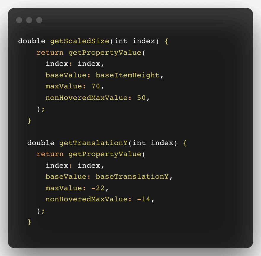
Now, to finally calculate our scale value and translation values for items, replace //TODO: add scale and translation calculator methods with the following code:
In your item’s Flutter UI code, replace the baseItemHeight with the getScaledSize(index) and baseTranslationY with the getTranslationY(index).
Test your animations by hovering over the items! 🙌
Build & run:
Adding the Mac Dock
The most interesting part of this design is how we size the MacOS dock. If you look at the animation carefully, then you’ll realize that the width of the dock is always equal to the width of the item’s row and its height is equal to the baseHeight of the item’s row when none of the items are in focus. As the items scale, so does the width of the animated dock.
But, when the items are animating, we don’t know what the width of the item’s row will be at any point in the interaction. So, how can we get around this?
We’ll use our knowledge of constraints. We need to position our dock in the Stack such that the constraints passed down to it will force it to have the maximum width of the Stack but limit the height to what we want.
Let’s see how we can do this!
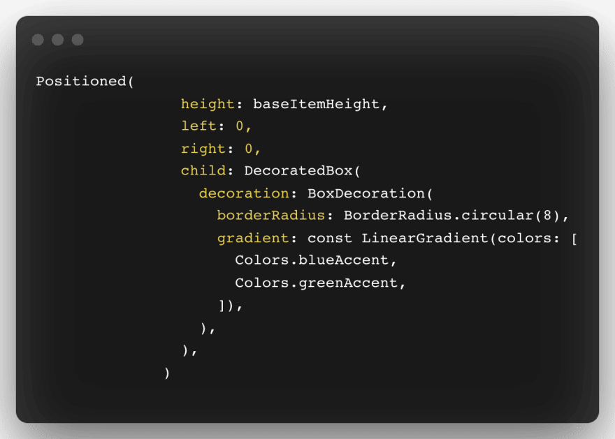
Replace //TODO: add Dock with the following code:
Welcome, Positioned widget! This Flutter widget is used to position widgets within the Stack. Here we tell the Positioned widget that the child should be positioned to 0 from the left and right edges of the Stack and will have a height equal to baseItemHeight. These constraints are then passed down to the DecoratedBox.
One thing to understand about DecoratedBox is that it will size itself to its child’s size when the child is present and the constraints passed to it are not forced constraints.
Here, as the child is not present, the DecoratedBox should have zero size, but our Positioned widget forces it to scale within the constraints we defined as the DecoratedBox itself doesn’t provide any information about its size and positioning.
Hot reload the app one final time to see our complete interaction in action! 💯
Build & run:
You did it! 🥳 You now have a really cool animated dock for your Flutter apps! 💙
Src Code : MacOS Inspired Dock In Flutter
Next Steps
🙏 Thanks for spending your precious time reading the article. Hope you had a blast 🙌 reading and learned some cool things! If you want to check out my other creations, head over to this repo. If you're interested in learning more about Flutter animations, check out this tutorial to build shaders!
Have an AMAZING day and keep Fluttering! 💙
Use Pieces to Store Your Flutter Snippets
When developing Flutter creations, you may have tons of widgets that you want to reuse later, but you just don't have them in a safe place where you can access them. You may also comb through Flutter and Dart documentation and want to save examples that come in handy when implementing a new feature or figuring out which widget to use for different circumstances.
Pieces helps you save all of your useful code snippets efficiently through a desktop application and integrations. Using Pieces, you can save any code snippets from StackOverflow with the click of a button using the web extension, have your code autosaved from locally-hosted ML algorithms that recognize your code patterns, auto-classify snippets by language, share code with others using generated links, and more! The Pieces for Developers Suite is continuously being developed, and there’s some groundbreaking stuff that is being put together to share, reuse, and save code snippets.


