
 Pieces 🌟
CSS positioning properties enhance the user experience on your page. Also, they allow you to position elements and contents on a web page differently. In this article, you’ll learn what CSS positioning properties are, the different CSS position property values, and how you can apply them to your web page.
What is the Position Property in CSS?
The CSS position property describes the type of positioning method used for an element and its placement on a web page. It helps you explicitly set a location, allowing you to move your elements around on the page. In addition, you can use the top, left, right, and bottom properties to give the document any look you want. For example, properties can place elements at the edge of the parent element or the viewport edge when the value of 0 is applied.
Why Use CSS Positioning?
We use positioning properties in CSS for many reasons:
- To enhance your design skills and improve the user experience on your page
- To specify where an element is displayed on the page
- To give the design layout a compelling visual appeal
- To enable you to exploit a component's location, allowing you to move your piece around the page
- To make your design more accessible and understandable
- To let you determine the final area of the element
How to Use Position Property in CSS
Before diving into this topic, you should realize that even without CSS, your HTML element already has predefined rules on how it should be displayed on a web page. Therefore, it’s important to understand how things are positioned by default before changing or bending them at will. Also, bear in mind that all HTML elements are static by default. Here is how the CSS positioning property works:
- The position property in CSS helps specify elements' positions on a web page.
- Whether it will appear within the normal flow of a document or not all depends on the order.
- The CSS positioning property works with the box offset properties
left,right,top, andbottom, which describe the final position of elements by moving them in different directions. - Depending on your CSS position property values, the box offset properties must be placed first for the CSS position properties to work.
CSS Positioning Property Values
The CSS positioning property has several values that influence how it works. These include the following:
Static Position
Static positioning exists in the normal flow of the page and rejects any box offset property; it is a default position. However, the top, bottom, left, and right properties do not affect it. Note that an element with static positioning does not have a unique position. Instead, it is always set according to the normal flow of the page.
All HTML elements are static by default. Using this position, you cannot change the placement of elements on a page.
Let’s look at this example of a single div element with a static position:
Example:
<!DOCTYPE html>
<html>

<head>
  <style>
    body {
      background-color: #73AD21;
    }

    .box {
      width: 400px;
      height: 200px;
      background-color: white;
    }
  </style>
</head>

<body>
  <div class="box"></div>

</body>

</html>
Here is the result of the above code:

Now, let's try to move it around with the left property:
 .box {
      width: 400px;
      height: 200px;
      background-color: white;
      position: static;
      left: 70px;
    }
Here is the result of the above:

Notice that there is no difference in the image. Static positioning is not affected by the top, bottom, left, and right properties.
CSS Relative Position
Relative position is an element relative to its normal position on the page. However, the setting of a relatively-positioned element's top, right, bottom, and left properties affect its normal page position. However, any space left by the relative element will not allow any content to adjust to fit. This is because the gap bounds them in the document. Therefore, when the element with a relative position moves, no part of anything else is influenced on the screen. Still, it is as if the element kept its position on the screen and everything else flows around it as if it had never moved.
Note that changing the position property does nothing. It only starts doing something when you use one of the coordinating properties. Therefore, you set the movement values using top, bottom, left, and right to cancel the box close to the current position of the element you are moving. It's essential to note that the movement of the components works opposite of the order given and not the direction of the movement set. For example:
- Set the positive value for the
leftproperty to move an element to the right. - Set the positive value for the
rightproperty to move an element to the left. - Set the positive value for the
bottomproperty to move an element up. - Set the positive value for the
topproperty to move an element down.
We’ll be centering the parent element in order to explain relative positioning. With this, it’s easier to understand the movement of what we will be doing:
<!DOCTYPE html>
<html>

<head>
  <style>
    .parent {
      background-color: #73AD21;
      border: solid 3px blue;
      display: flex;
      align-items: center;
      justify-content: center;
      height: 500px;
    }

    .box1 {
      width: 200px;
      height: 100px;
      background-color: white;
    }

    .box2 {
      width: 200px;
      height: 100px;
      background-color: yellow;
    }

    .box3 {
      width: 200px;
      height: 100px;
      background-color: red;
    }
  </style>
</head>

<body>
  <div class="parent">
    <div class="box1"></div>
    <div class="box2"></div>
    <div class="box3"></div>
  </div>


</body>

</html>
Here is the result:

Now, let’s add the position property CSS relative to our code to move the box around:
<!DOCTYPE html>
<html>

<head>
  <style>
    .parent {
      background-color: #73AD21;
      border: solid 3px blue;
      display: flex;
      align-items: center;
      justify-content: center;
      height: 500px;
    }

    .box1 {
      width: 200px;
      height: 100px;
      background-color: white;
      position: relative;
    }

    .box2 {
      width: 200px;
      height: 100px;
      background-color: yellow;
      position: relative;
    }

    .box3 {
      width: 200px;
      height: 100px;
      background-color: red;
      position: relative;
    }
  </style>
</head>

<body>
  <div class="parent">
    <div class="box1"></div>
    <div class="box2"></div>
    <div class="box3"></div>
  </div>


</body>

</html>
Here is the outcome:
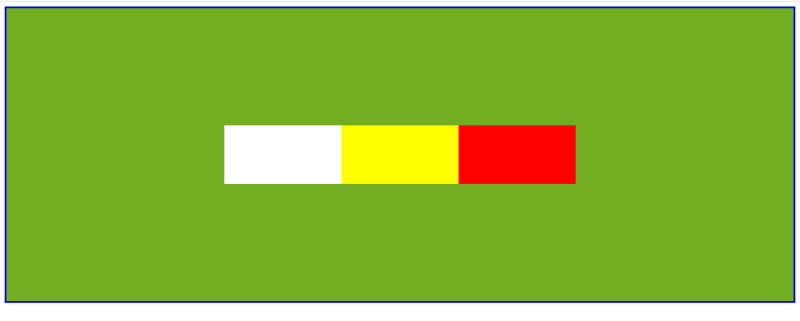
Observe that nothing changes. This is because the position property relative does nothing to the elements. You can effect change by adding any coordinating properties: left, right, top and bottom.
Next, let's move the element (box1) to the left and bottom:
 .box1 {
      width: 200px;
      height: 100px;
      background-color: white;
      position: relative;
      right: 250px;
      top: 90px;
    }
Let's look at the result to better understand how to set the value of the properties:
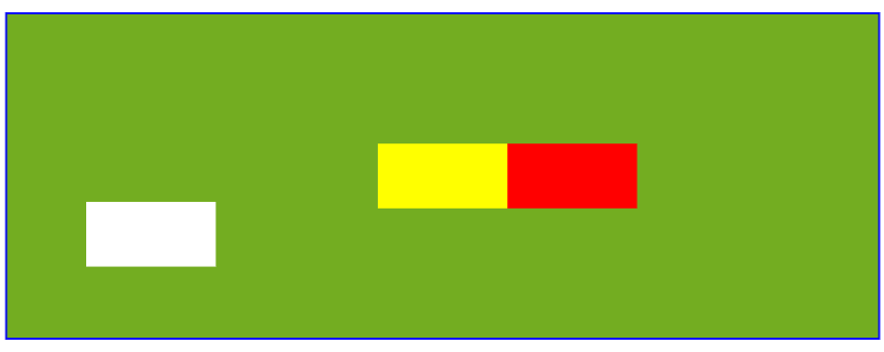
Notice that to move the element to the left, you need to set the value to the right; to move it to the bottom, you set it to the top. Also, it is as if the element kept its position on the screen.
Now, let’s move the element (box2) to the right and top:
.box2 {
      width: 200px;
      height: 100px;
      background-color: yellow;
      position: relative;
      left: 100px;
      bottom: 70px;
    }
Here is the result:

Remember that the value was set to left to enable the element to move right; to move it to the top, you set it to the bottom. In addition, the movement of the element did not push down or influence the other elements on the screen.
Absolute Position
Absolute position) is an element with its position relative to its parent element. In this case, you remove the element from the normal document flow and do not create any gap for it in the page layout. Instead, the left, top, bottom and right values determine the element's final position.
Note that an absolute positioned element uses the document body and moves along with page scrolling. In addition, if it has no positioned ancestors, it can overlap.
For better understanding, we’ll work with these elements to explain how absolute positioning works:
<!DOCTYPE html>
<html>

<head>
  <style>
  body{
    background-color: #73AD21;
  }
    .container {
      background-color: red;
      border: solid 3px blue;
      display: flex;
      align-items: center;
      justify-content: center;
      width: 500px;
      height: 400px;
      position: relative;
    }

    .box1 {
      width: 200px;
      height: 100px;
      background-color: white;
    }
    .box2 {
      width: 200px;
      height: 100px;
      background-color: yellow;

    }
  </style>
</head>
<body>
  <div class="container">
    <div class="box1"></div>
    <div class="box2"></div>
  </div>


</body>

</html>
Here is the outcome:

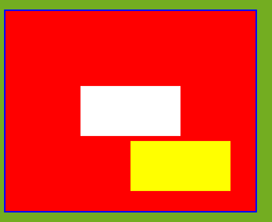
Now, we’ll move the box. As mentioned earlier, that absolute position is an element with its position relative to its parent element.
Let’s move box1 to the left 50px from the parent element and down 40px from the parent element:
 .box1 {
      width: 200px;
      height: 100px;
      background-color: white;
      position: absolute;
      left: 50px;
      top: 40px;
    }
Here is the result:

Notice that the element was taken out of the document's normal flow, unlike the relative positioning, which leaves a space for a ghost element.
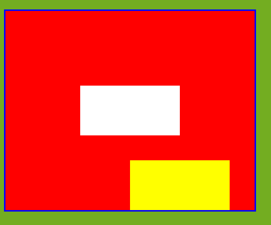
Next, let’s move the box1 element to the left of 50px and the top margin of 0 relative to its parent element:
.box1 {
      width: 200px;
      height: 100px;
      background-color: white;
      position: absolute;
      left: 50px;
      top: 0;
    }
Here is the outcome:

The above image shows how box1 is positioned relative to its parent element.
Now, let’s move the box2 element to the right 50px from the parent element, and down 40px from the parent element:
.box2 {
      width: 200px;
      height: 100px;
      background-color: yellow;
      position: absolute;
      right: 50px;
      bottom: 40px;
    }
Here is the effect of the code:
Notice that the element affects the flow on the page. Also, the coordinating properties work as rendered, unlike relative positioning, where you have to set right to move left.
Next, let’s move the box2 element to the right 50px and to the bottom margin of 0 relative to its parent element:
.box2 {
      width: 200px;
      height: 100px;
      background-color: yellow;
      position: absolute;
      right: 50px;
      bottom: 0;
    }
Here is the result:
This shows that box2 element is positioned relative to its parent element, which has a bottom margin of 0.
Fixed Position
An element with a fixed position is similar to an absolute element. This position is relative to the viewport, showing that it always remains in the same position even when you scroll through the page. When you see a fixed element on a page, it does not leave a gap. For example, the properties top, right, left, and bottom work as position elements. Note that fixed elements are not affected by scrolling; instead, they are in the same position on the screen.
We’ll use this image to explain the fixed position, white element and yellow element before we scroll down:

Now, let’s use two box elements to explain the fixed position. To do this, we’ll set the box1 (white) element as the absolute position and the box2 (yellow) element as the fixed position:
<style>
  body{
    background-color: #73AD21;
  }
    .container {
      background-color: red;
      border: solid 3px blue;
      display: flex;
      overflow: scroll;
      align-items: center;
      justify-content: center;
      width: 500px;
      height: 400px;
      position: relative;
    }

    .box1 {
      width: 100px;
      height: 100px;
      background-color: white;
      position: absolute;
      left: 50px;
    }
    .box2 {
      width: 100px;
      height: 100px;
      background-color: yellow;
      position: fixed;
  }
  </style>
Here is the result:

Notice that the box2 (yellow) element was not affected by the scrolling, rather, it remains fixed in the same position on the screen.
Sticky Position
A sticky position occurs when an element is positioned based on the user's scroll position. The sticky position combines the relative and fixed positions, depending on the part of the scroll. In this way, it acts like a relatively positioned element. In addition, it maintains a relative position until a given offset position is met in the viewport, and then it "sticks" in place like a fixed position.
Let’s look at this example for a better understanding of how the sticky position works:
<style>
  .container {
    background-color: grey;
    border: solid 3px blue;
    width: 600px;
    height: 400px;
    overflow: scroll;
  }

.sticky {
  background-color: white;
  width: 100px;
  height: 100px;
  position: sticky;
  top:0;
}
</style>
Below are the results of the element before and after we scroll.
The image before the scrolling:

The image after scrolling:

Notice that the white element maintained a relative position until it met the specified top scroll position of top:0. Then, it acts as a fixed position element and sticks to the specified spot.
Conclusion
The CSS positioning properties give structure to your designs and make reviewing the content on a web page more accessible. So, be intentional with CSS positioning, and the results will blow your mind! However, mastering CSS takes regular practice. Keep honing your skills, and you’ll get better at it in time. Learn more about CSS positioning properties such as CSS float and clear, or how to style text in CSS on your site.


