Forms are integral part of your online business. Being the primary source of data collection for your visitors, their appearance on the internet matters more than you can think of! Keep in mind though, that even if you do design them neat and catchy, they may end up looking absurd when accessed through different browsers and browser versions. In this article, I will demonstrate cross browser compatibility of the new input form fields that were introduced with the introduction of HTML5. I will design a simple HTML form with all input fields, and will perform cross browser testing for that form using LambdaTest.
Do you know? LT Debug allows you to modify headers of traffic on your favorite web pages and delete headers and stop online tracking to test your site in production.
Brief Introduction Of HTML5 Form Input Fields
An input field in HTML is used for giving the option to the user to enter the desired input. This input can be anything like your contact number, your residential address, date of birth etc. Since the inputs are variable there arise a need to mention and validate this at the client level only.
Let’s say you are filling a driving licence form and you are required to enter the mobile number but mistakenly enter your pin code instead. We can also think about a scenario where your D.O.B is required and you enter it in whatever way you desired. Since every human thinks differently, some would write 08.04.1995 and some would write 08-April-1995. There are literally a lot of ways to enter your date of birth and although all of them are correct and understandable by humans, this is not the case with computers. In computers we need to feed the logic at the back end to save your information correctly in the database. If we get so many different kind of entries for a single column in the database, we need to feed the logic for all of them. This is clearly not feasible.
Even if we say it is feasible and we can put up the logic, there is no way we can derive all the ways a billion of humans would enter the date of birth. This is a huge problem and was existing before HTML5.
However, with the introduction of HTML5 came new types in the input field to makes the work of user and developer easier than ever. Now, you don’t need to enter the birth date but instead can open the calendar in the input box and then select the date. This will automatically fill the box with the predefined format. Although many types have been introduced in HTML5, all of those are not “so important” as it might seem. In this article, we will explore each of them and see whether they are important while coding your web page or not? So we have divided this article into two main parts namely Relevant Input Types and Irrelevant Input Types.
Before we go ahead and deep dive into this article, you can check out the complete HTML5 form sample on one of our LambdaTest Experiments where you can witness the rendering of the same form over different browsers by performing browser compatibility testing. I have made use of automated screenshot testing offered by LambdaTest to quickly capture the appearance of my form over multiple browsers, simultaneously, in a single test session.
I will be talking more about everything in details, as you read further. Here we go!
Relevant Input Types
In this section, we will explore the input types introduced in HTML5 that are relevant to use and have vanished the difficulties we faced in the previous versions.
HTML5 Input Field — Search
Search is the most common operation that is used by people on the internet today. As per statistics, we search 40,000 queries on Google every second and that is not a small number. It has made us habitual of using this operation on websites, e-commerce, blogs etc. Not to mention how much time it saves. So, search purpose was facilitated as the new HTML5 form input fields, which can be used as:
<input type="search" name="xyz">
Before this option, searching was done on a normal text field. Although, it does not affect anything at the back end of the search operation, it does ease it out for the user and provide few stylistic effects. When we have the HTML5 form input field as search defined, and you start typing something then a small x can be seen at the end of the box. This is for clearing out the complete search phrase.
It is recognized by all the browsers in mobile and desktop, giving it a plus point on browser compatibility testing and is used today very commonly. In the mobile, we get additional support other than the clear sign. In apple mobiles, when you select the search box then an additional search button can be seen instead of the regular go button. This feature is not available on other browsers in mobiles such as Google Chrome or Samsung internet but yet this looks good in visual. Although, it has no effect on the positive or negative side. You should use the search button for these small styling changes which are indeed useful for the users. It saves you a lot of JavaScript code that you have coded for the same styling.
HTML5 Input Field — Email
Email field is also one such field that was creating some small troubles for the developers before HTML5. Before HTML5, email field was just used as a plain text. So even if you don’t put a real and valid email address, it would work. Now, some websites actually rely on email address as the prime source of contact and sometimes the only source of contact. Gathering email addresses for future announcements and releases is also a common future. This needed a few lines of JS code to validate the email field like to see whether there is a “.” or not, a “@” or not and there lies no space in between. With the introduction of email type in the input field in HTML5, these things are taken care of without any extra code. Now you can also get an error message if the email address is not valid. The email type goes like this in the input
<input type="email" required>
There is an important thing to keep in mind while using this email type. You should know your user base or should be accepting the address in English syllables only. If you are receiving emails all around the world then be prepared to receive email address with two different syllables from two different languages. For example, the email address harish@日本.jp is not valid in Firefox, Chrome and Safari. So for this you can use the JS code or else you can also use the pattern attribute as follows
<input type="email" pattern= "[^ @]*@[^ @]*">
There is also an important thing to note in the mobiles when you are entering the email address. In the keypad, you will automatically see an ‘@’ and ‘.com’ for easy entering. You would not be getting this while using the text field.
HTML5 Input Field — Number
As you must have already guessed with the name, number type is used to input a number in the input box. Although, a text field would do a similar job but number type ensures that the user has entered the number only instead of anything else. Moreover, for number type you also get to decide the min and max value of the input number as shown in the code below.
<input type="number" min="3" max="30">
For the above code, the user can only input a number between 3 and 30 (inclusive). This will help you write extra code for checking whether the number was entered correctly or not. A new property as step is also introduced along with the number field. Step tells you the legal values that can be contained inside the input box. For instance, let us say that you wish to have only those numbers which are divisible by 4 as the inputs. So you could write it as:
<input type="number" min="4" max="40" step="4">
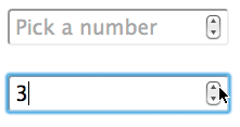
Since step is equal to 4, the legal values becomes 4, 8, 12, 16…..40. Talking about the effect of number type in the input field, the browser adds its own useful properties for the easiness of the user. The desktop browsers Chrome, Safari and IE adds up and down arrow to increase and decrease the number.
In the mobile browsers, your keypad automatically changes to numeric one once you tap on the input field. That is quite convenient too. However, if you plan to deliver a seamless experience of the customization over this field then be sure to perform thorough cross browser testing.
HTML5 Input Field — Range
Range type is similar to number type in some ways but is more specific. Since in number type the user has to enter a particular number, in range type the user has a sliding bar to enter his choice. Although the bar does not show the numbers written but that is what it’s purpose is, to provide a range. The exact value here is not important but just your approximation of the answer. Similar to when a restaurant asks you how much satisfied are you on this scale? Range type can be coded in HTML as:
<input type="range" min="1" max="10">
Did you notice the difference in cross browser compatibility? Now that you do, it would be a good practice to include this in your testing checklist so you don’t miss out on cross browser testing for verification of your web design if you are using Range as one of the HTML5 input fields.
You could also opt to go for the step attribute in this case. It is accepted and implemented by every browser except IE version 9 and before.
HTML5 Input Field — Telephone
The telephone or tel input type is used for entering the telephone number. Since there are so many different formats of telephone, HTML cannot provide a basic and strict validation rule on this field. Telephone input type can be coded in HTML as
<input type="tel" required>
You must be wondering about what is the use of telephone then anyway? Why didn’t they just use number field. Well, for starters telephone cannot have those up-down arrows to increase and decrease because you have a fixed telephone number. Also, whenever you tap on this input type you will be prompted to auto fill (if you have enabled that feature in your browser) and that way you can save time. You will also dynamically get the numeric keypad when you click on the input box to enter the number with ease.
HTML5 Input Field — URL
The URL input type is used in the input box to input some URL as in web addresses. URL field is important in the HTML coding as it helps validate the web address so that there is no extra piece of code required for the same. An error message is also produced if the input is found invalid. An url type can be coded as:
<input type= "url">
It is seen similar to the telephone or text field as a plain input box.
The input type URL also helps in the mobile effects when you are using the browser on mobile. Normally, companies like apple try to provide convenience to their users by creating effects. This may include browser effects and automatic keyboard change to the one which contains ‘.com’ or something else. URL field is a great introduction to the web designing world.
HTML5 Input Field — Date
Date input type is one of the much needed input type in the web designing. It has solved the same problem that we talked about in the introduction about entering the birth dates in the format of your own. With the introduction of date type, you can now fill out the date in the pre selected format with the help of other features. Date input type is coded as follows
<input type="date">
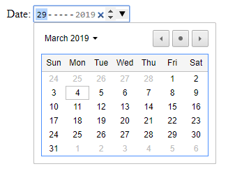
Date type has introduced the calendar also to select the date with the ease of convenience. Now when you tap on the date box, a calendar pops up in which you can select the desired date and it will be automatically filled in the input box. This is shown as below.
This has helped not only in filling the birth dates but selecting dates for other purposes like flights, trains etc. Using min and max attributes, you could enumerate minimum and maximum valid date respectively.
<input type="date" min="2019-01-01" max="2019-06-01">
Look at how Google Chrome shows the date input type as opposed to the Internet Explorer.
This will remove the headache of validating the date through JS code. Such feature is very important when you have to apply and eligibility criteria is already set for age. A custom date picker can also be used to enhance the visual appearance of your form but you have to be vary of the browser differences. We have written a detailed blog on fixing cross browser compatibility issue with HTML5 input types where we have corrected the date function with jquery library. You can perform cross browser testing on LambdaTest to realize how well is ‘date’ as an HTML5 input field in your website is rendering across 2000+ browsers and browser versions.
Did you know? decimal-to-gray-code — Free Online Tool to convert any Decimal number into Gray Code format. This tool convert between any number base and gray code.
HTML5 Input Field — Month
Month input type is for the input as month. In the date type, the input is the complete date along with the month and year. However, keep in mind that the month input type would only accept values for the month and year as an input. You can code the month input type as follow
<input type="month">
This is particularly useful when the desired input is just the month and the year as in debit card expiry details. All the browsers implement it differently but all of them surely do. This although is not an important and essential input type to be used. This is something that can easily be missed as to input date and expiry, a simple scroll panel or text box is also enough. Since the input value is too low (unlike a number and telephone input type) text input type is also reliable in such cases.
HTML5 Input Field — Time
Time input type has the widest support among the date and time input types. Time is used for entering the time in 12-hour or 24-hour format as required. This is required in many cases as many times we ask for the time from the user while filling up the forms. It can be coded as
<input type="time">
The browser support is great for time input type except for the safari browser which is yet to implement it. When a browser see something for which it has no implementation, then it reduces it to text input type. The browsers implementation differs according to the browsers. Edge browser implement the time input type as follows
You can also use other attributes along with this input type such as min (least time to accept), max(last time to accept), read-only (only readable time) and step. You cannot implement size attribute with the time input type because it is not needed. I mean, why would you need to change the size of time input? Even if you want to, you have to rely on CSS for this and code your way through it.
HTML5 Input Field — Datetime
Datetime input type is used to enter a particular time on a particular date along with month and year. This is a useful feature but has been put in this list because of its less popularity. The datetime is only implemented in Chrome, Opera and Edge browsers putting all other browsers out of the pool. All these browser deduce it to input type text. It is coded as
<input type="datetime">
Wondering, what’s the difference in cross browser compatibility?
Well, if you notice more carefully, you will find that in Chrome 72 has rounded corners.
Irrelevant Input Types
By irrelevant input types, I refer to those input types that were introduced with HTML5 but are either not fully utilised by the browsers or are not needed. Although you can use all of the below data types as you want but this may prove to be harmful for the user base of your website.
HTML5 Input Field — Color
Input type color is used for entering the color as a input. This can be coded in HTML as
<input type="color">
For those browsers that implement this type, they use color picker for the same. So when you tap on the color input tab, a color picker or a color well appears and you can choose any color with your mouse and the hexadecimal value of the same will be entered in the input box. This color picker depends totally on the developers of the browser. They can implement it like whatever they like. So a chrome color picker will look like this
This is used when you need to get an input as a color from the user. Looks important but there arises a problem with this input type. Since we already know that whenever a input type is not supported by the browser, it gets default to text input type. Now color input type actually takes input as the hexadecimal value of the color. This means if a browser is not supporting color input type then the user has to enter the input in hexadecimal format. This is never recommended and is always pain to see such a field. This is how you will see the color input in Safari browser 10.1
Color is a good input type but is still not meaningful because of the bad implementation. It is very good if implemented in the browser but if not, there is no way around to enter the color in the hexadecimal format which is really something to worry about
HTML5 Input Field — Week
Week is yet another input type that was not at all necessary to implement. Week input type is the refinement of the month input type and is used to enter the complete week as an input. I could not find any particular case where week input type can be used. Week input type can be coded as follows
<input type="week">
This input type looks like this in the browser.
Let’s Club Them Together!
Now, that we have seen the input types individually and learnt in good detail about them, it will not hurt to combine all these data types and construct a single form, an application form, and see how this form will be seen by the major browsers by performing cross browser testing on LambdaTest.
The code we have used for implementing the form is:
    <html>
    <head>
    <title>lambdatest</title>
    <style>
    input {
      width: 30%;
      padding: 12px 20px;
      margin: 8px 0;
      box-sizing: border-box;
     border: 2px solid black;
      border-radius: 4px;
    align: center;
    }

    input:focus {
      background-color: lightblue;
    }

    </style>
    <body style="background-color:silver">
    <br><br>
    <center>
    <h1>Input Types In HTML5</h1>
    <div>
    <form>
    Search :  <input type="search" name="xyz">
    <br><br>
    Email : <input  type="email" required>
    <br><br>
    Number : <input type="number" min="3" max="30">
    <br><br>
    Range : <input type="range" min="0" max="100" step="5">
    <br><br>
    Telephone : <input type="tel" required>
    <br><br>
    URL : <input type= "url">
    <br><br>
    Date : <input type="date">
    <br><br>
    Month : <input type="month">
    <br><br>
    Time : <input type="time">
    <br><br>
    DateTime : <input type="datetime">
    <br><br>
    Color : <input type="color">
    <br><br>
    Week : <input type="week">
    <br><br>

    <button> Submit </button>
    </center>
    </form>
    </div>
    </body>
    </html>
What Is LambdaTest?
LambdaTest is a scalable, cloud-based, cross browser testing tool that helps you to ensure that your website renders seamlessly over various browsers. LambdaTest offers a browser library of more than 2000 real browsers and browser version running on numerous operating systems, varying from windows to mac in desktop and iOS to android for mobile devices.
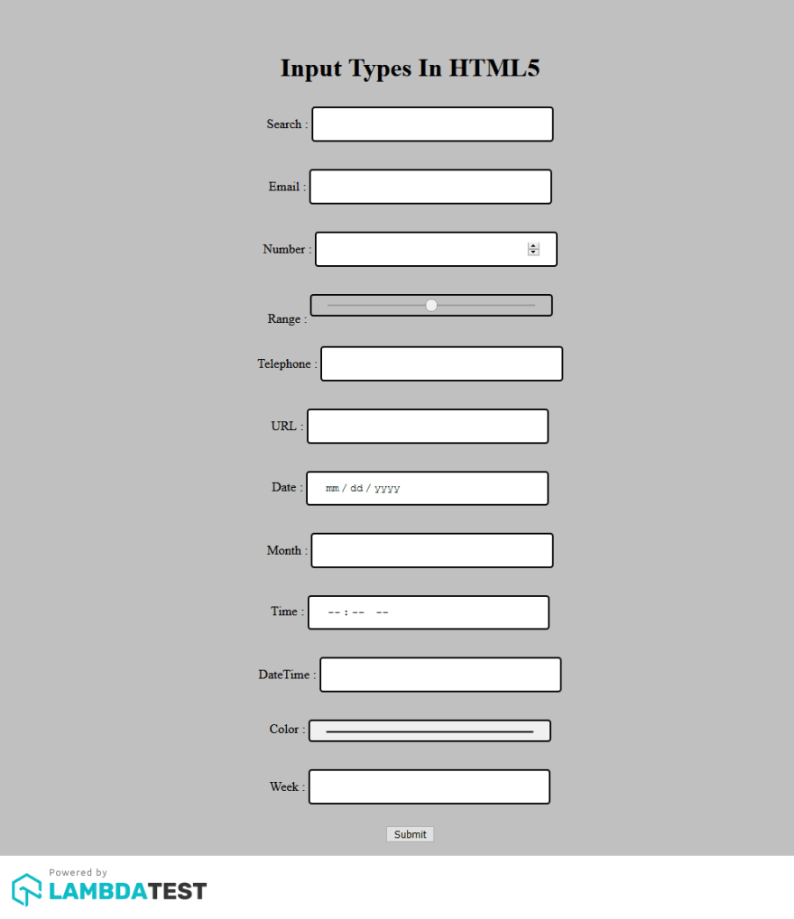
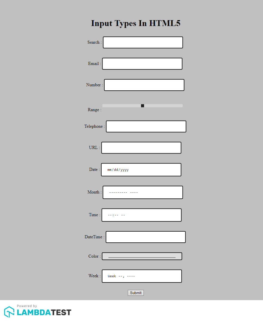
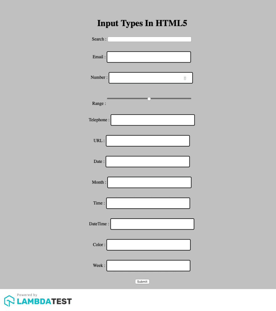
I have used the feature for automated screenshot testing offered by LambdaTest to capture screenshots in bulk over different browser + OS configurations. If you are an existing user of LambdaTest then here are 10 Must Try Features Of Automated Screenshot Testing On LambdaTest. Now, let’s have a look at our the result of browser compatibility testing performed for our HTML5 form to evaluate the difference in rendering across various input types.
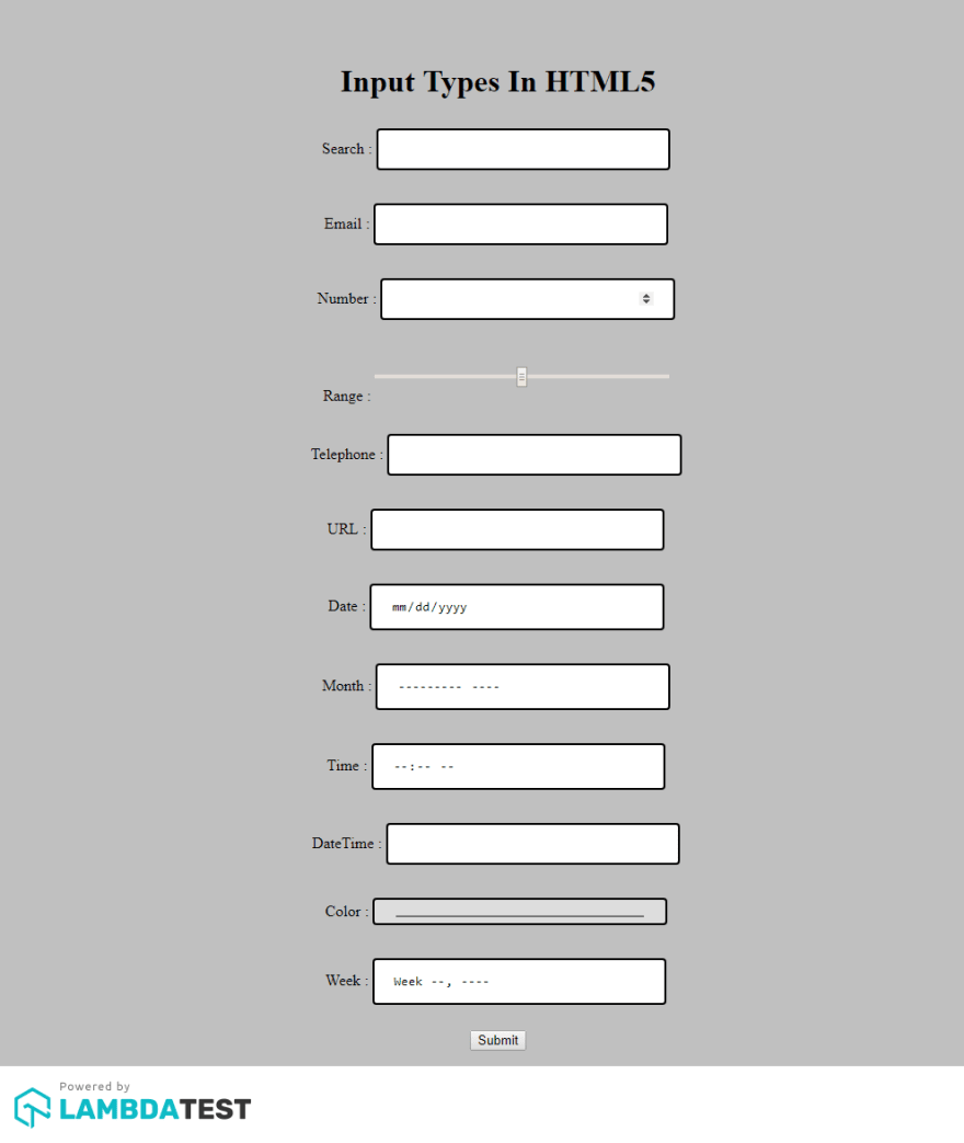
HTML5 Input Fields In Google Chrome 72
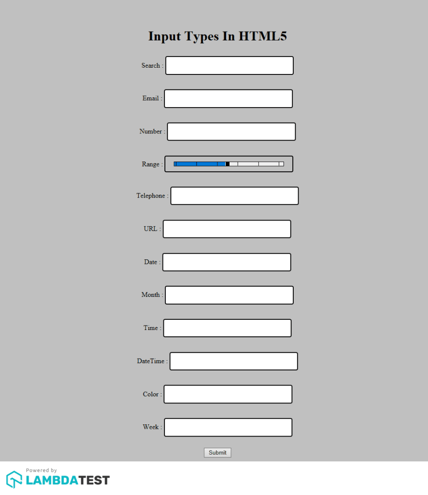
HTML5 Input Fields In Internet Explorer 11
HTML5 Input Fields In Mozilla Firefox 64
HTML5 Input Fields In Opera 56
HTML5 Input Fields In Safari 12
Click here to know more about 15 Best Testing Conferences to Attend in 2022.
Summarizing What We Learnt!
HTML5 brought 13 new input types with it to solve some of the issues that were long faced by the developers. With these input types small but meaningful problems like entering a date or email in the input box was solved. With this the browser developers added their own feature which could catch this input type and provide few extra things to please the user and make things easier. As I mentioned in article all the 13 input types were not relevant and some of them are still yet to prove their existence like color while some are really not needed like week. But as everything is developed keeping the future in mind, we can never say. Maybe today, it is not needed but let’s wait for some time in the future, maybe we end up utilizing them more often than we imagined.
A key thing to remember about these fields is the browser differences that are caused while rendering the input form across different browsers. It is crucial to perform a round of cross browser testing to deliver a pixel-perfect user experience to your customers. If you are already suffering with cross browser compatibility issues in HTML5 input types then here is an article which will help you rectify them for field input types such as date/time, color, range, and number. Cheers!


