Introduction
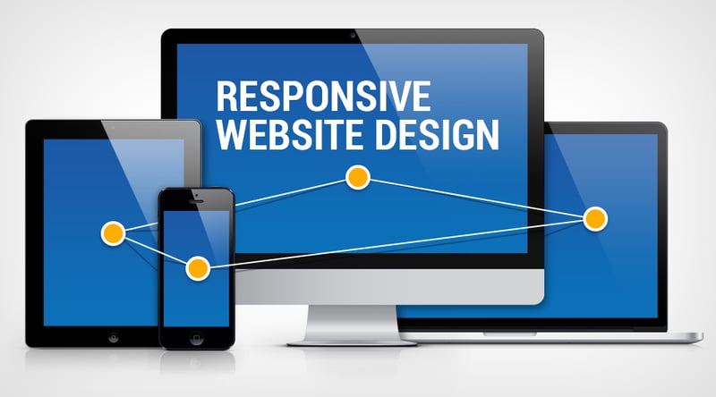
Today, there are a lot of devices from where a user can access the web page. As the device changes their screen sizes, resolution and all. So it becomes necessary to optimize your website to look great on all device screen. Responsiveness of your website is very very important today. So I am going to list some tips to starting thing responsive for your website.
1. Ditch "Pixel" as a unit
You might be using pixel for height/width for your contents, images, etc. But Pixels remain the same with change in screen size and it makes the website look out of shape and give a bad impression. Instead of using pixel, use the percentage as a unit for adjusting height/width. As it adjusts itself according to screen size.

5 Netflix Documentaries For Every Designer
Suraj Vishwakarma ・ Sep 12 '20
2. Use of "em" and "rem"
em and rem are two units which are dependent on other element's unit and it comes under the relative unit. em and rem will greatly help in adjusting font-size and padding according to the size of the screen. You can simply change one font-size and it will affect the whole document as em and rem are relative. Changing font-size and padding is quite helpful to adapt to different screen sizes. I personally use em for padding and rem for font-size. You can read more about em and rem on REM vs EM – The Great Debate.
3. Media Query
Media query can give more dynamic to your CSS style. By using media query you can change the CSS style of any element according to any given condition.
header{
    text-algin : left;
}

@media (max-width : 675px){
    header{
        text-align : center;
    }
}
In the above example, if the width of the page is 675px or lower then the text will align in the center or else it will align in left. Media query is one of the features you are going to love while making a responsive website.

Why Most Developers Prefer The Dark Theme IDE?
Suraj Vishwakarma ・ Oct 1 '20
4. Mobile First
I had written the blog on this topic but for some reason, I have to delete that post. But I want to add this point from my original post. This point was recommended by Seye Olajuyin. When you write CSS starts with writing for small size screen i.e. Mobile devices. This helps you to write less code. As you end up modifying less to your code.
If hope whenever you next time design a website, think responsiveness of your website. You can give your opinion or idea in the comment box. Thank you for reading the blog.


